Role:
Sole designer: research, UX, brand, and marketing assets
Timeline:
2 Hours
Tools:
Figma, Claude, Gemini
Scope:
Concept project. Sample data, no real metrics.
The starting point
An app that worked, but looked dated
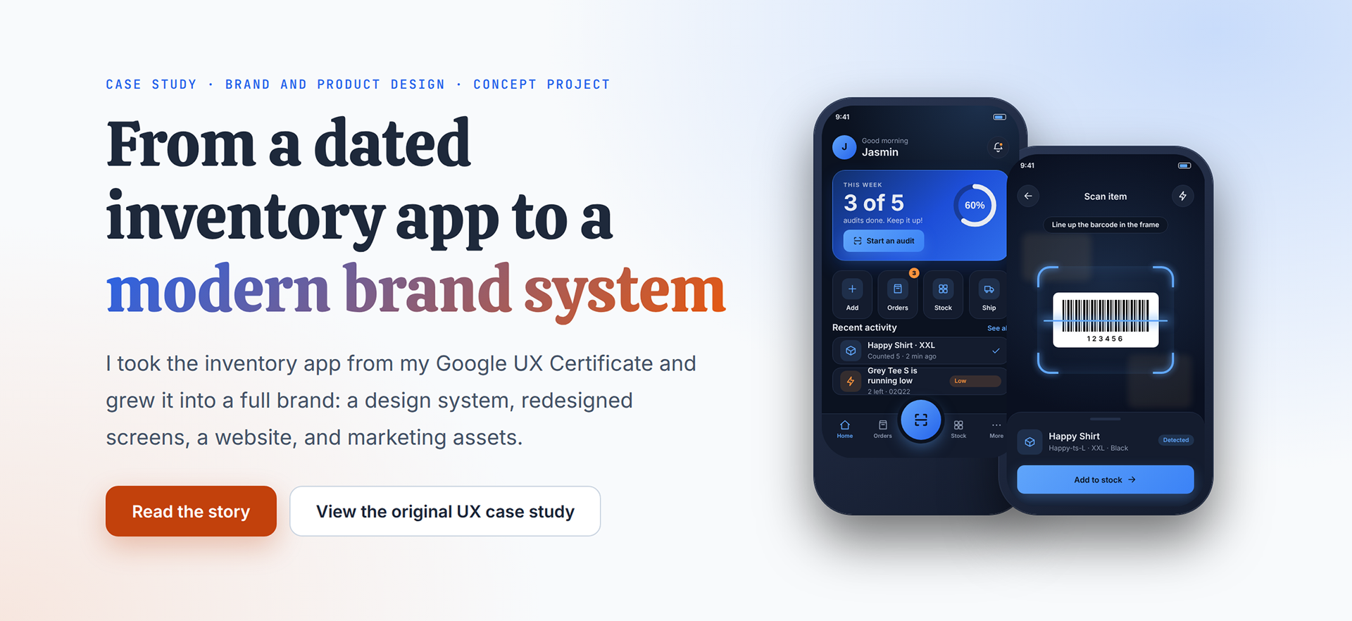
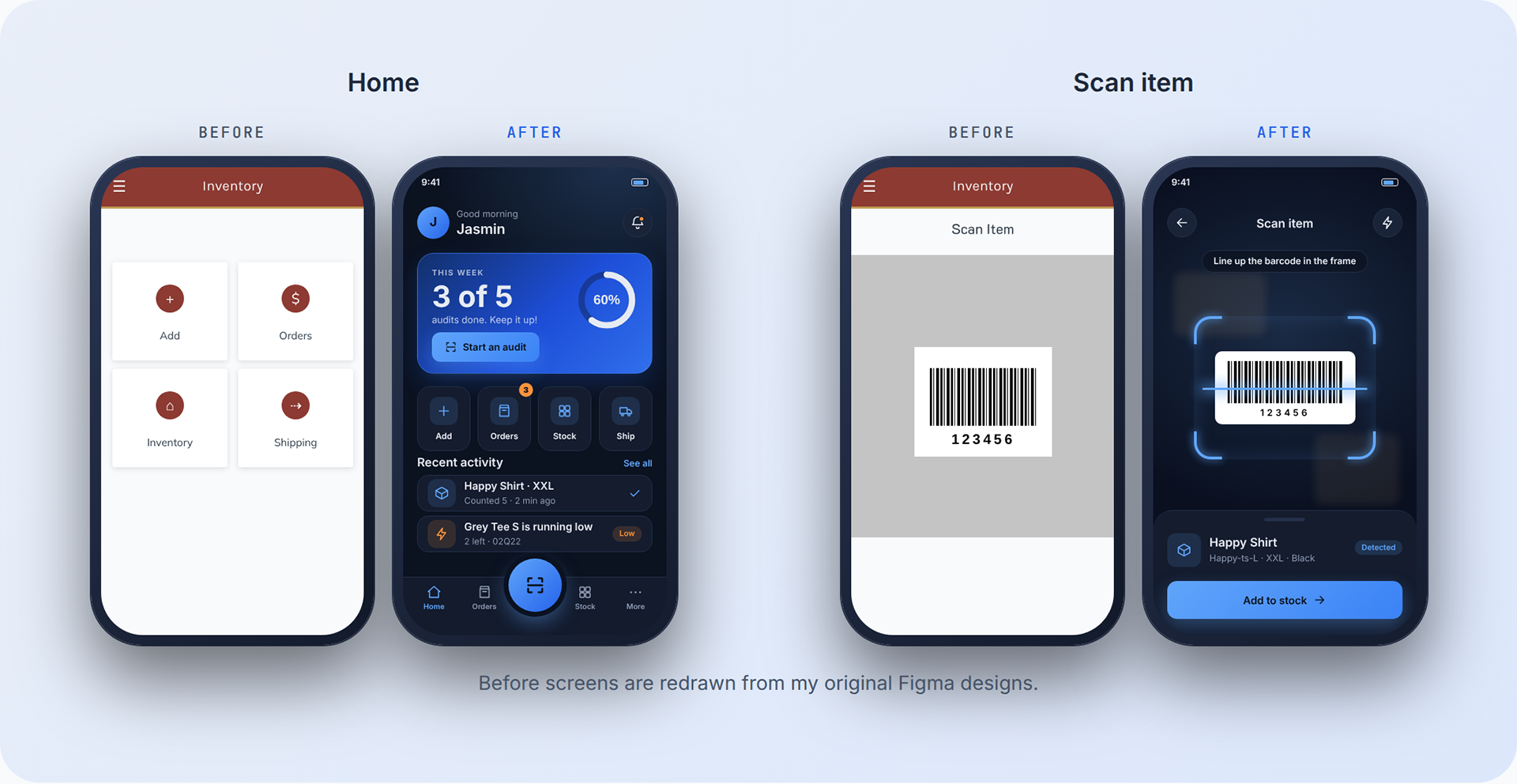
I designed this mobile inventory app for e-commerce teams during my Google UX Design Certificate. My research pointed to three frustrations: mistakes, poor organization, and typing the same data by hand. The app solved them, but it looked dated, and there was no brand around it.
Key Decisions
Four choices that shaped the system
I explored two directions, tested them, and kept what held up.
Decision 1:
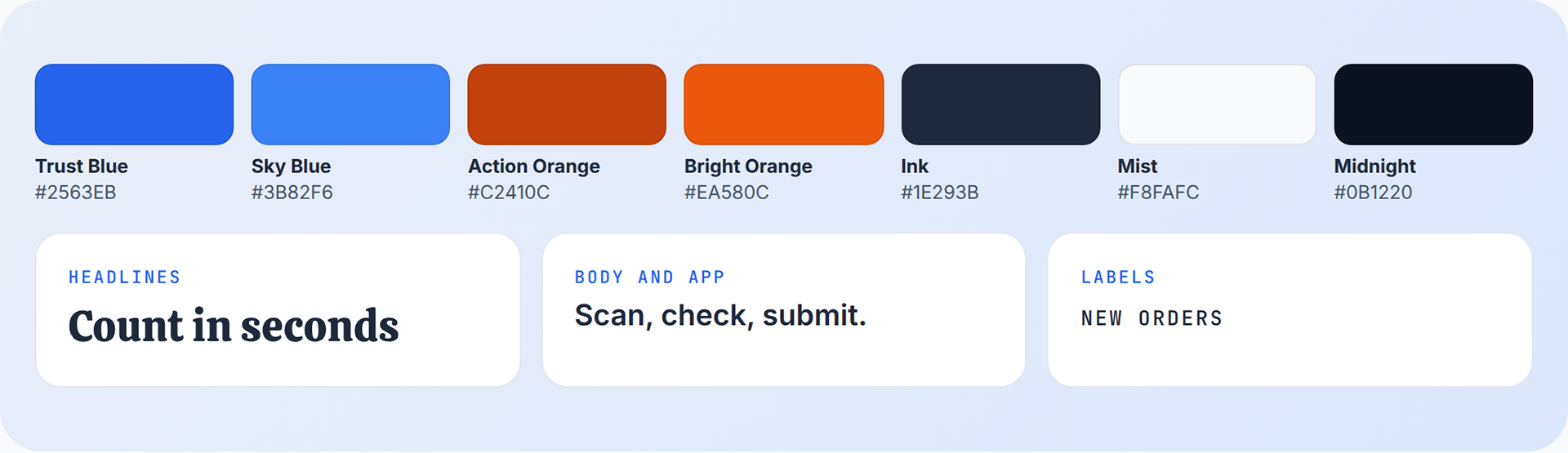
Blue and orange over dark midnight and teal. I compared a premium dark look with a teal accent against a light, frosted look with blue and orange. Blue signals trust, and one orange action color makes the next step obvious. Light pages are easier to read for marketing, so I kept dark mode inside the app for low-light stockrooms.
Decision 2:
Real icons instead of text symbols. My early redesign used text characters as icons, and it looked amateur. I switched to one consistent SVG icon set so every screen reads as professional and stays easy to scan.
Decision 3:
A deeper orange for contrast. White text on my first orange measured about 3.6:1, below the 4.5:1 standard for small text. I moved buttons to a deeper orange (#C2410C, about 5.2:1) and kept the brighter orange for large accents only.
Decision 4:
One font in the app, a display font on the web. The app uses Inter so it stays clean and readable. Web headlines use Calistoga for a warmer, more expressive voice.
The Design System
Palette, type, and rules in one guide
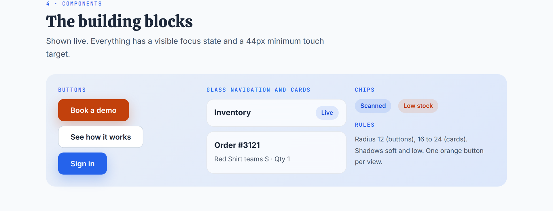
A brand guide gives every future screen, page, and slide the same foundation. It also covers components, motion, accessibility, and voice, including contrast ratios for every pairing.
The Redesigned App
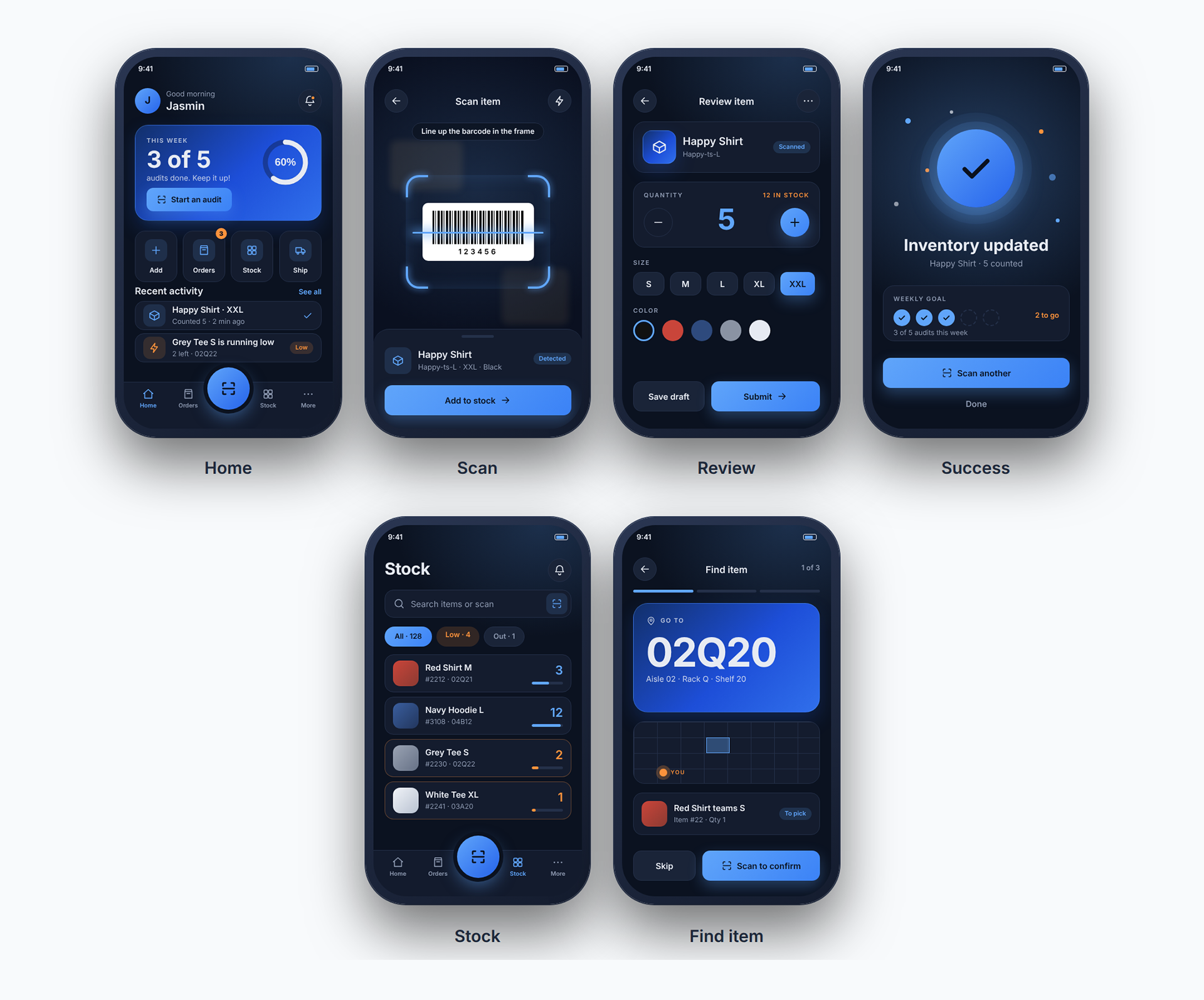
Six core screens, rebuilt
Real icons, depth, bold type, and a floating scan button. Progress rings and a weekly goal make finishing a count feel good.
The Marketing System
One brand, everywhere it shows up
The same palette, type, and voice carry across every touchpoint. The photos were generated with Gemini from prompts I wrote. I art-directed the scenes and chose which images to use.



Reflection
How I worked, and what's next
Directing AI: I used Claude and Gemini like a small team. I set the direction, compared options, and rejected what didn't fit, such as my first teal direction and an off-topic photo. I checked contrast and accessibility myself.
What I'd do differently: I'd test the new screens with real users and replace the AI photos with real photography of real teams.
What's next: finish updating the Figma file with the new system, and add real results as soon as there are any.
Contact
Want to talk about this project?
I'd love to walk you through the decisions behind it.