Context:
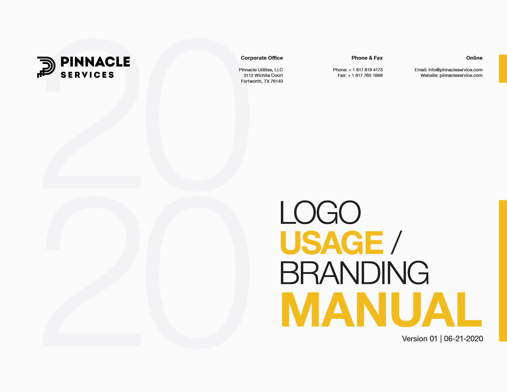
As part of my efforts to establish a cohesive and consistent brand identity for Pinnacle Services, I developed a comprehensive brand guide. This guide serves as a foundational tool for maintaining uniformity across all communications, ensuring that Pinnacle Services' values of quality and professionalism are consistently represented across every touchpoint.
As part of my efforts to establish a cohesive and consistent brand identity for Pinnacle Services, I developed a comprehensive brand guide. This guide serves as a foundational tool for maintaining uniformity across all communications, ensuring that Pinnacle Services' values of quality and professionalism are consistently represented across every touchpoint.
Design Approach:
The goal was to create a brand guide that would not only provide a clear visual identity for Pinnacle Services but also allow flexibility for future creative work. The guide should reflect the company’s rich legacy and forward-thinking approach, giving teams the tools they needed to create consistent, on-brand materials while maintaining room for creative freedom.
Creative Process:
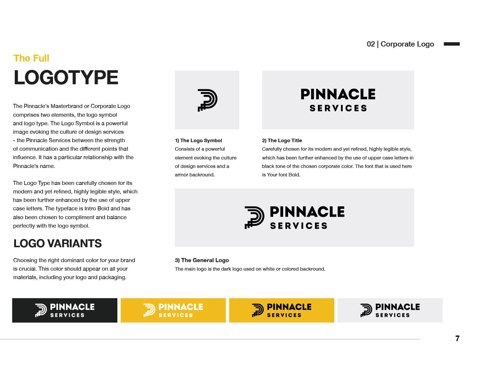
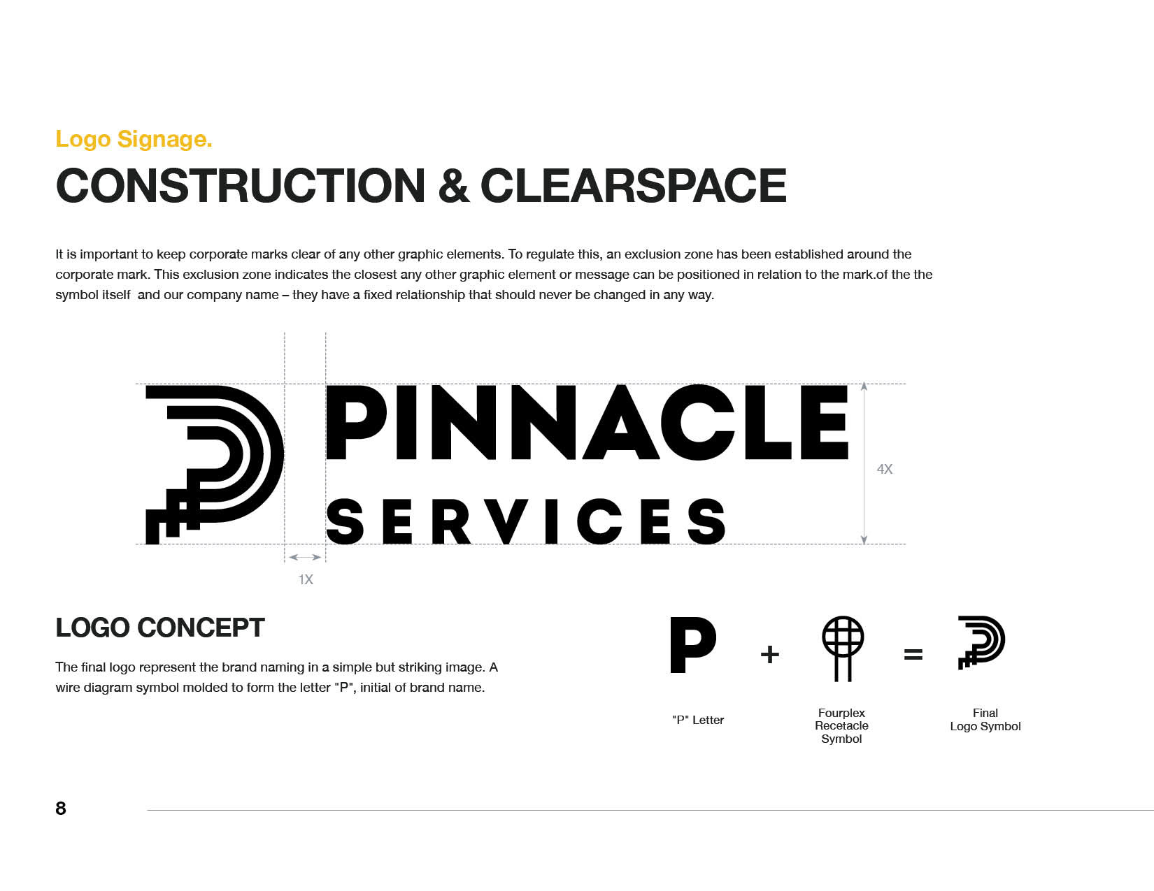
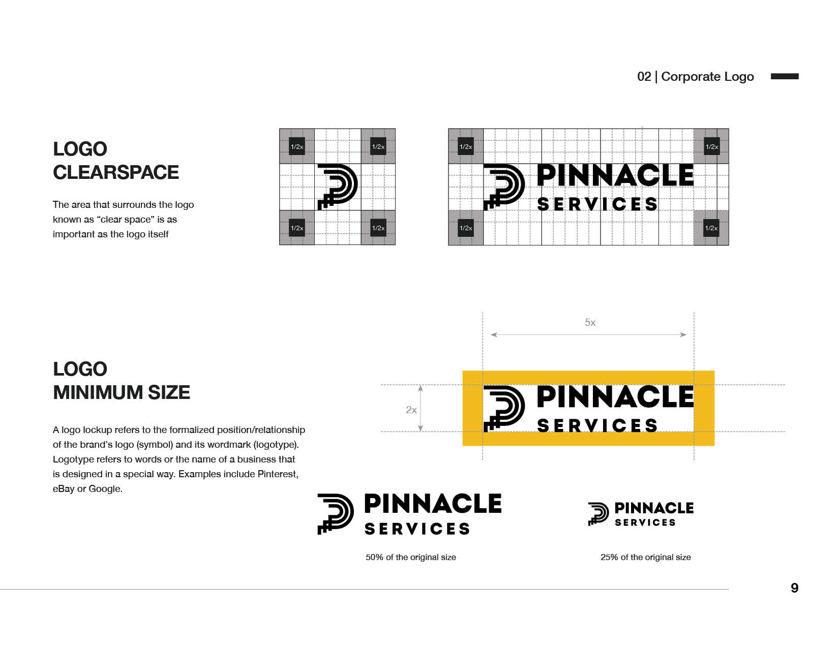
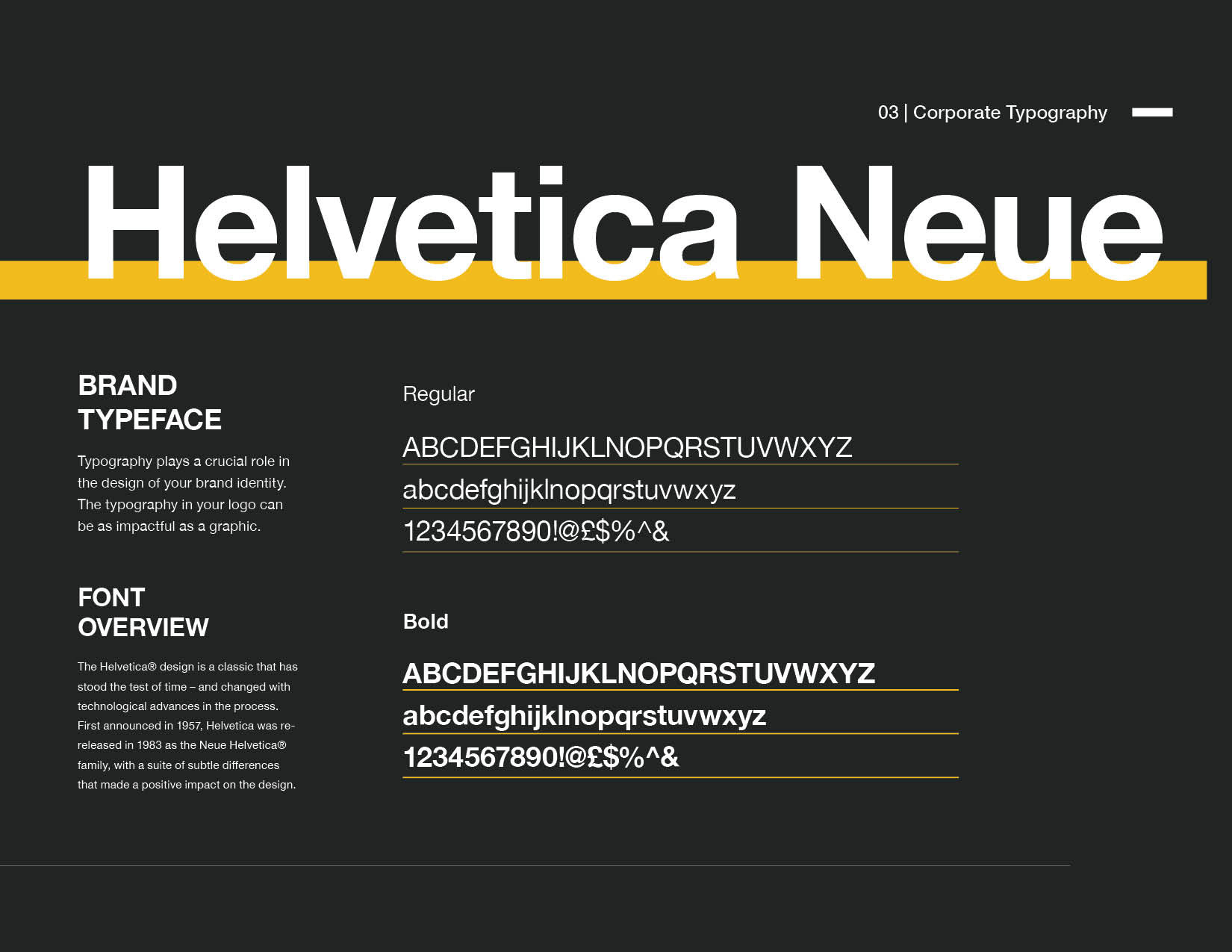
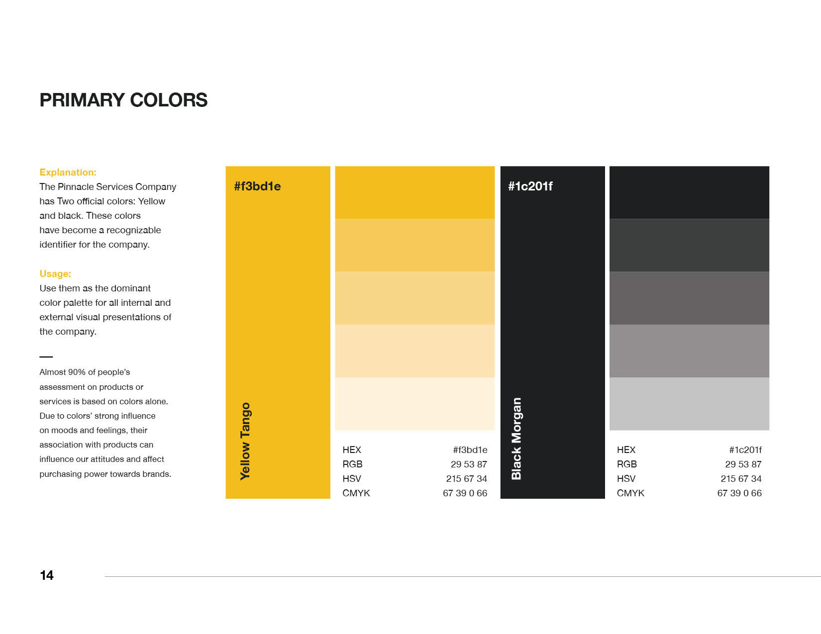
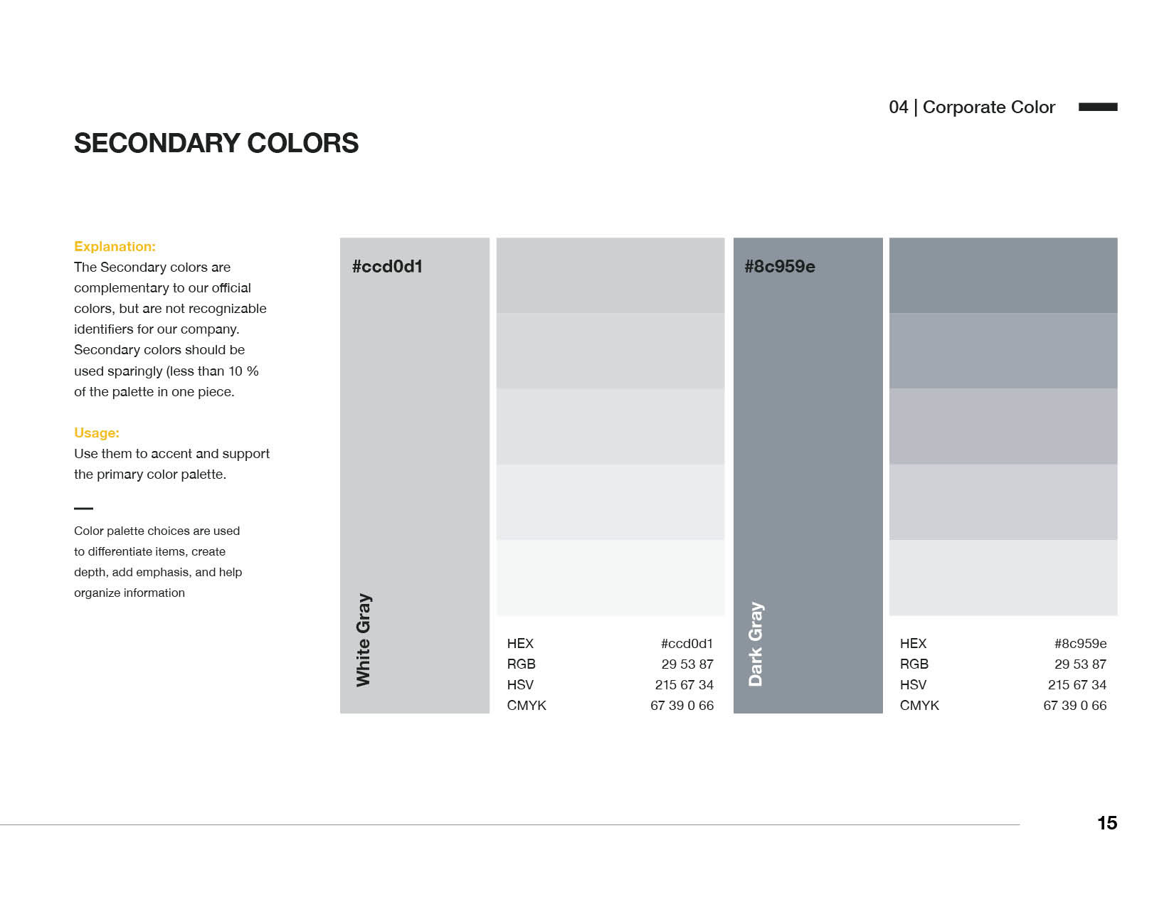
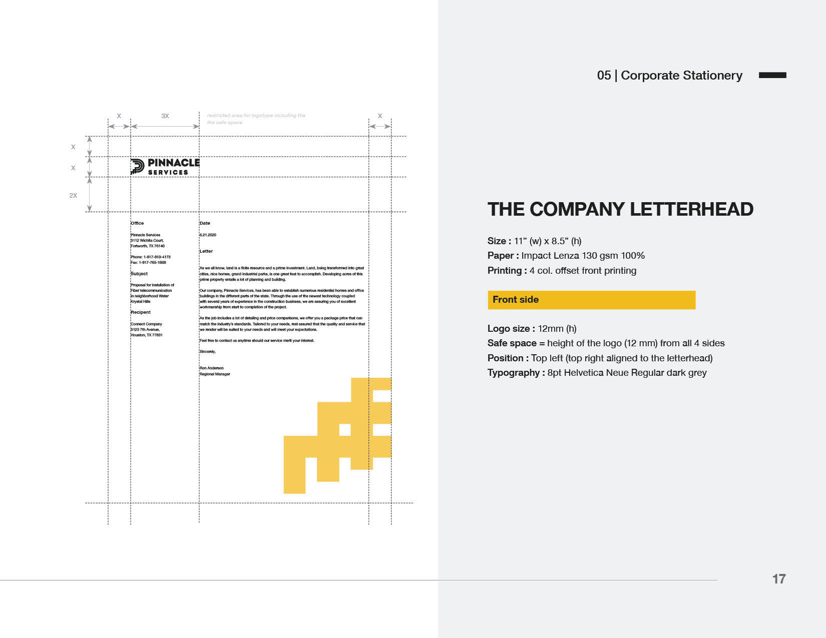
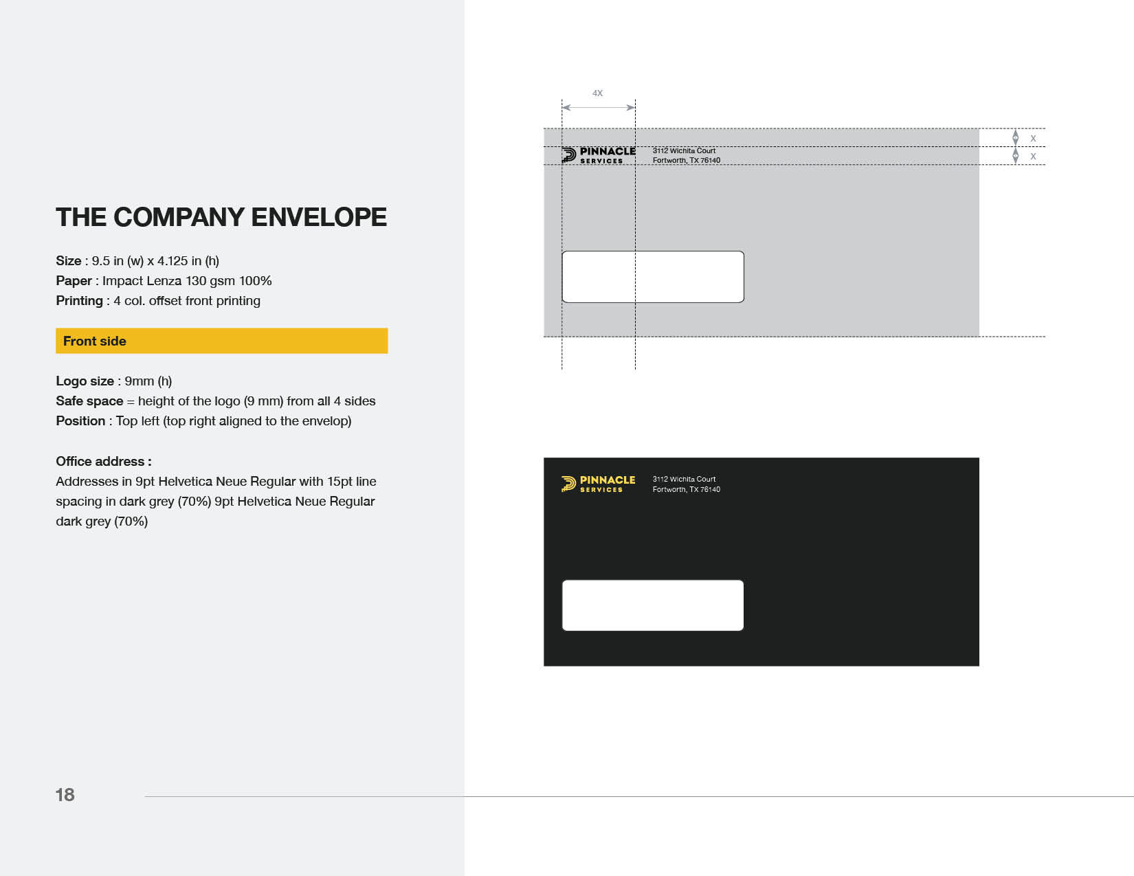
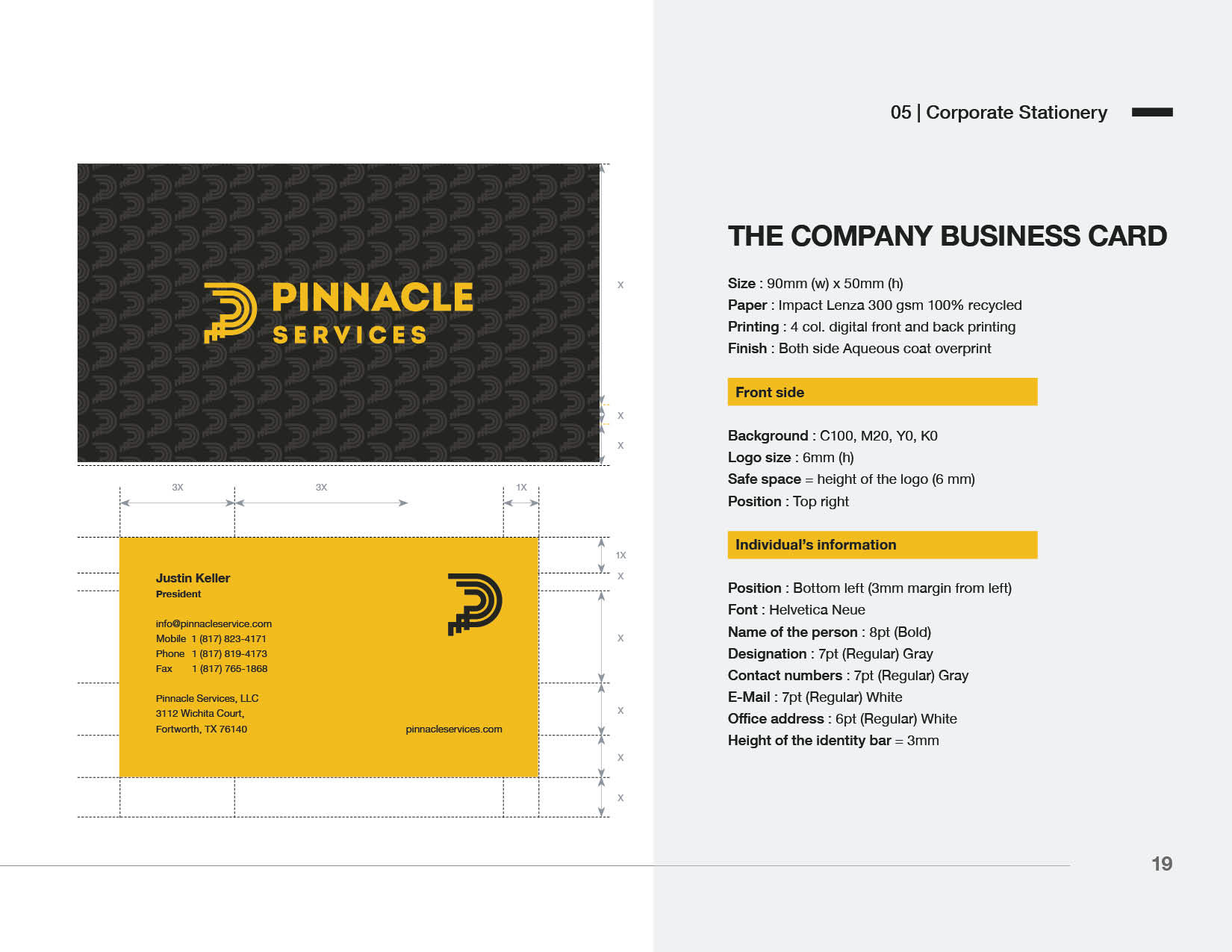
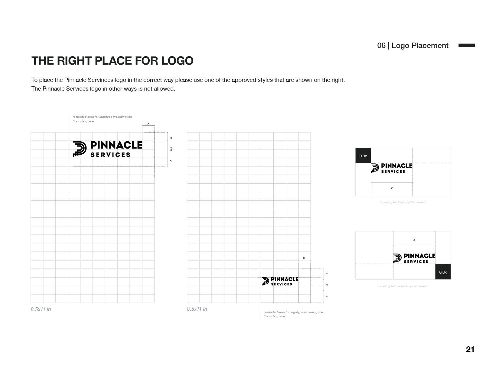
I began by studying the company’s history, mission, and values to ensure that the brand guide aligned with Pinnacle’s long-term vision. Working closely with key stakeholders, I defined the company’s visual elements, starting with the logo. I emphasized the importance of clear space and precise usage rules to preserve brand integrity across various formats and media. For the color palette, I crafted a strategy that balanced traditional elements with a contemporary edge, allowing flexibility without compromising the brand’s professionalism. Helvetica Neue was selected for its timeless, clean design, which enhances readability and supports Pinnacle’s sophisticated, professional image.
I began by studying the company’s history, mission, and values to ensure that the brand guide aligned with Pinnacle’s long-term vision. Working closely with key stakeholders, I defined the company’s visual elements, starting with the logo. I emphasized the importance of clear space and precise usage rules to preserve brand integrity across various formats and media. For the color palette, I crafted a strategy that balanced traditional elements with a contemporary edge, allowing flexibility without compromising the brand’s professionalism. Helvetica Neue was selected for its timeless, clean design, which enhances readability and supports Pinnacle’s sophisticated, professional image.
Outcome/Results:
The brand guide successfully established a strong and cohesive visual identity for Pinnacle Services, streamlining the process of creating consistent, on-brand materials. It not only reflects the company’s mission and values but also provides a strategic framework for visual communication that supports Pinnacle’s long-term goals. The guide has become a vital resource, ensuring that all teams can produce materials that align with the brand’s visual and verbal identity, contributing to a unified and professional presence across all touchpoints.
The brand guide successfully established a strong and cohesive visual identity for Pinnacle Services, streamlining the process of creating consistent, on-brand materials. It not only reflects the company’s mission and values but also provides a strategic framework for visual communication that supports Pinnacle’s long-term goals. The guide has become a vital resource, ensuring that all teams can produce materials that align with the brand’s visual and verbal identity, contributing to a unified and professional presence across all touchpoints.
