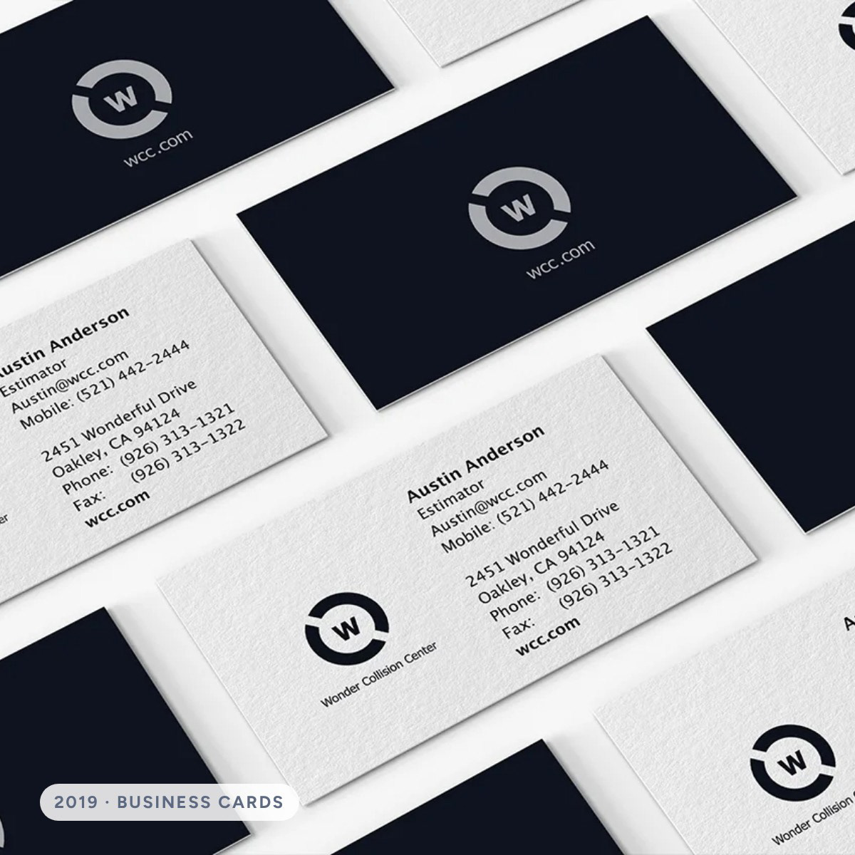
Wonder Collision Center is a concept for a modern collision repair shop. I designed the identity in 2019 around one idea: getting your car fixed shouldn’t take over your week. In 2026 I came back and turned it into a full brand system, so the same promise shows up on the website, in the app, in every email and on the technician’s shirt.
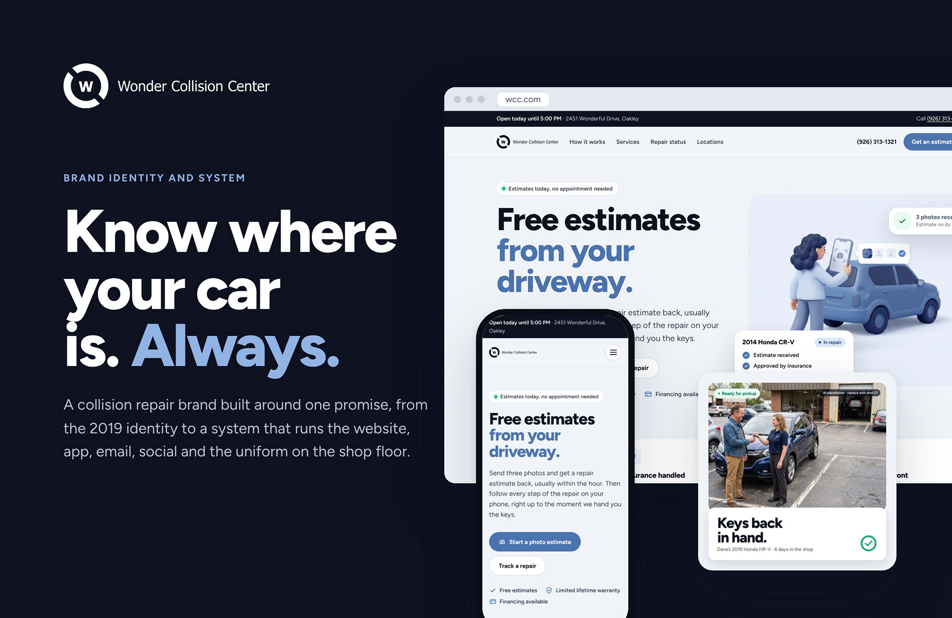
Where it started
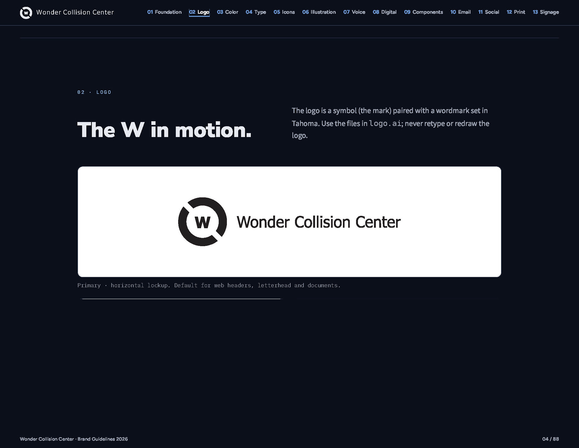
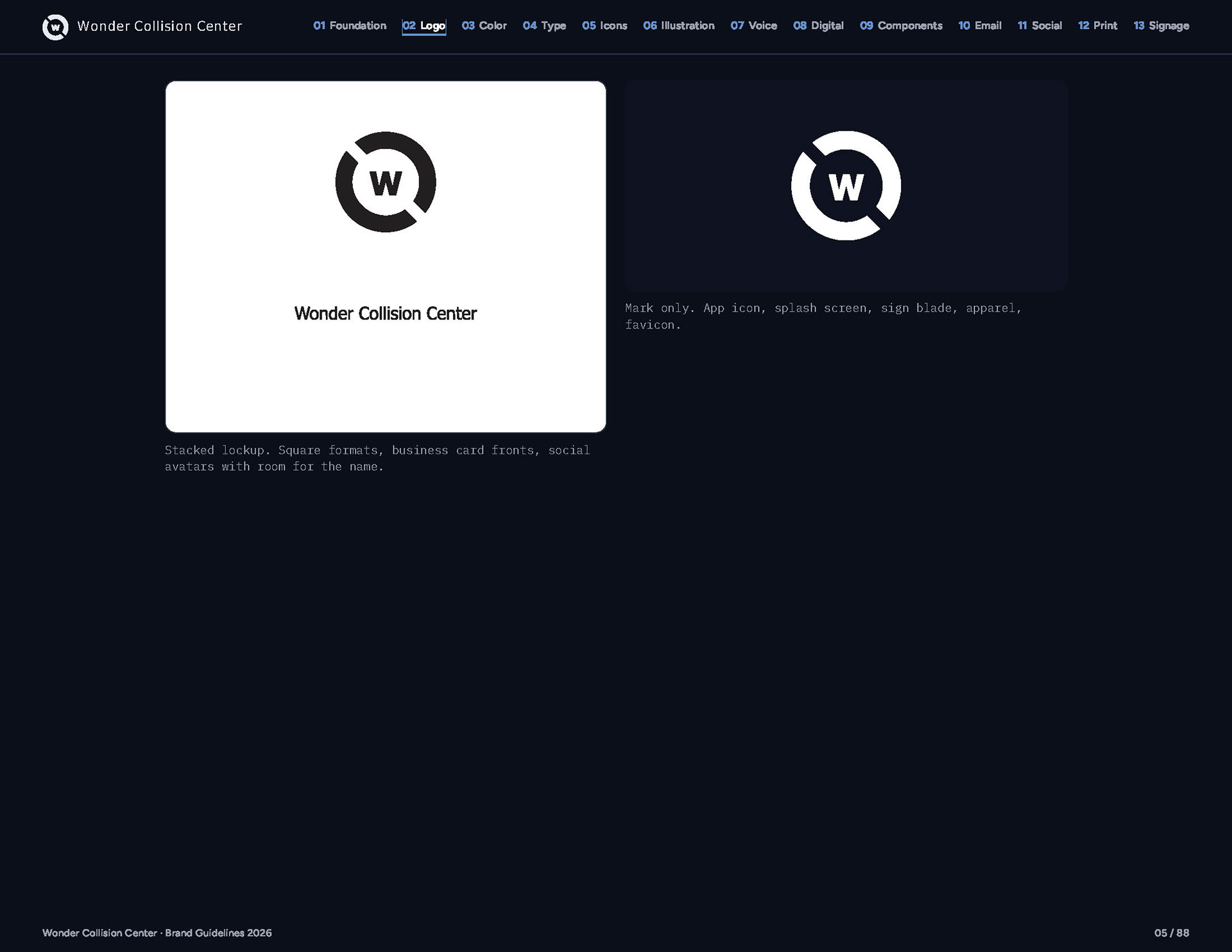
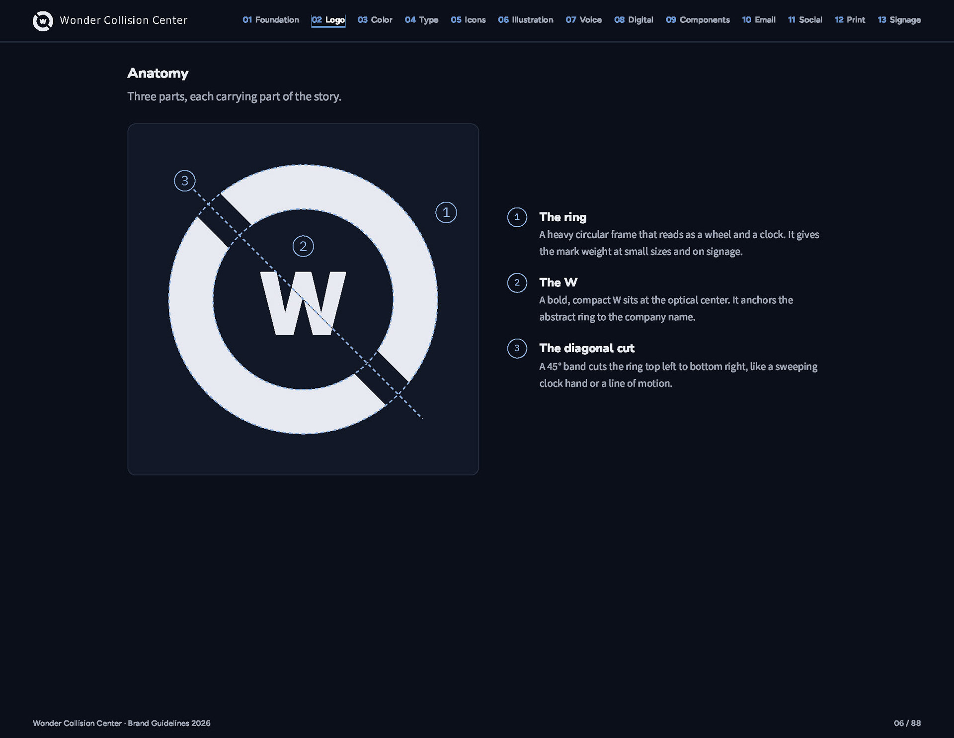
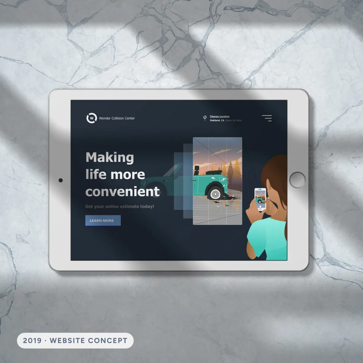
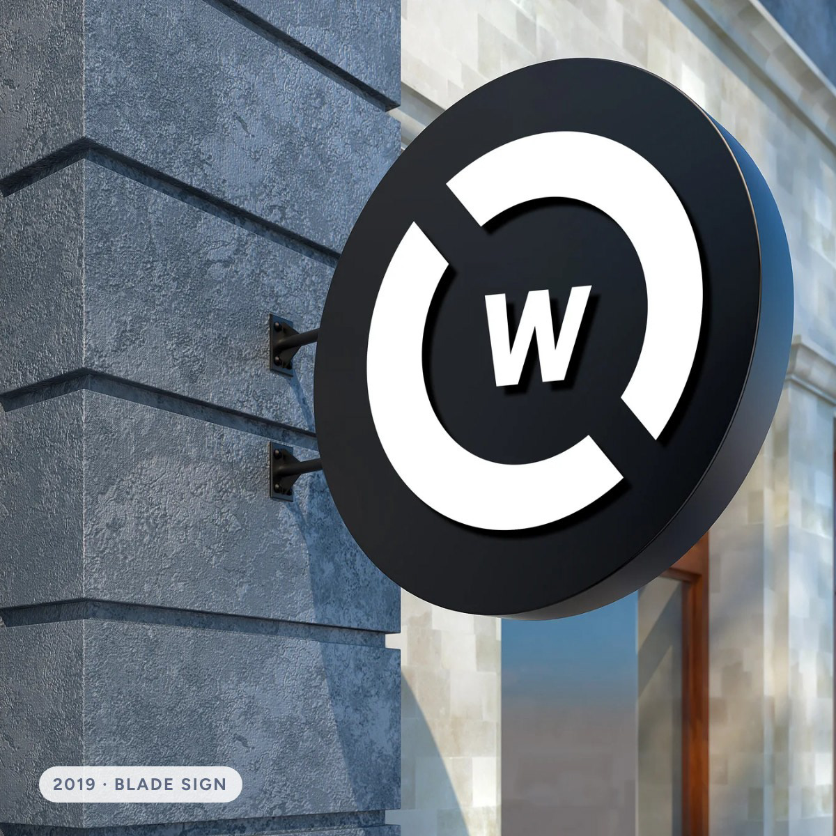
The 2019 brief was a collision shop that feels like a technology company. The mark is a W inside a ring, cut on the diagonal so it reads as a clock hand and a turning wheel at once. Around it I designed a website and app built on booking an estimate in a few taps.
The audit
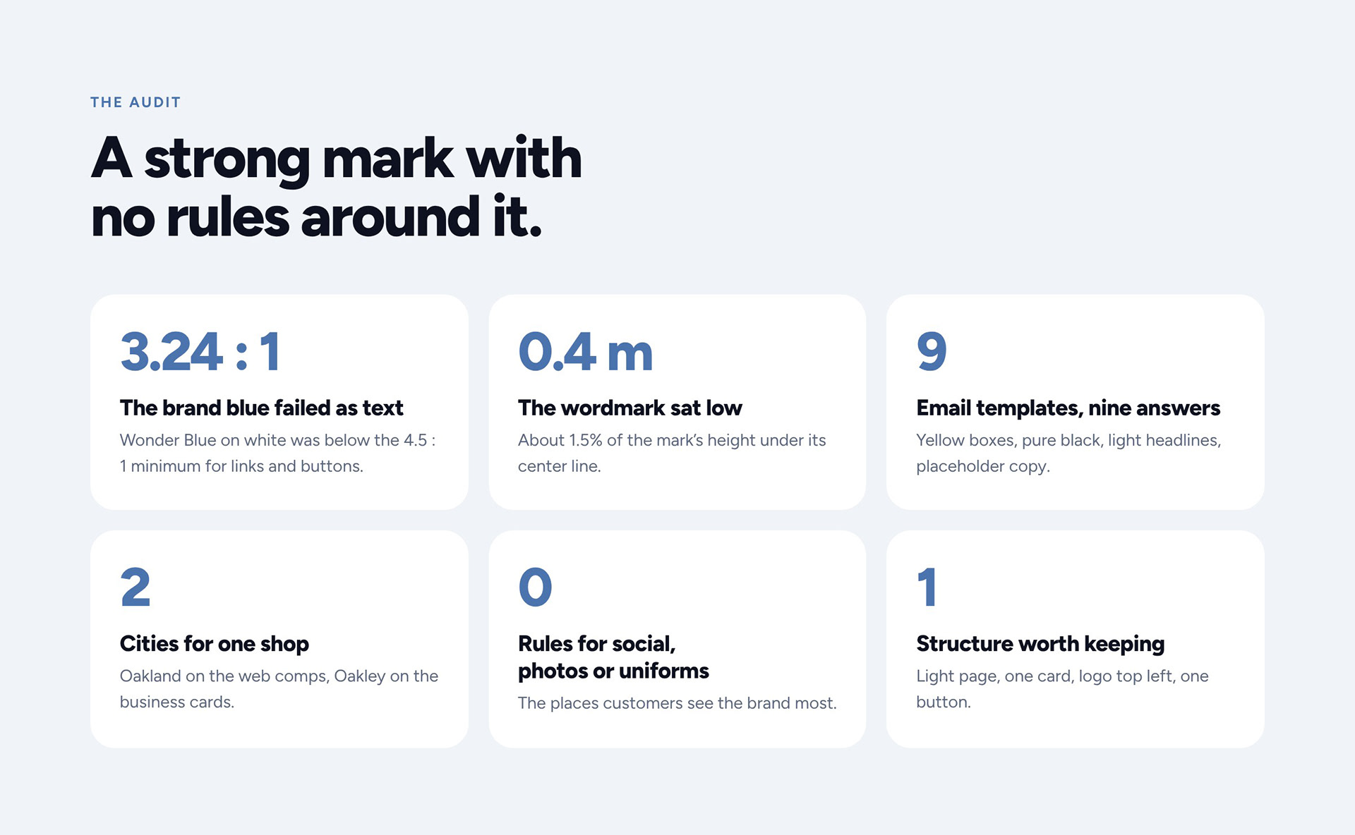
Seven years later the mark held up, but everything around it had drifted. Before designing anything new, I measured what was in the folder: a brand blue that failed as text, a wordmark sitting low, nine email templates solved nine ways, and no rules for the places customers see the brand most.
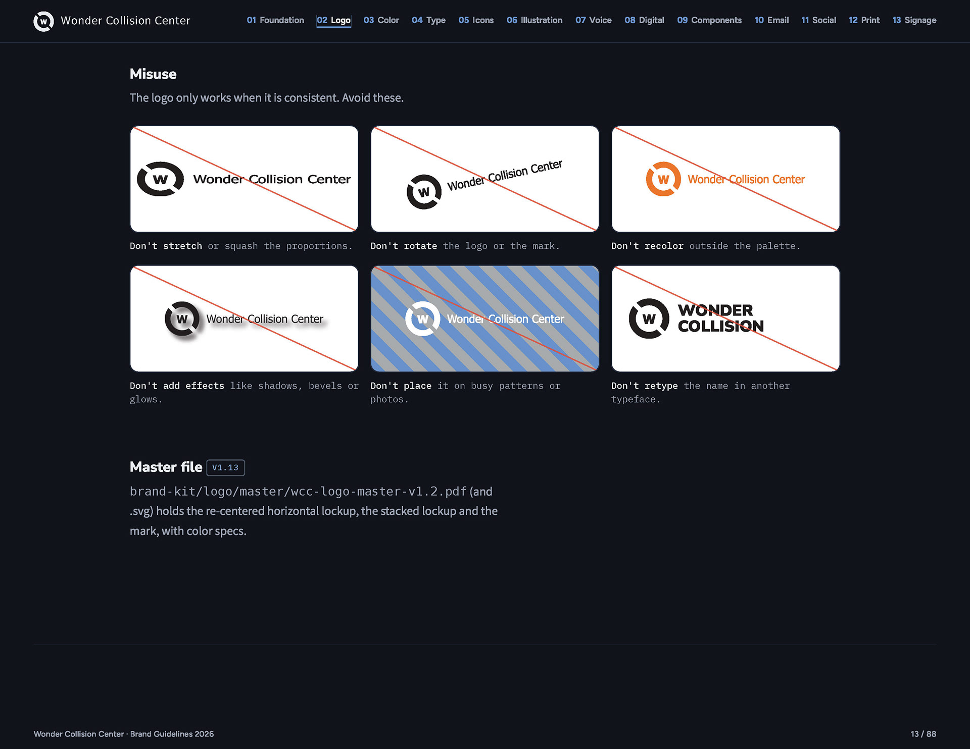
Logo
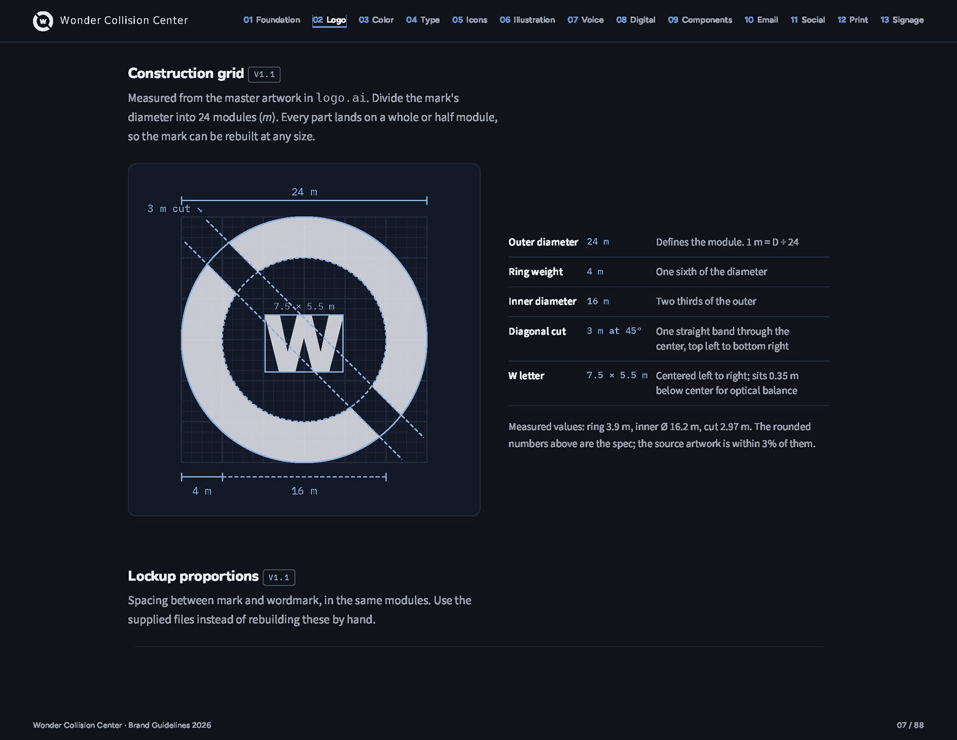
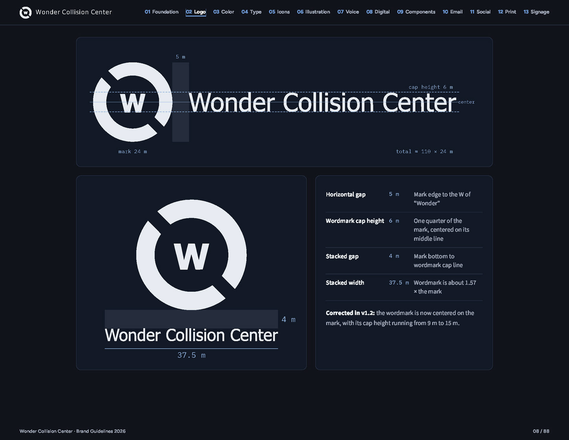
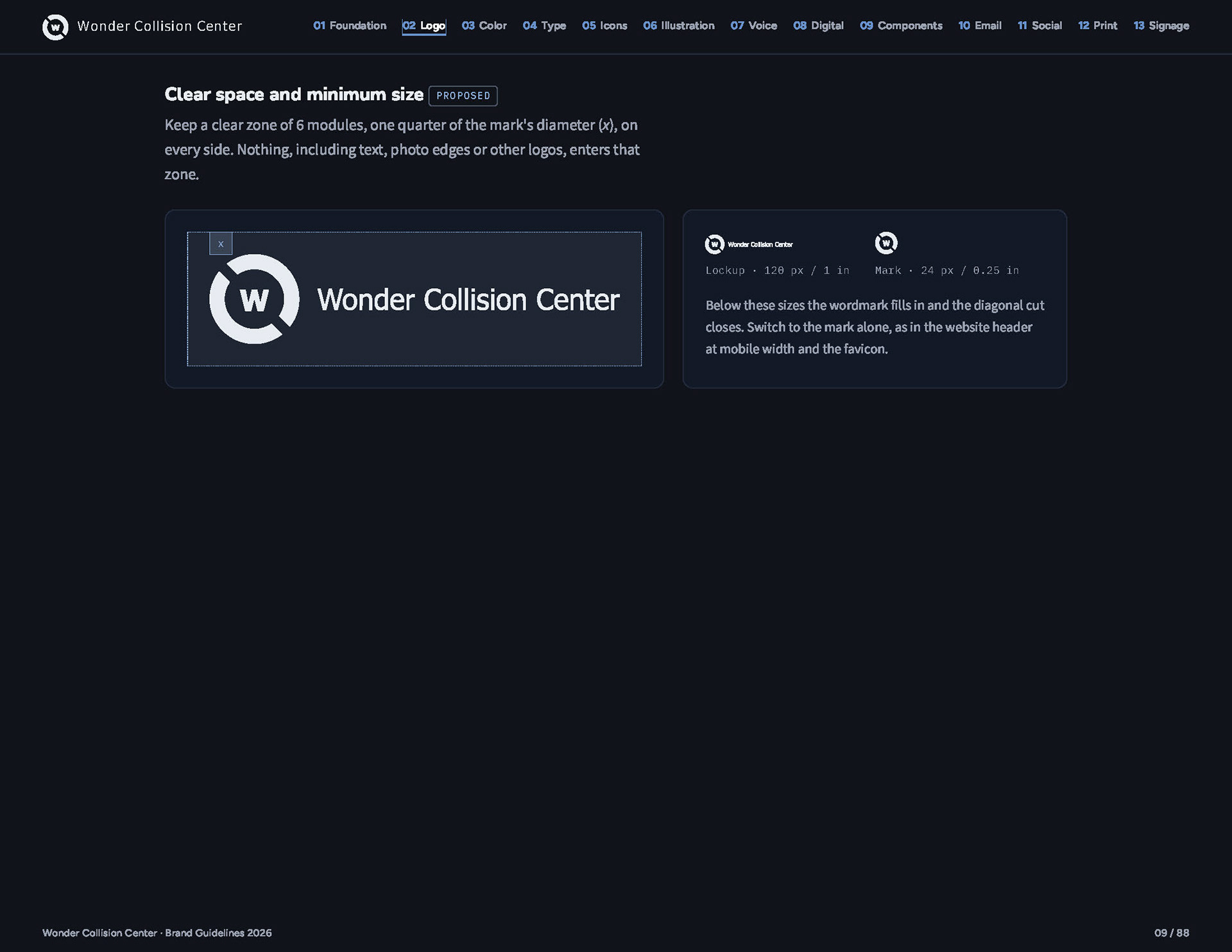
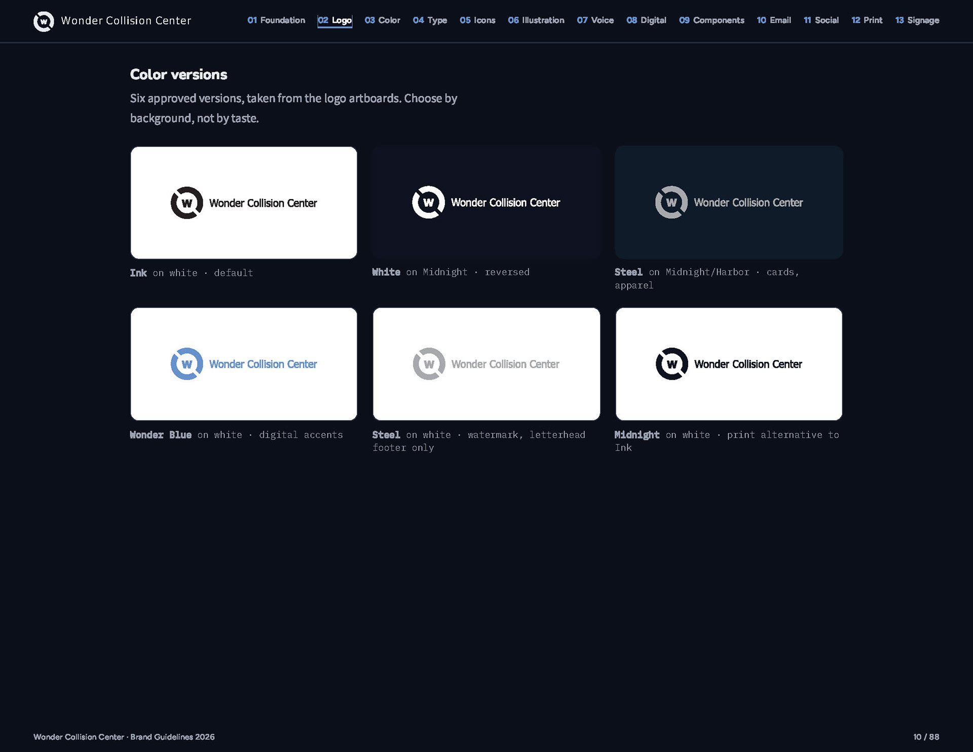
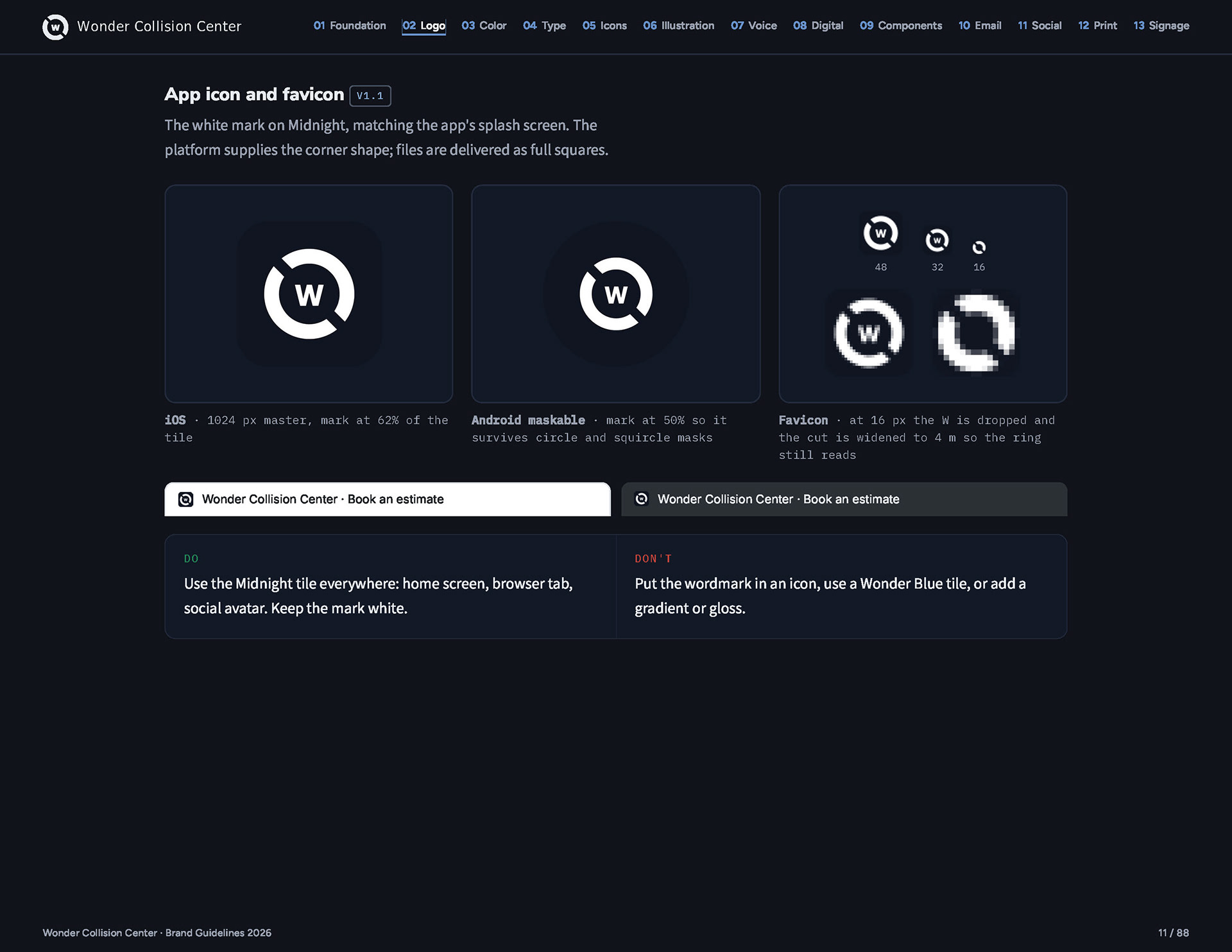
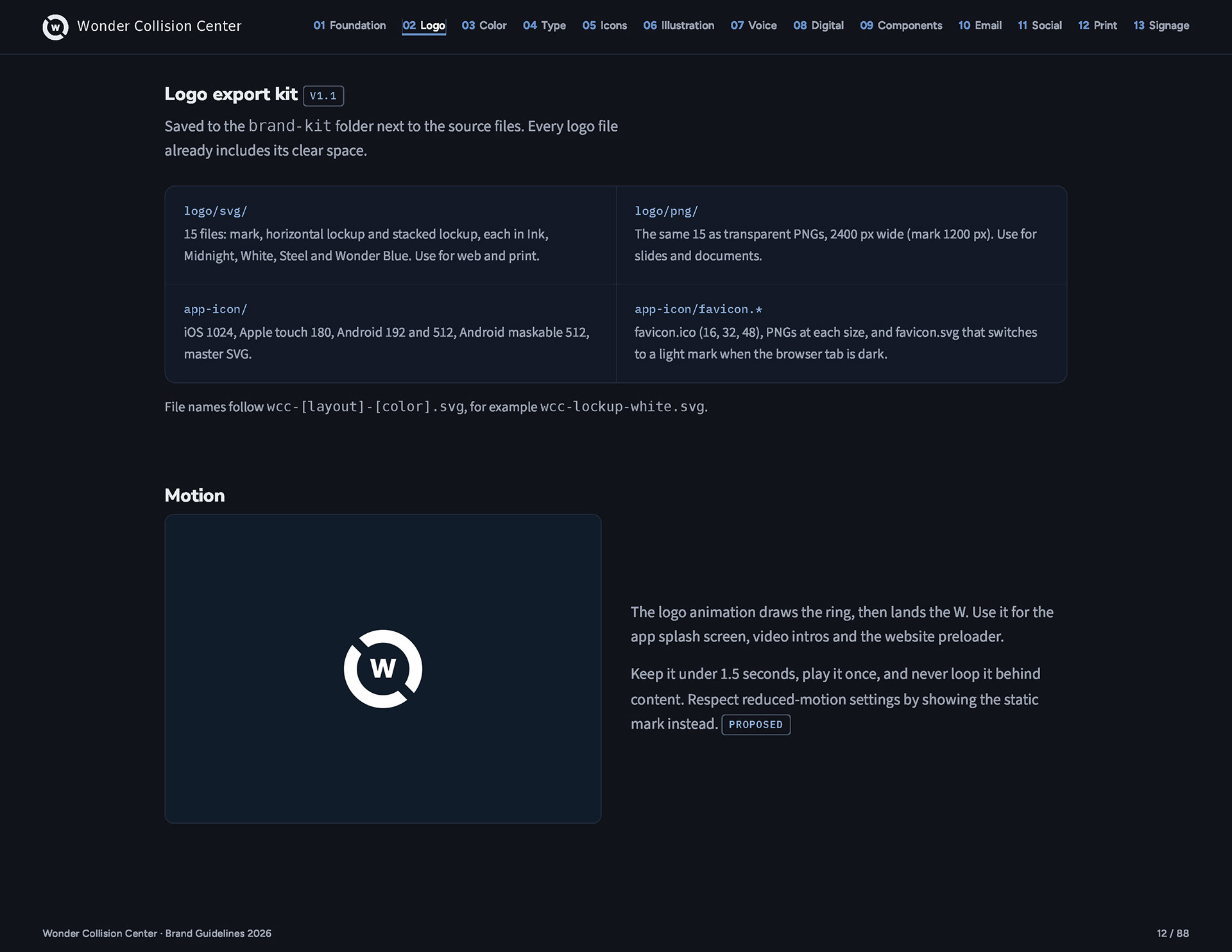
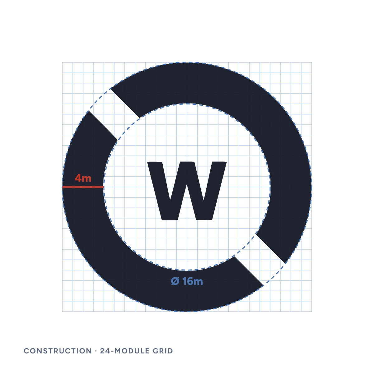
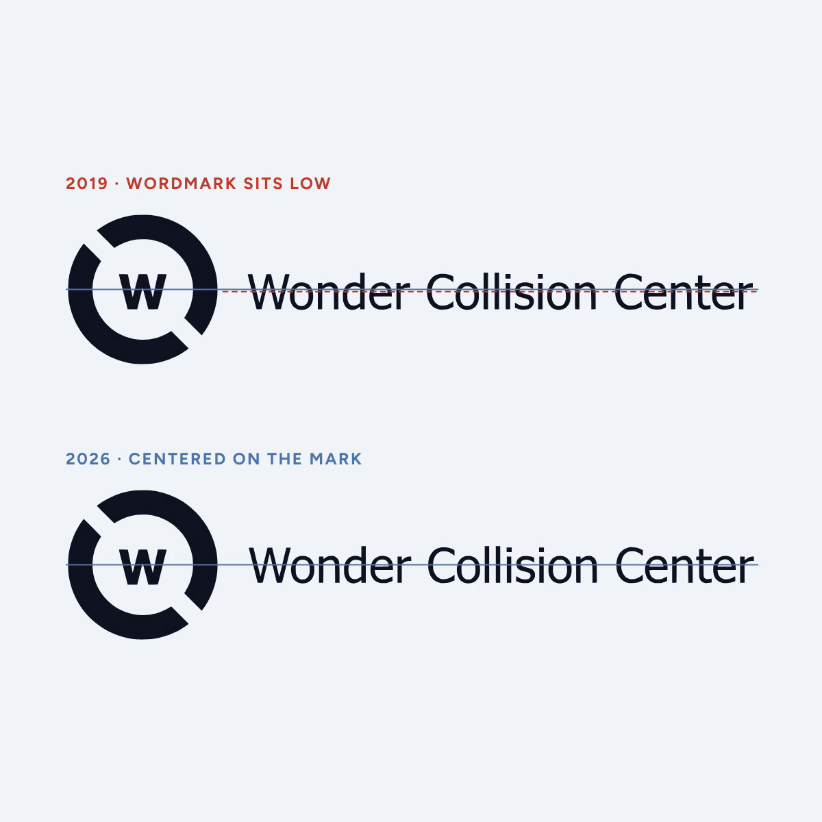
Tracing the master artwork revealed the geometry underneath it: the mark divides into 24 modules, the ring is 4 modules thick and the cut is 3 modules at 45°. That grid now sets clear space and minimum sizes, and the same measurement showed the wordmark sitting low. I re-centered it and rebuilt every logo file.
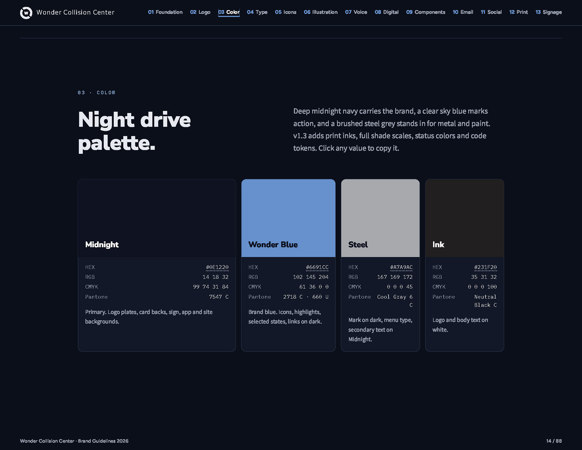
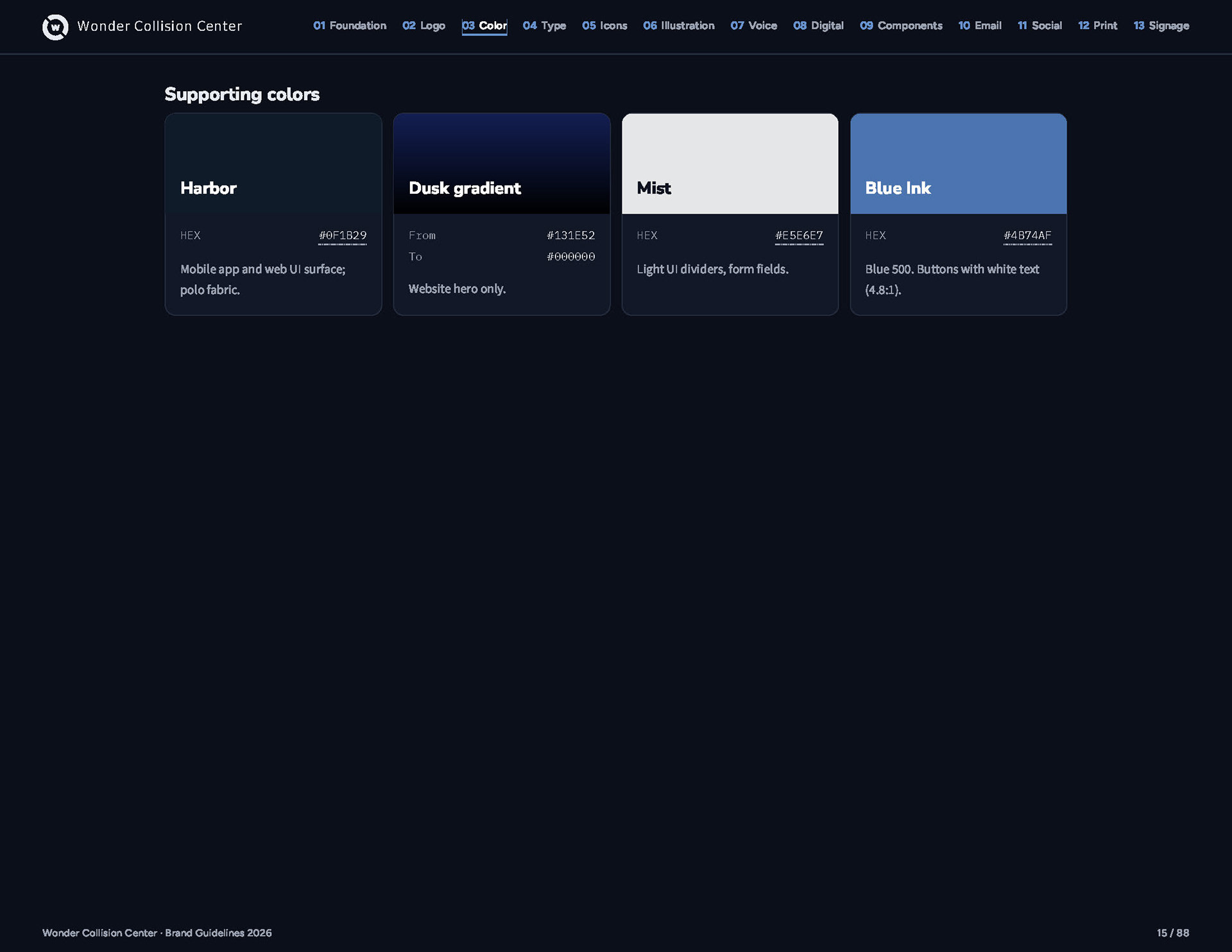
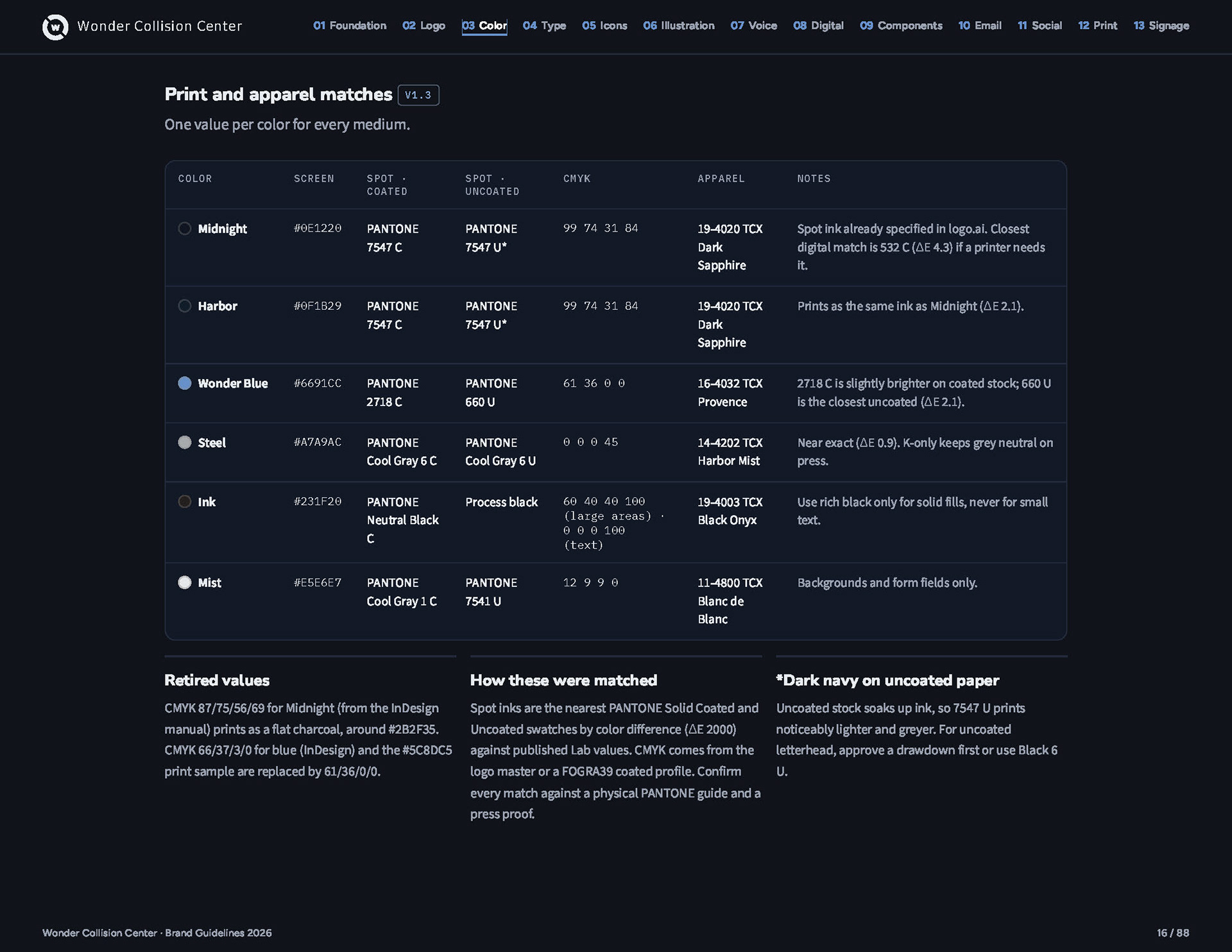
Color
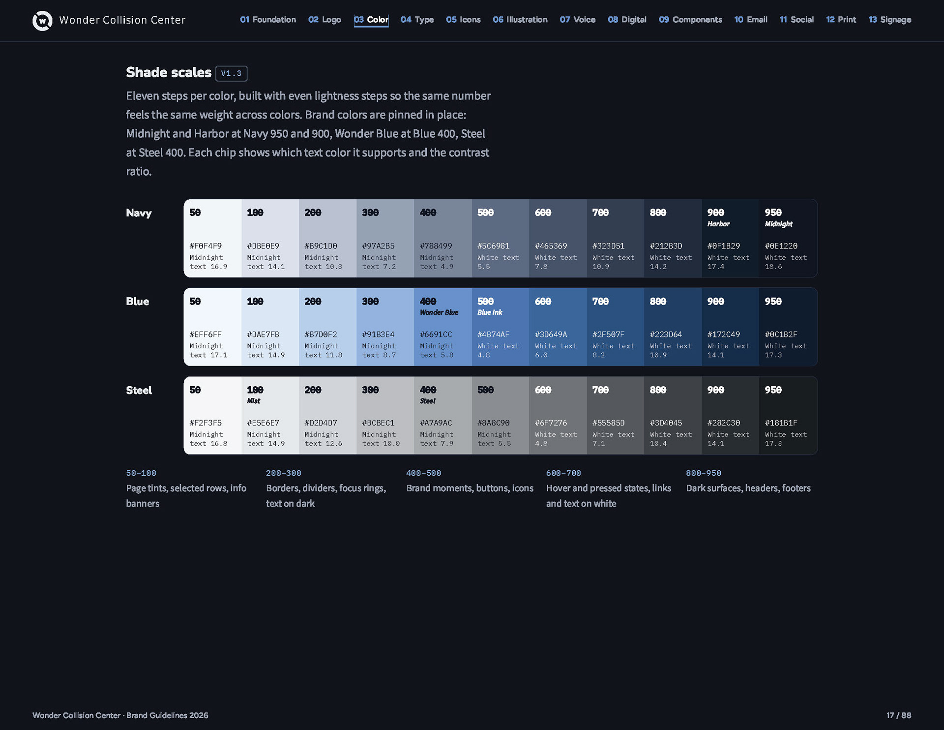
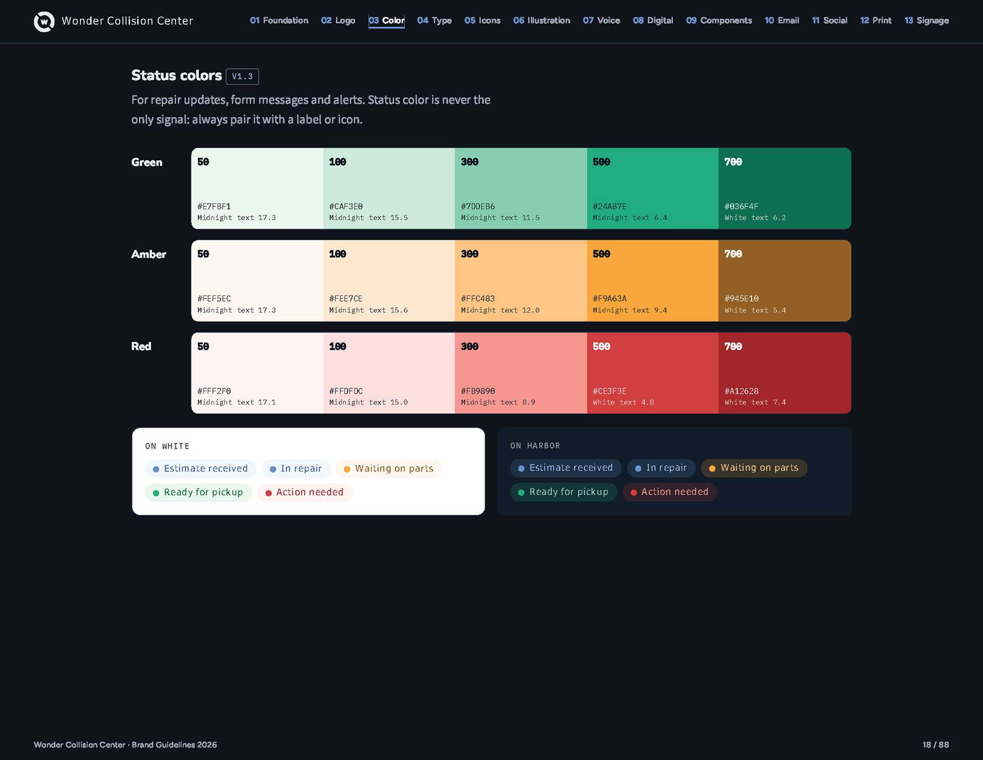
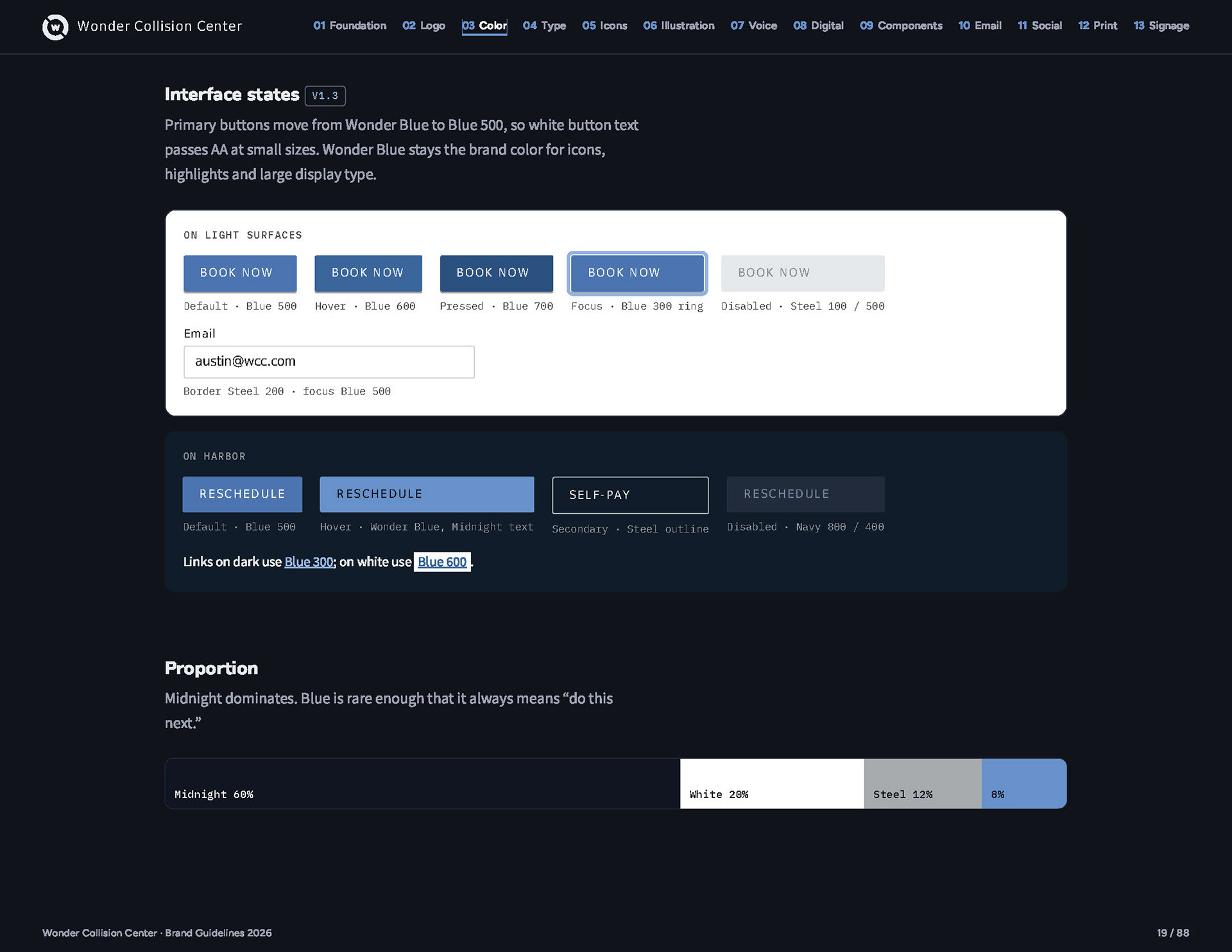
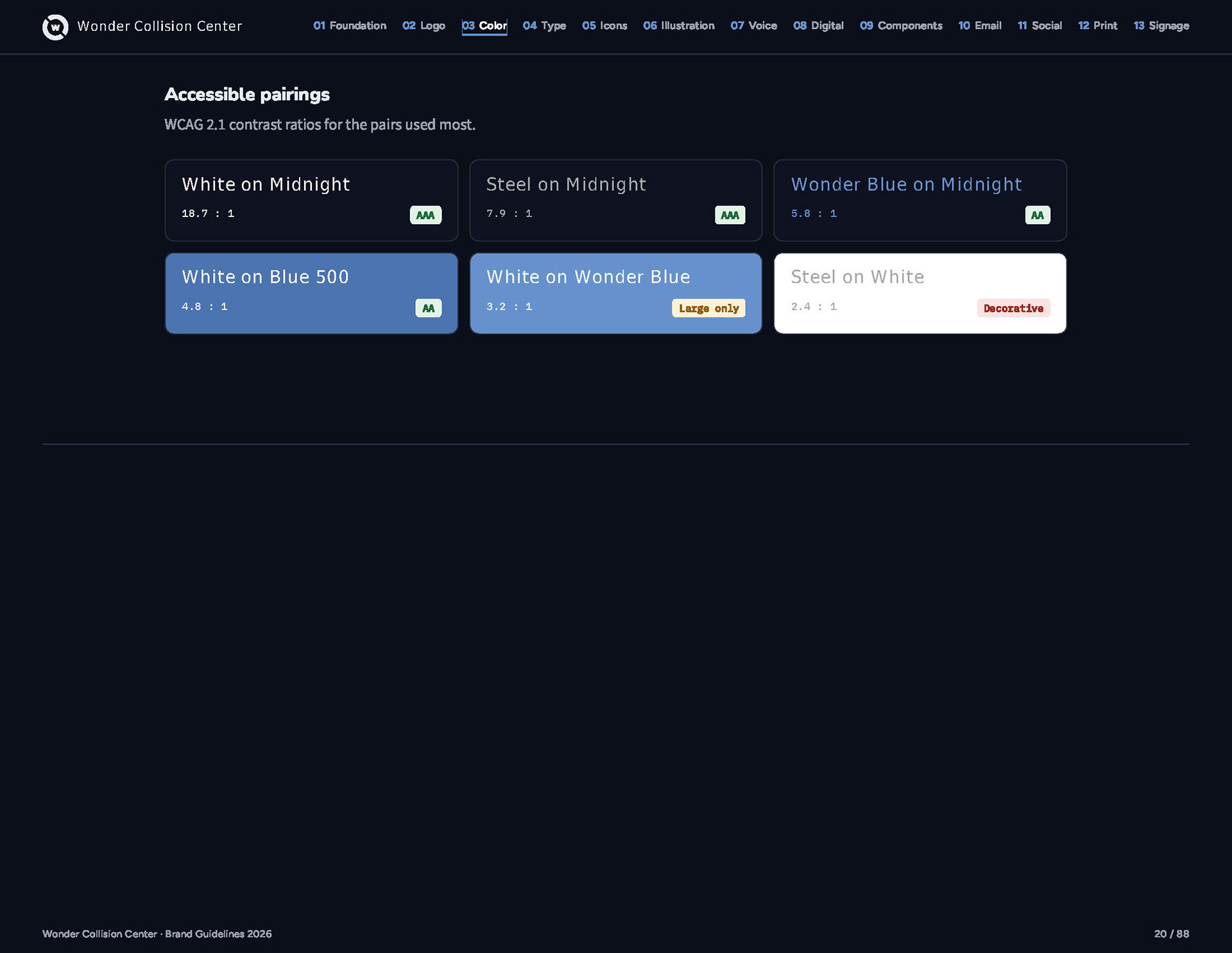
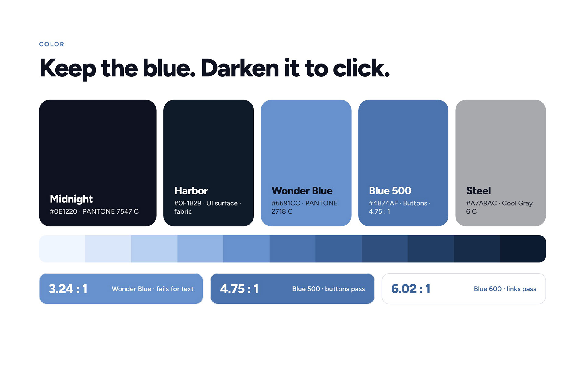
Wonder Blue stays the color people remember, used for the mark and large type. For anything you click, I built 11-step scales and moved to darker steps that pass accessibility: Blue 500 for buttons and Blue 600 for links. Green, amber and red only ever mean repair status.
Type
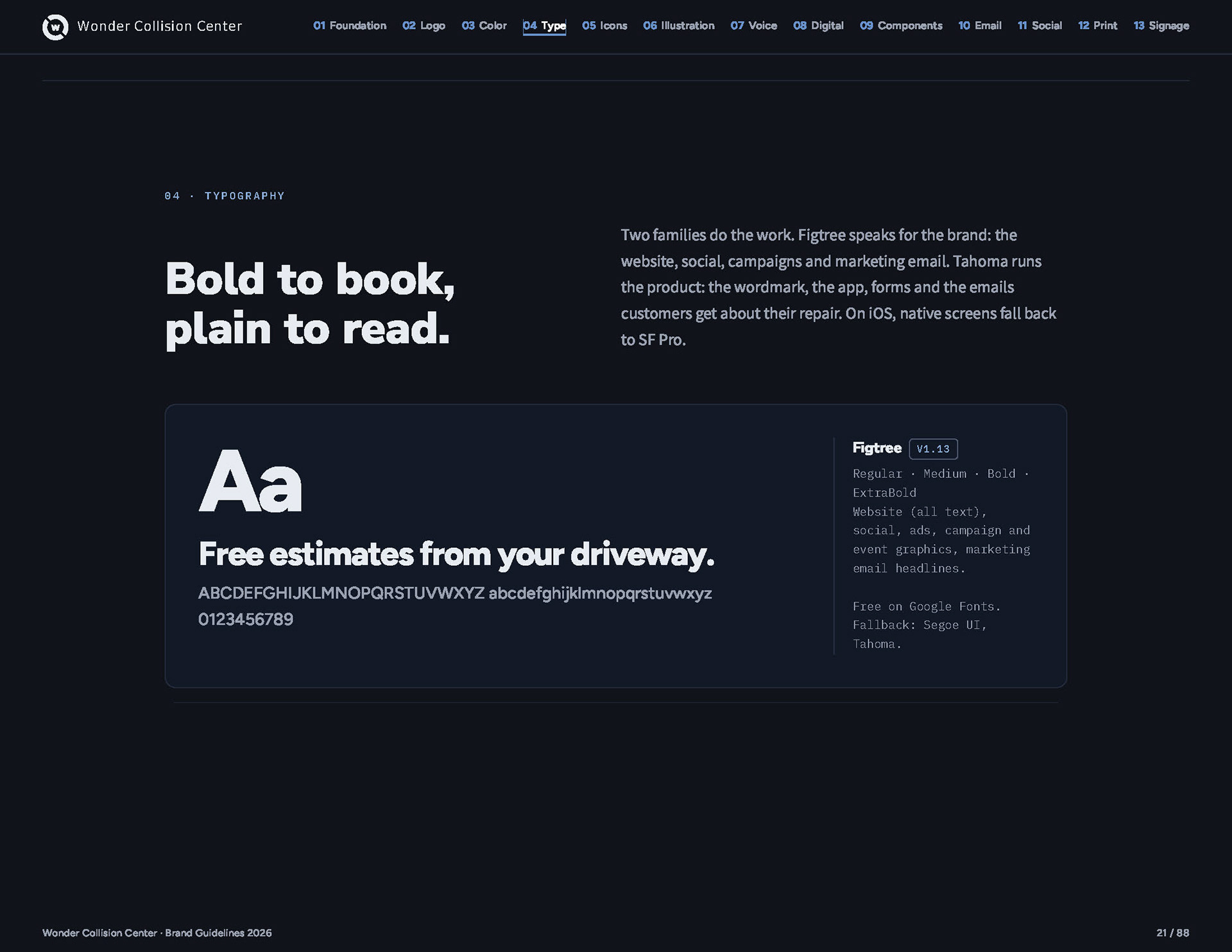
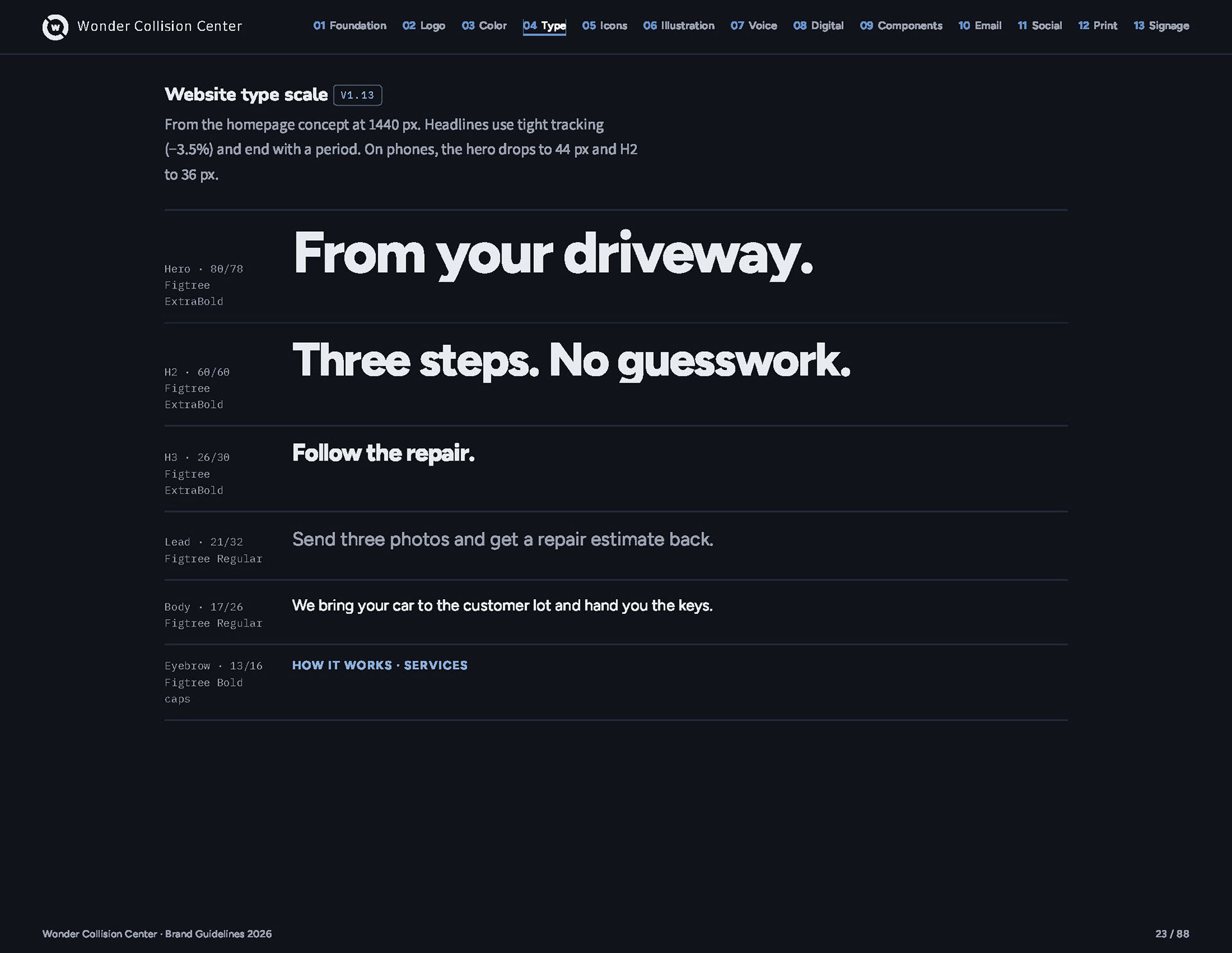
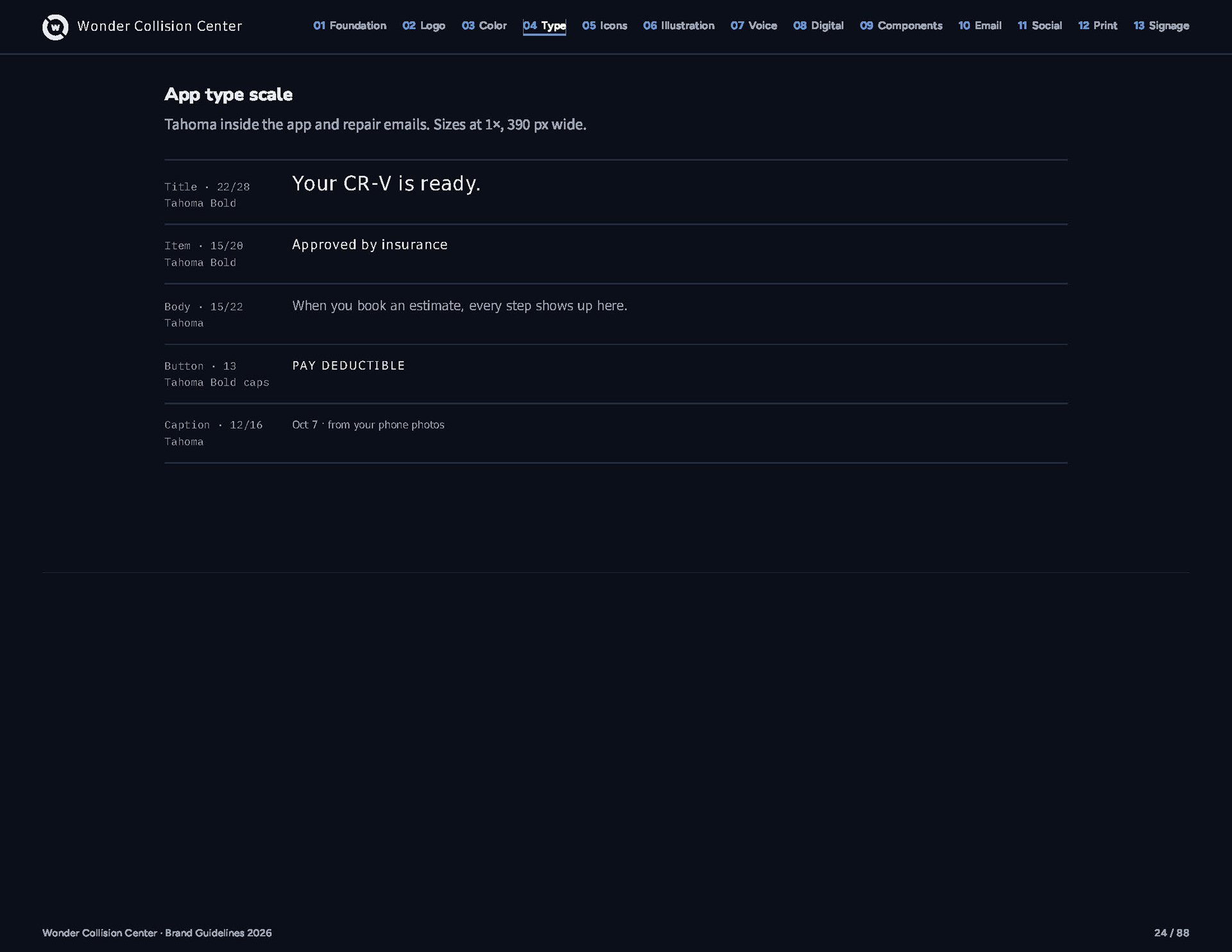
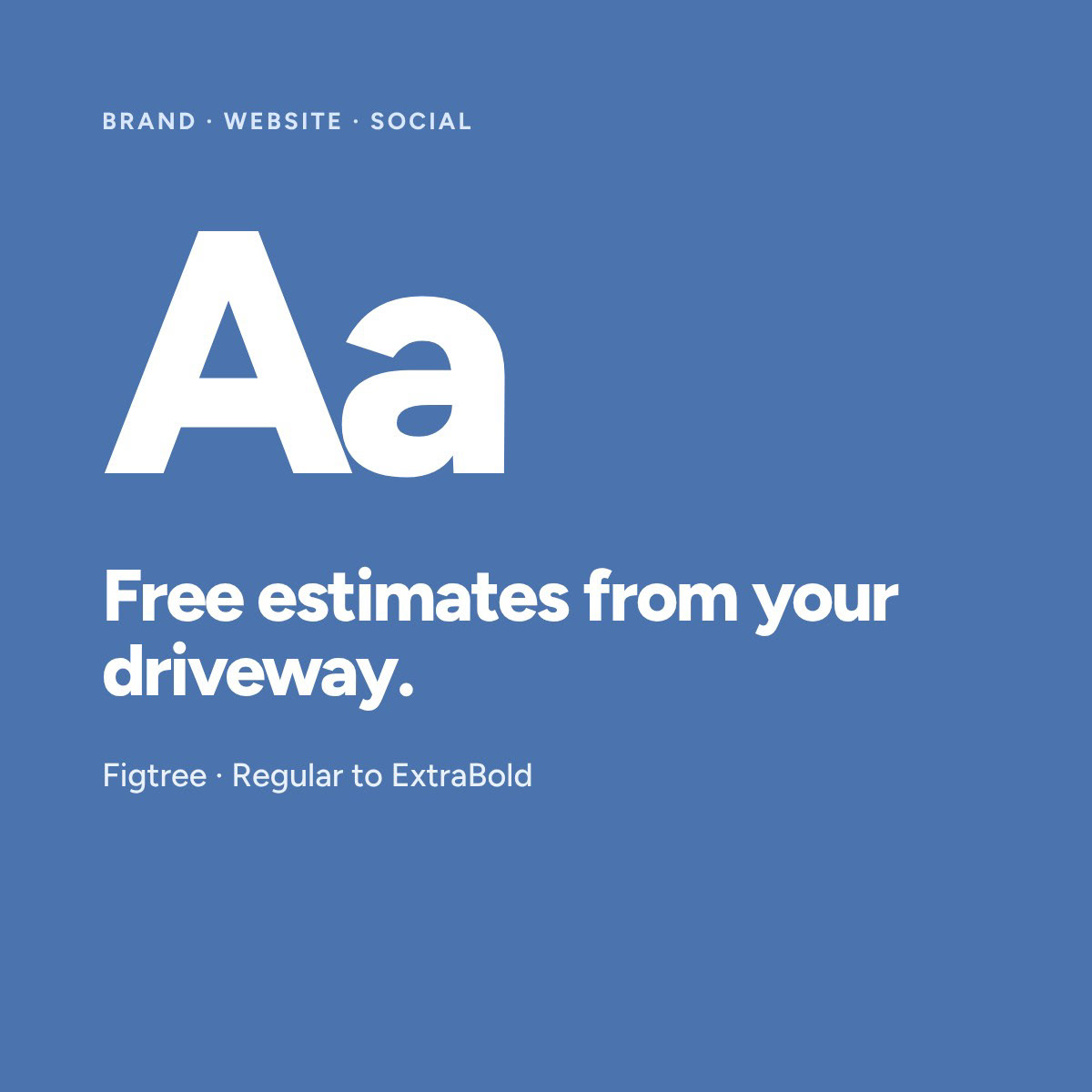
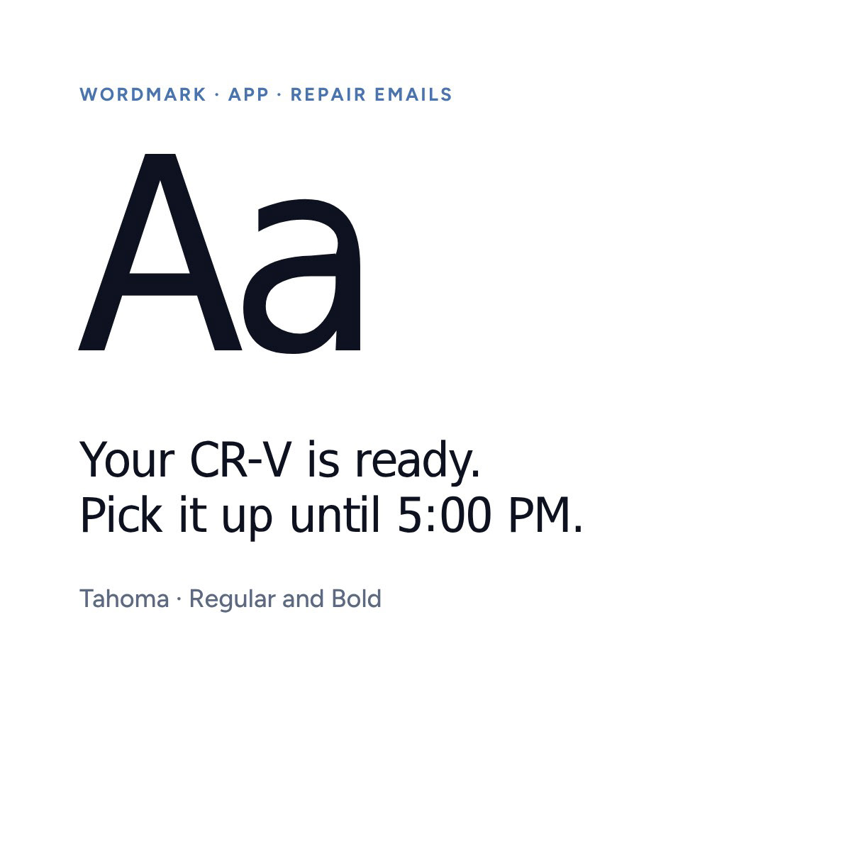
Two faces, two jobs. Figtree speaks for the brand on the website, social and campaigns. Tahoma runs the product: the wordmark, the app and the emails customers get about their repair.
Illustration
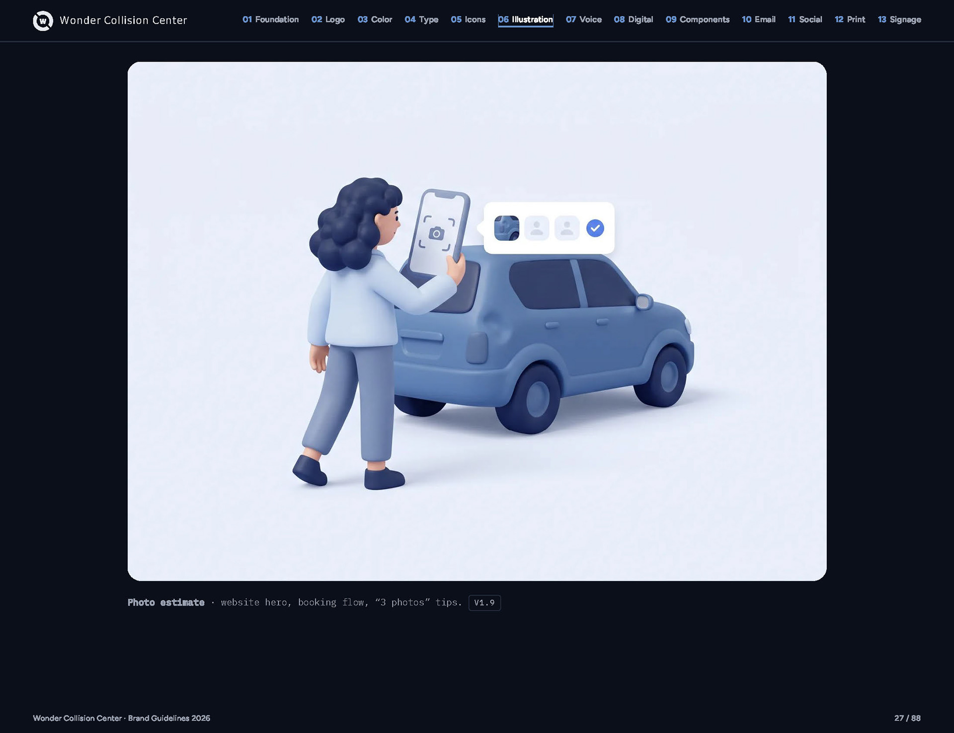
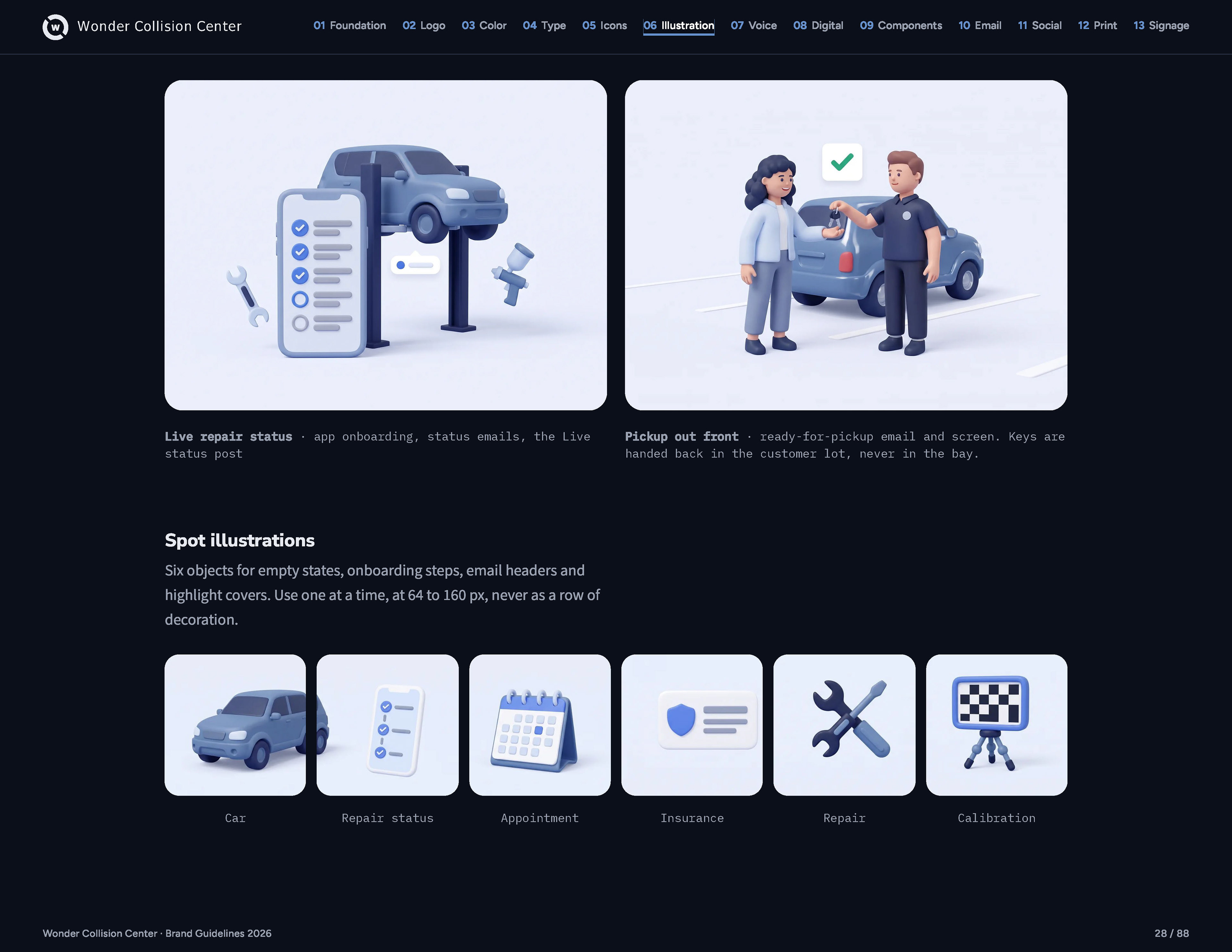
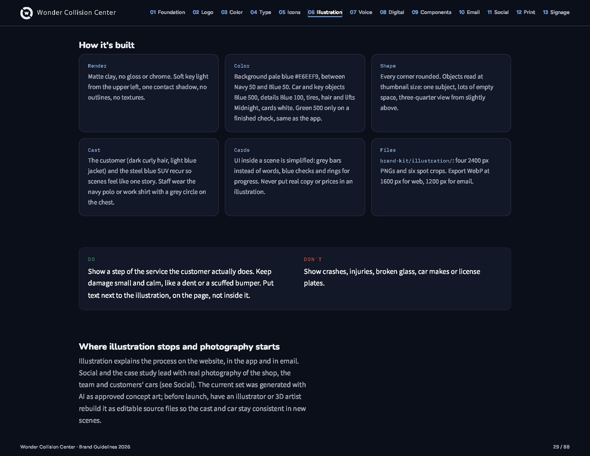
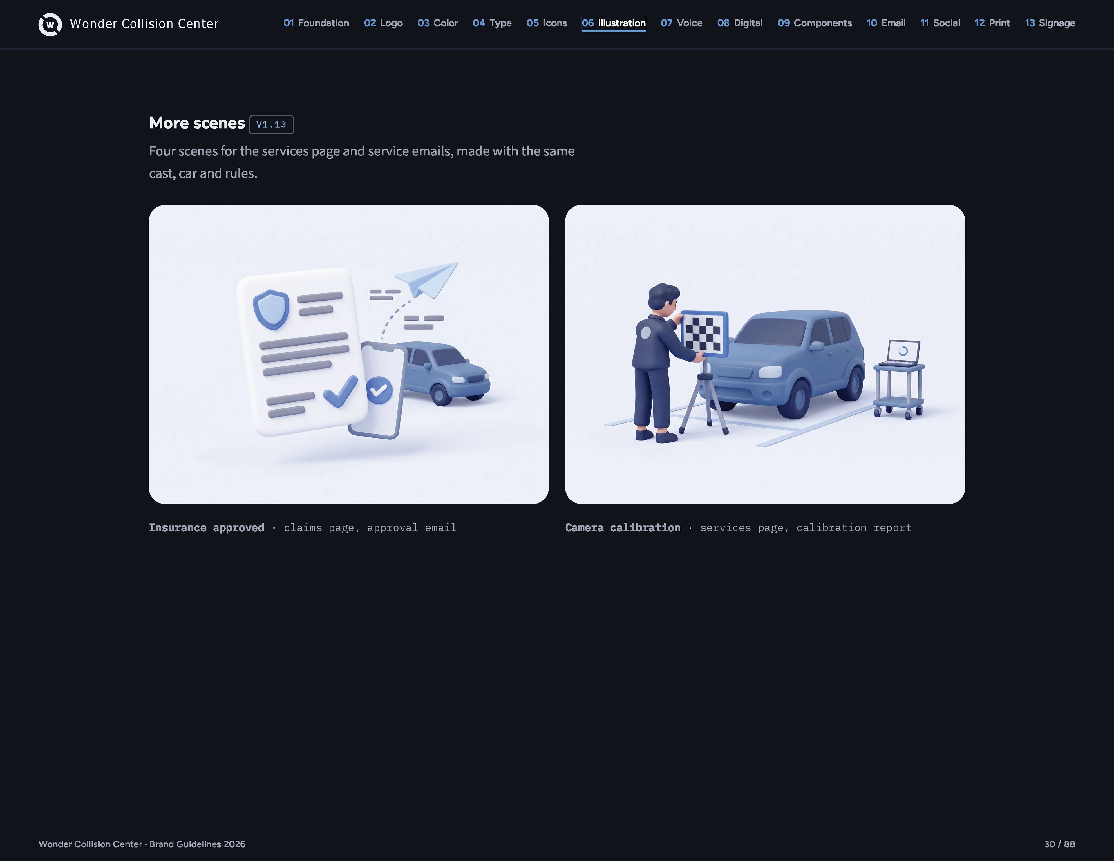
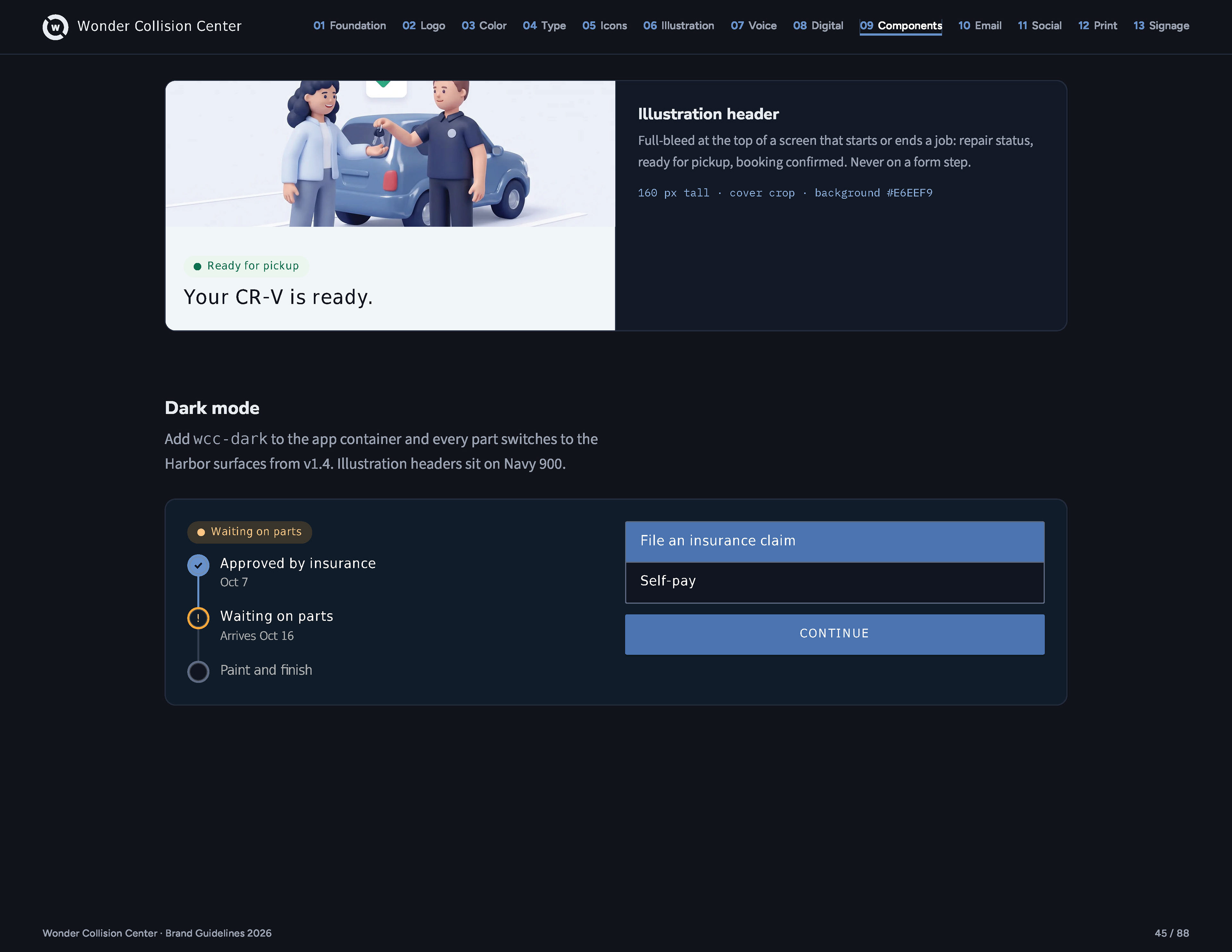
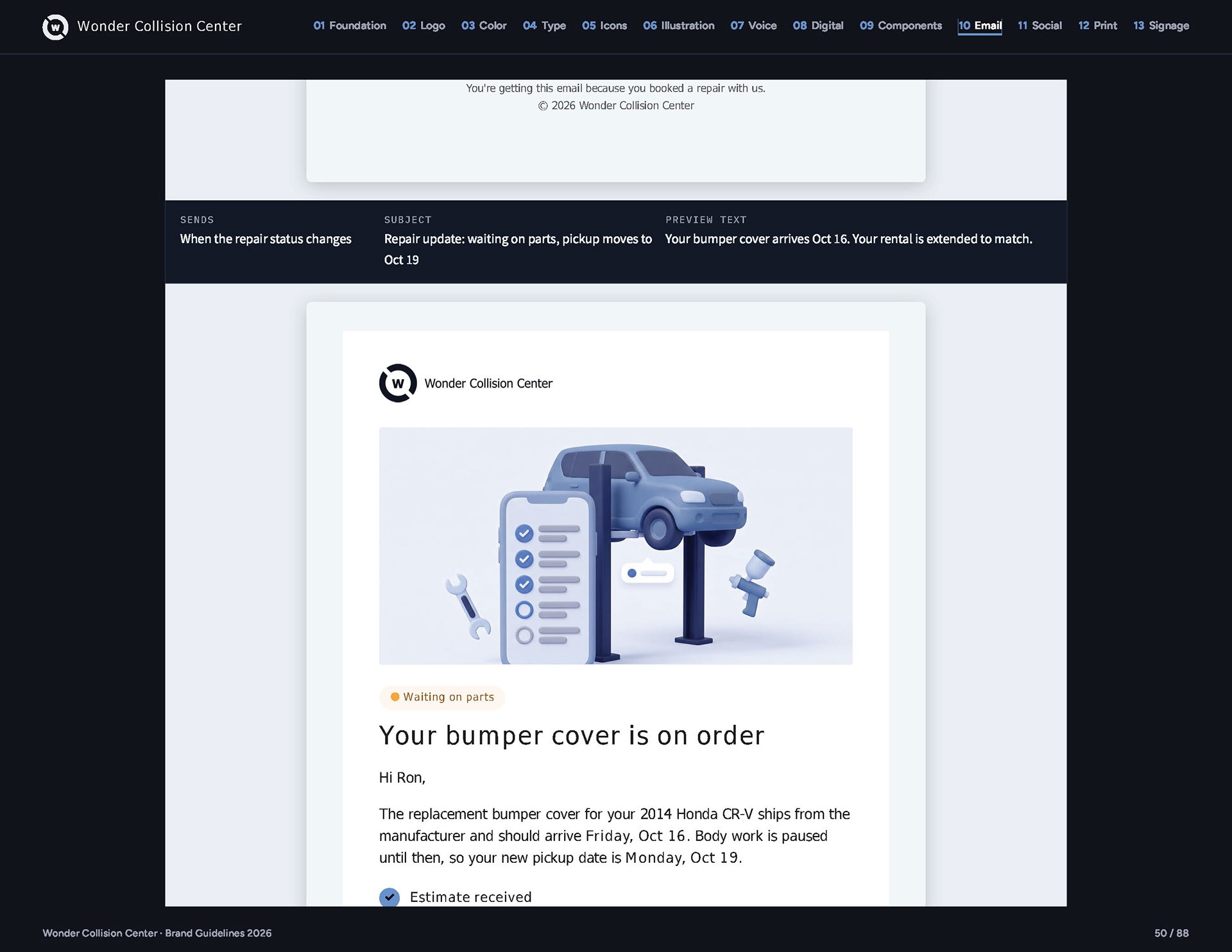
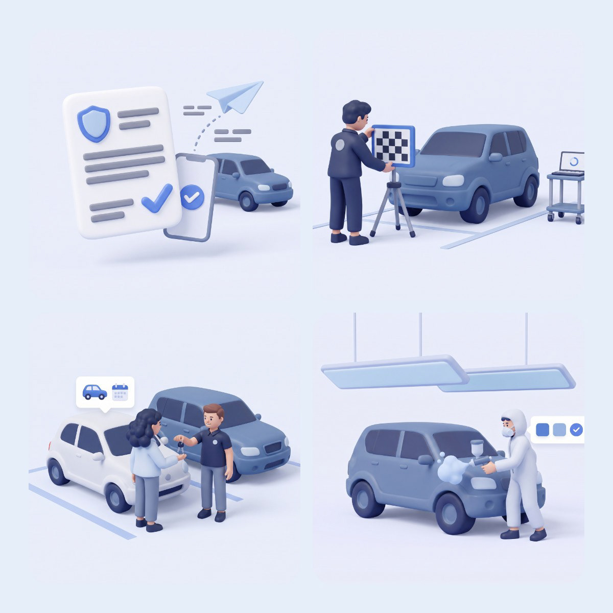
The 2019 scenes were dusk skies and a different car in every picture. I replaced them with soft 3D: matte, rounded, in the brand blues, with one customer and one SUV that appear in every scene, from the photo estimate to the keys handed back out front.


Social
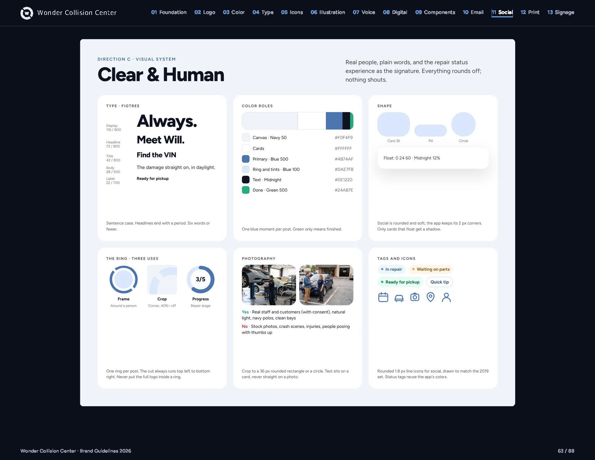
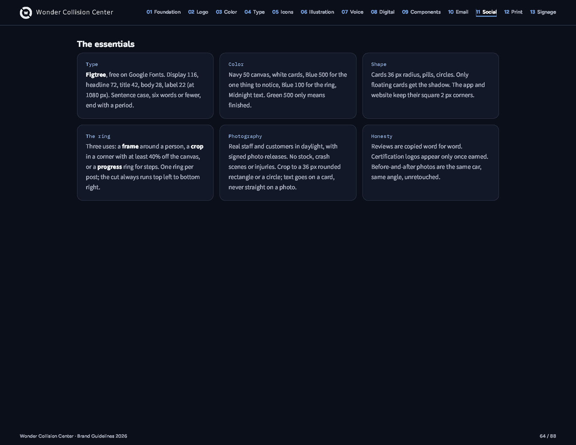
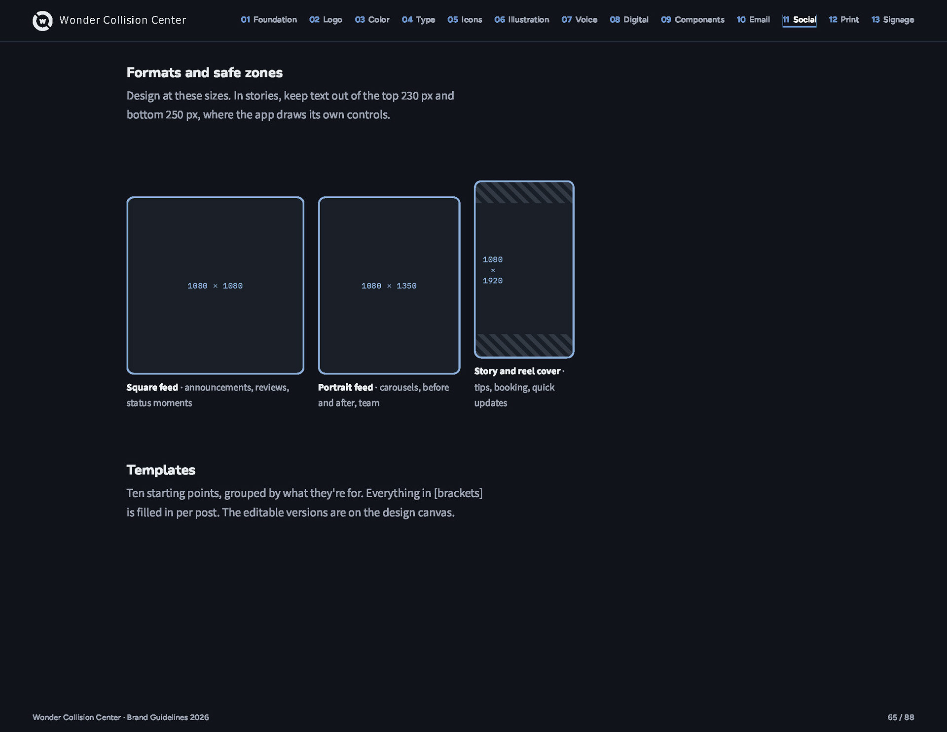
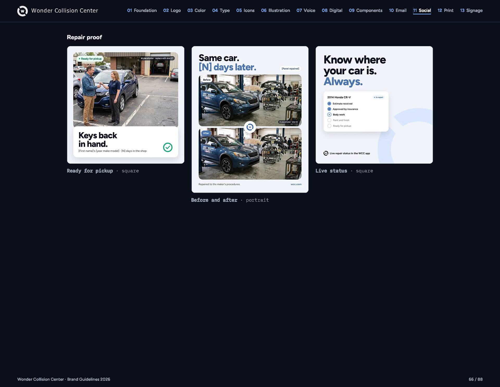
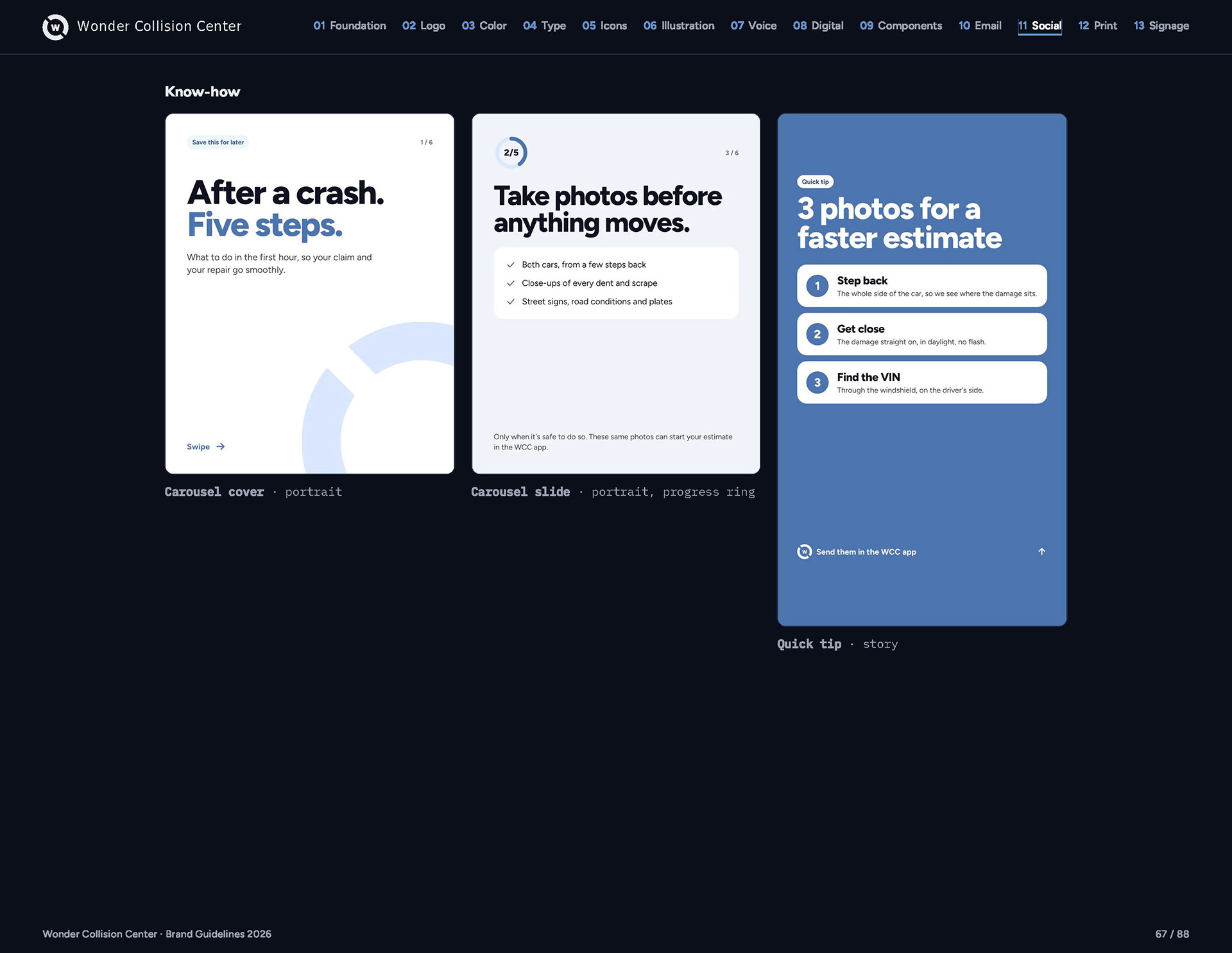
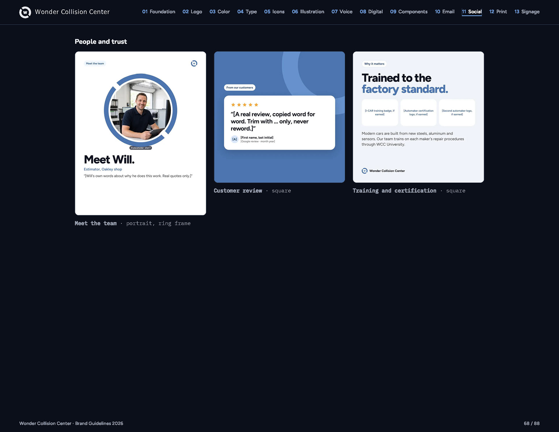
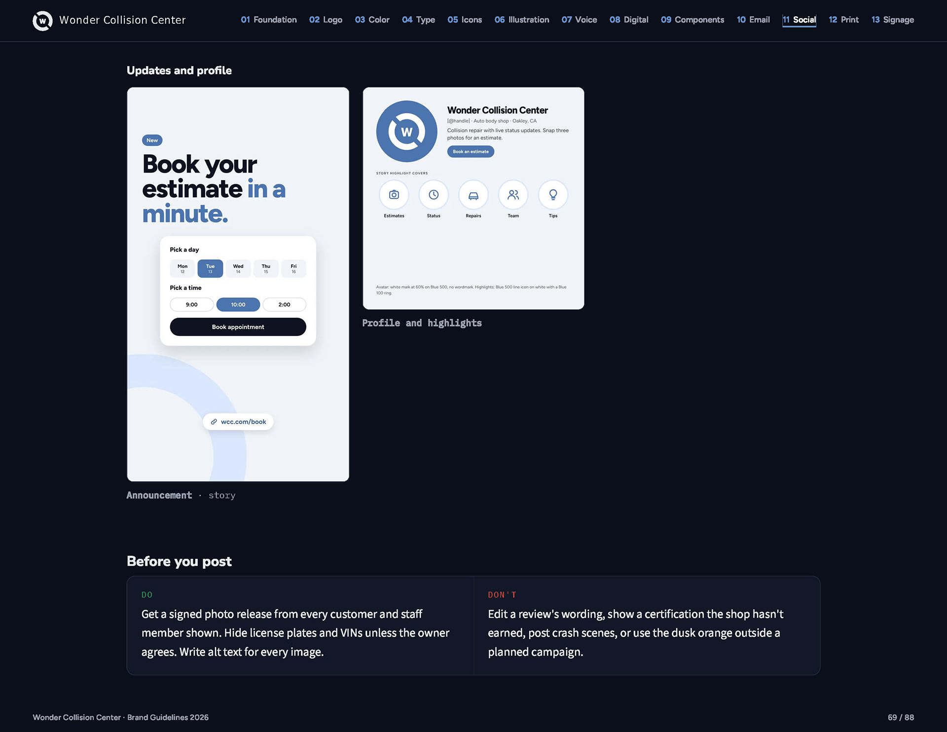
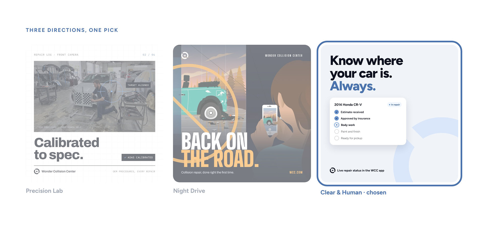
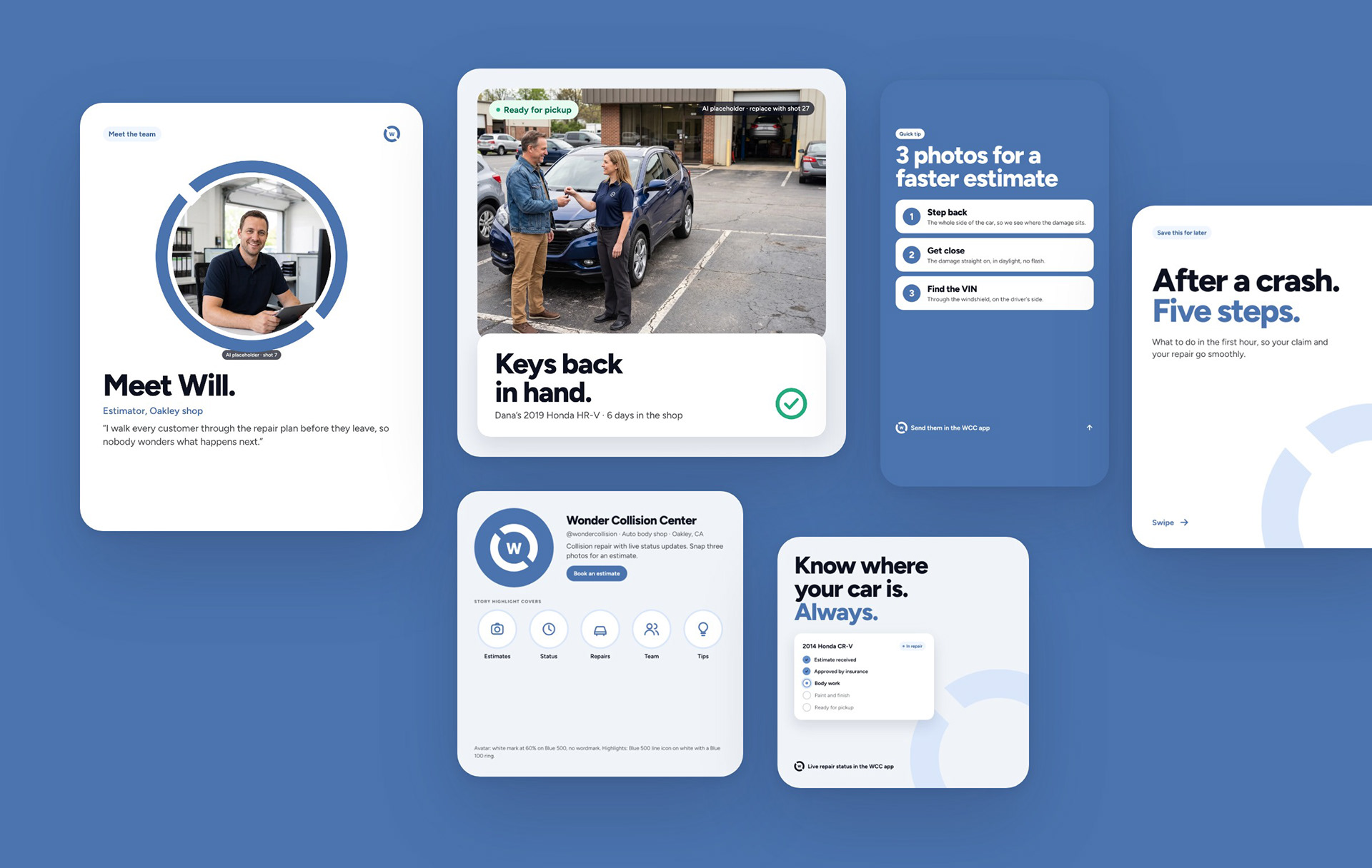
I designed the same post three ways. Clear & Human won because it turns the app’s repair tracker into the visual signature: real people, plain words, rounded cards and one blue highlight. Ten templates followed.
Website and app
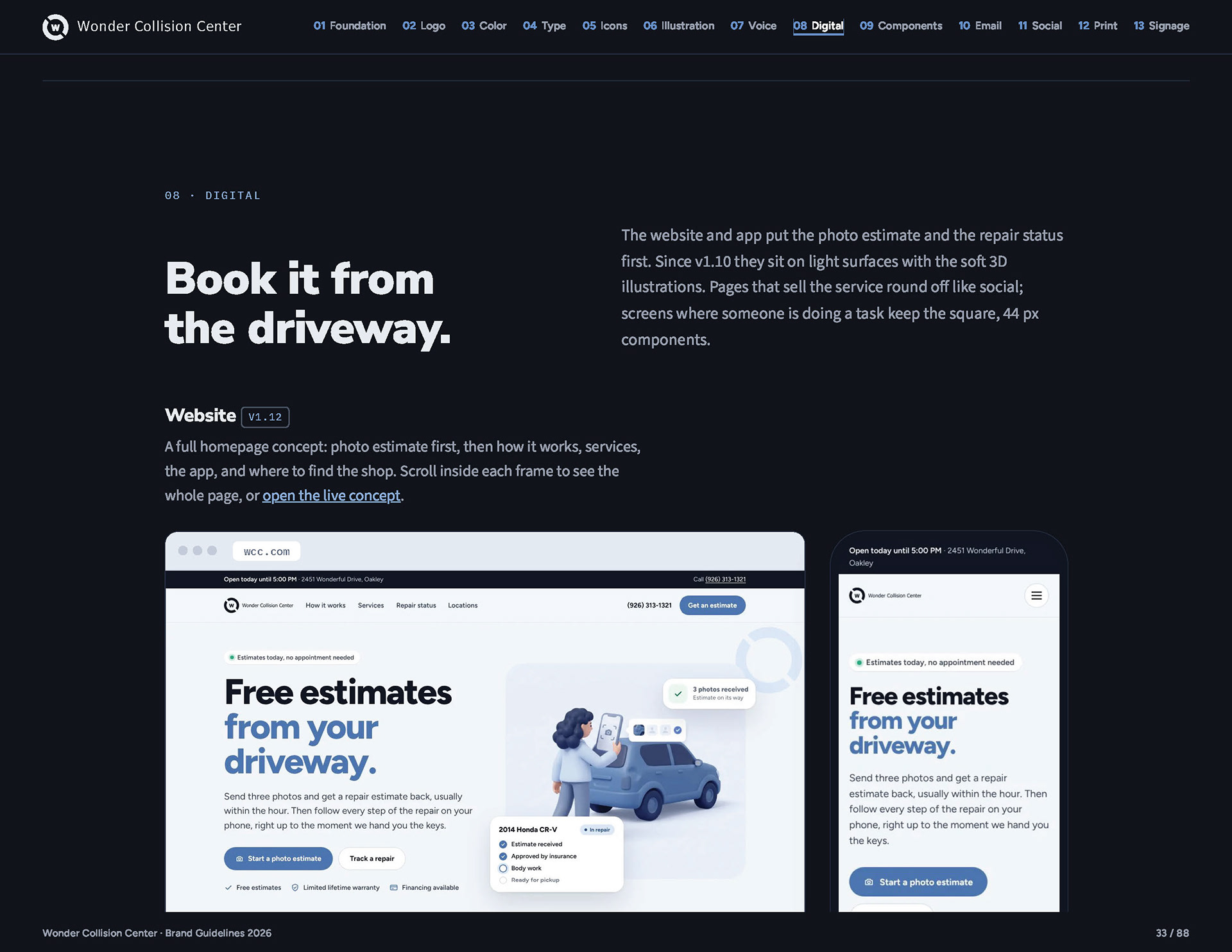
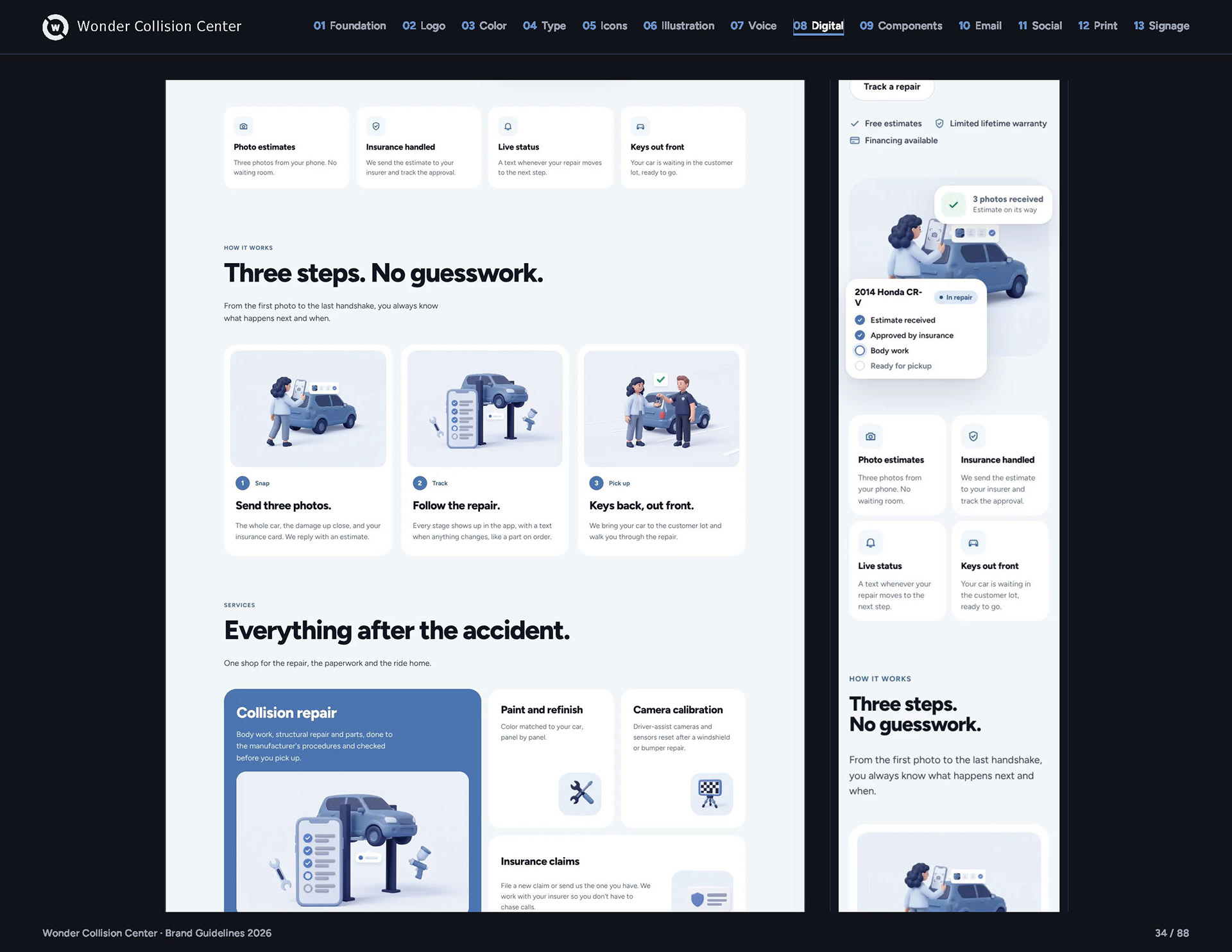
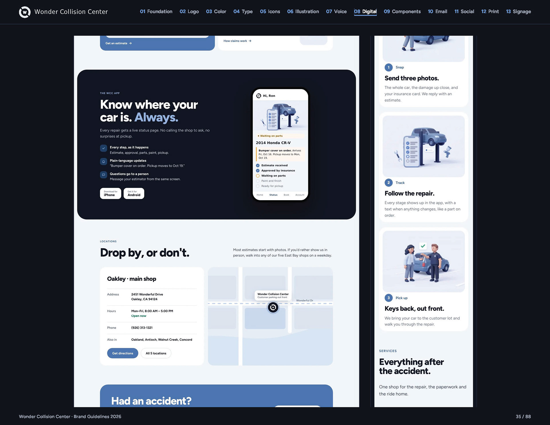
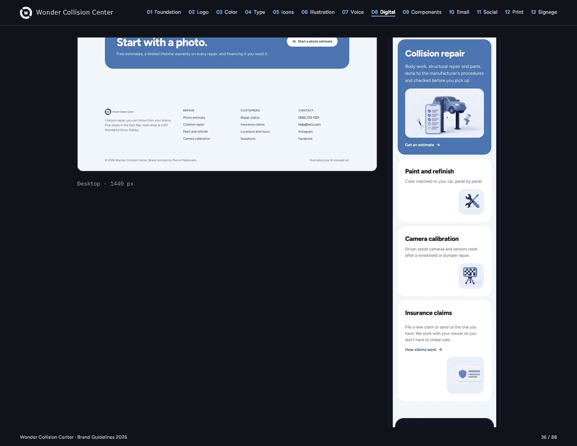
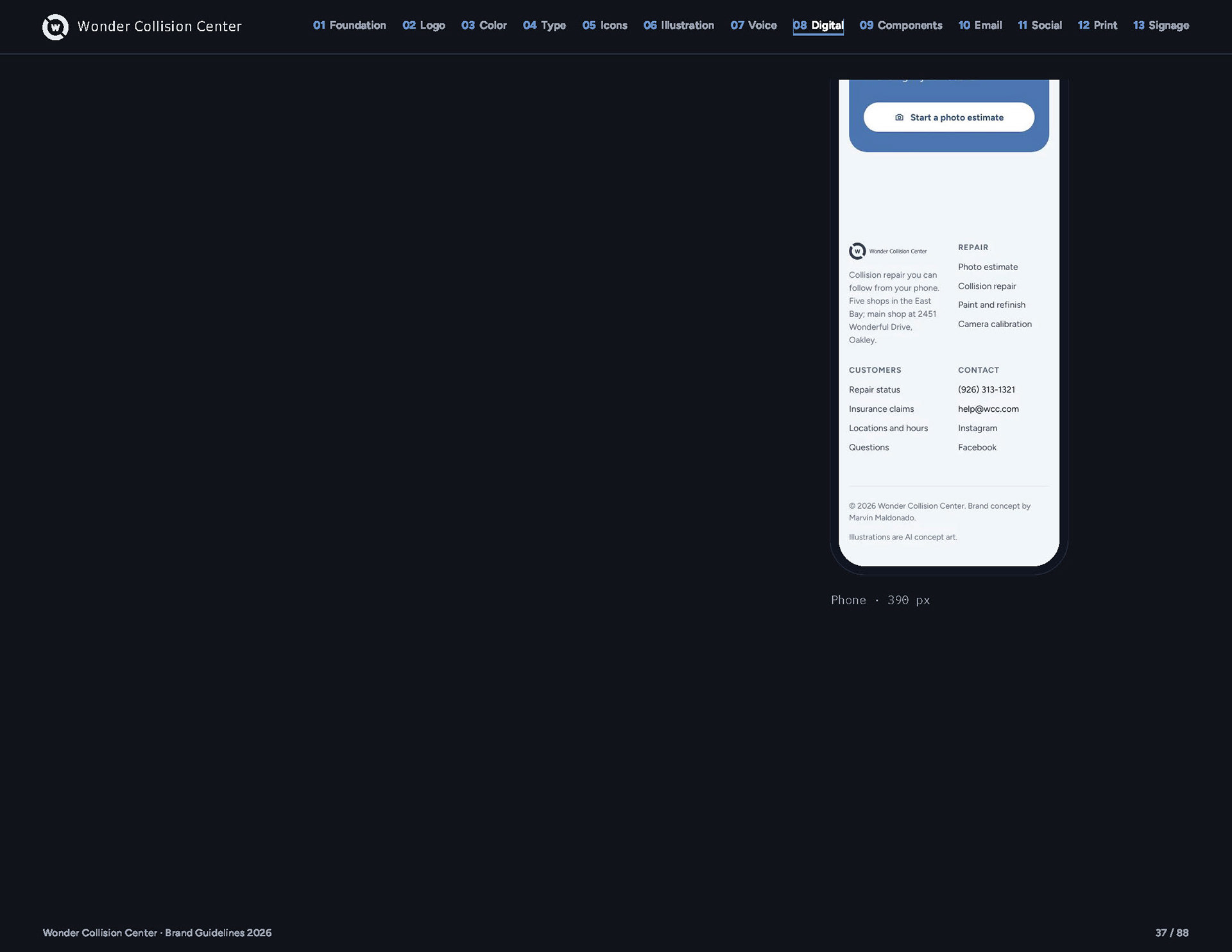
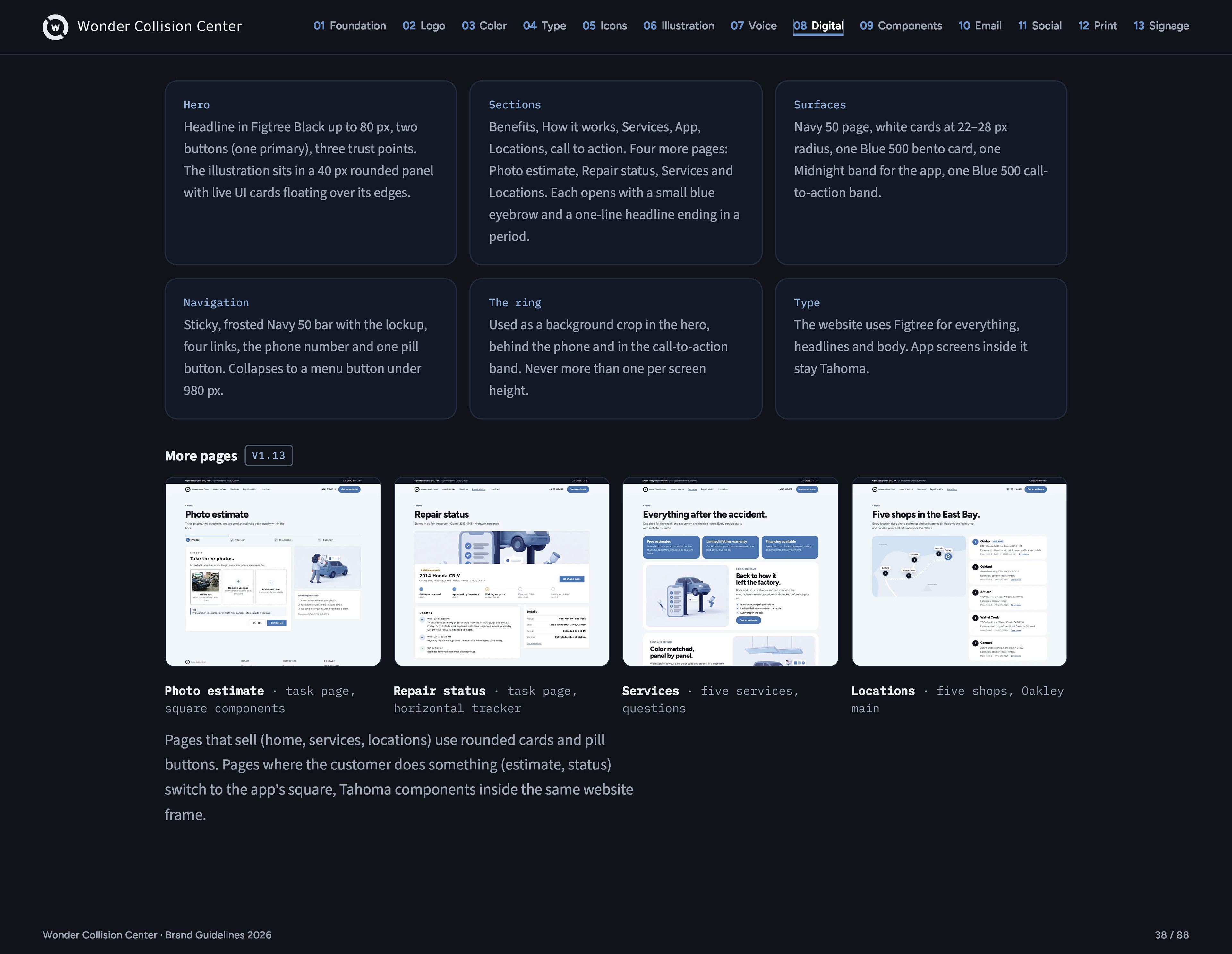
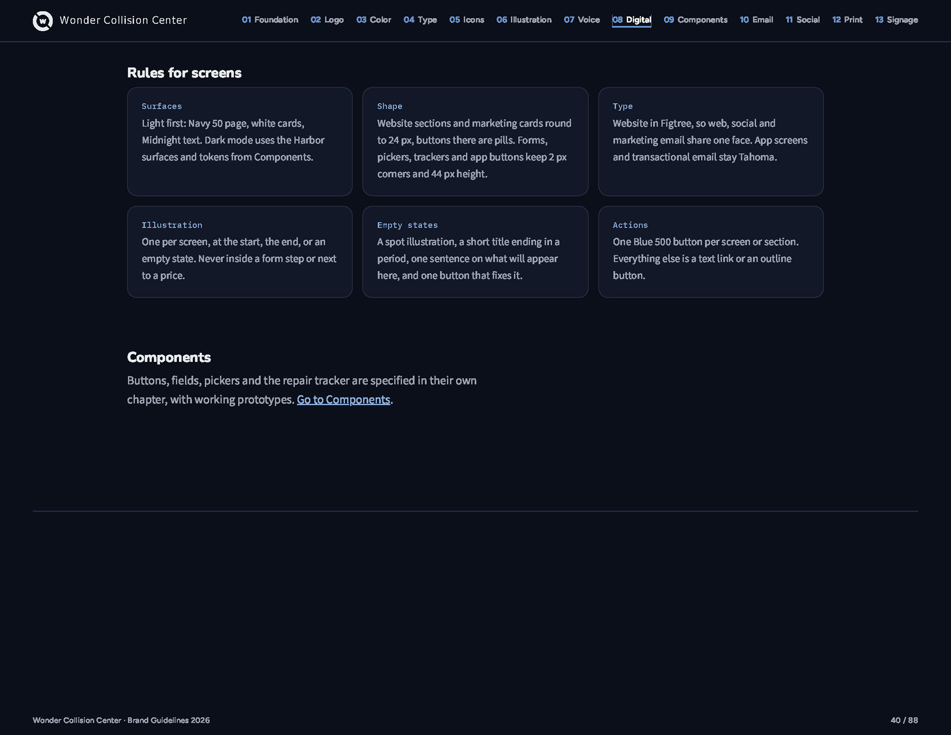
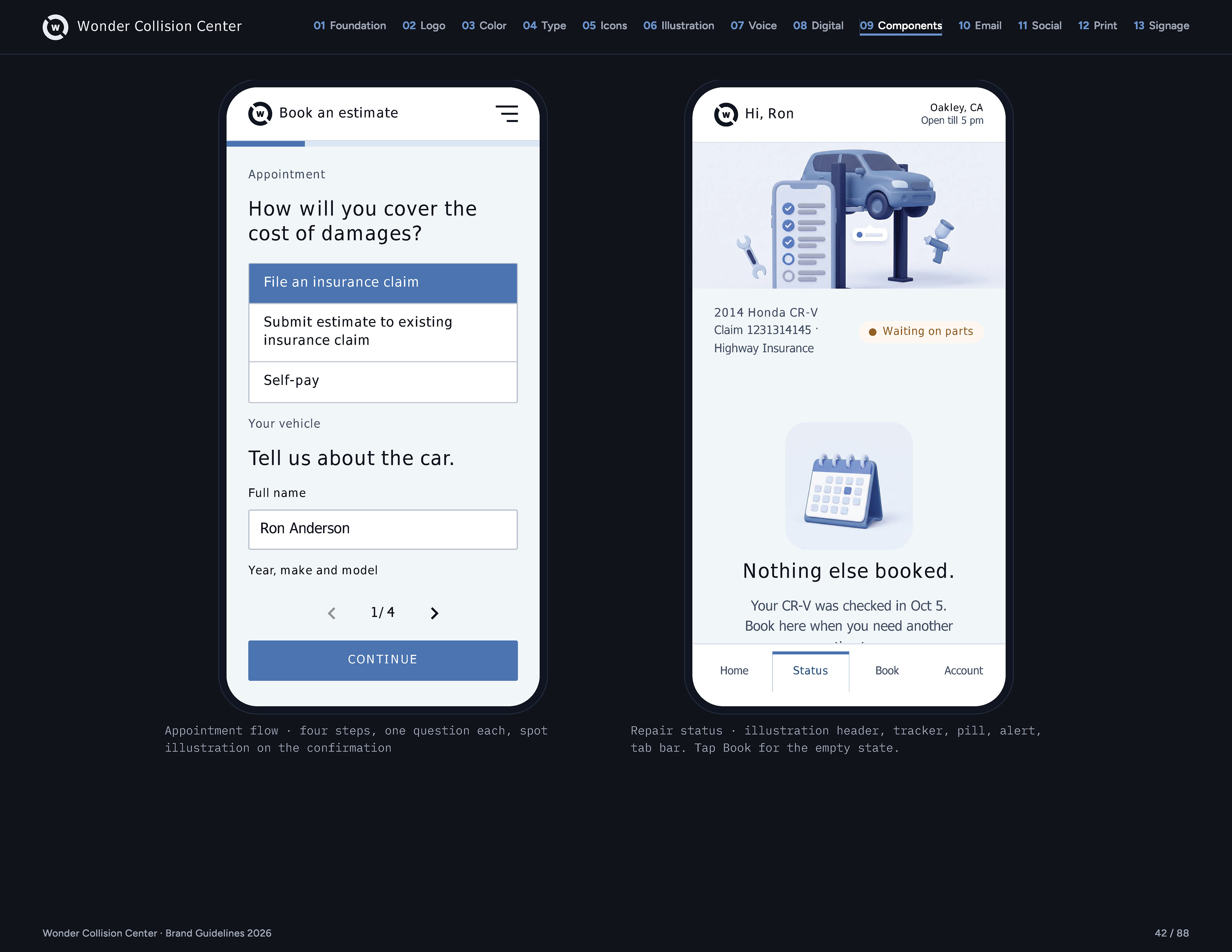
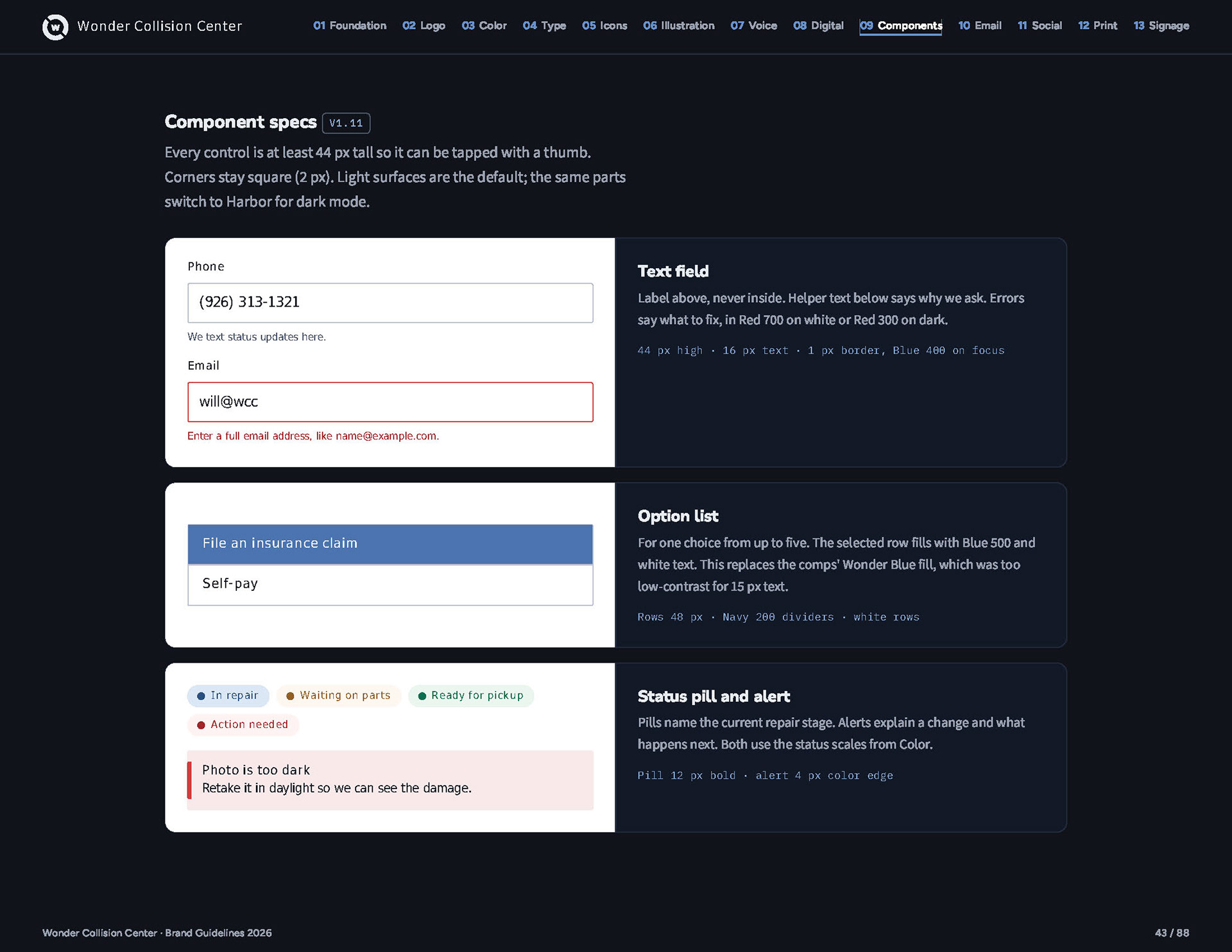
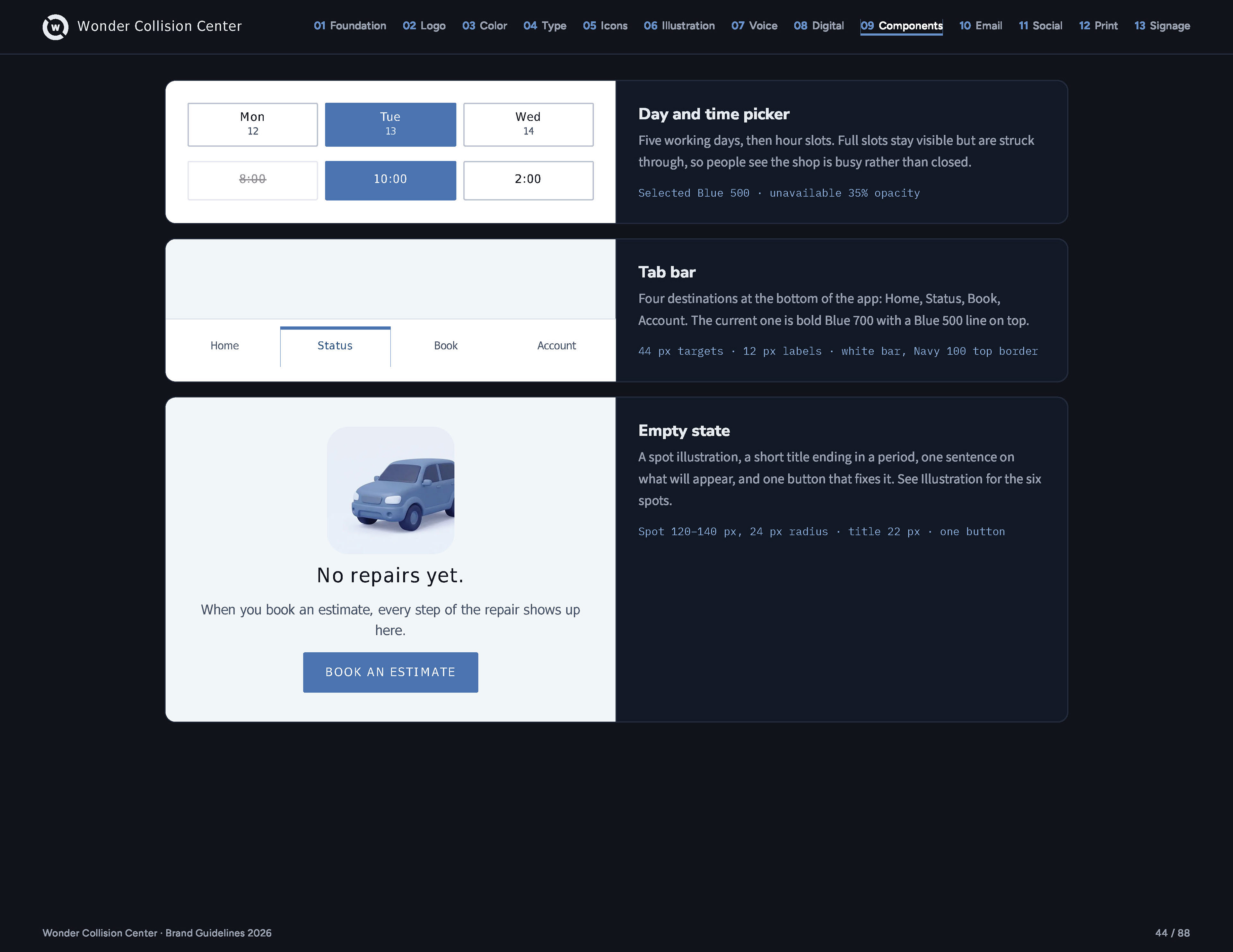
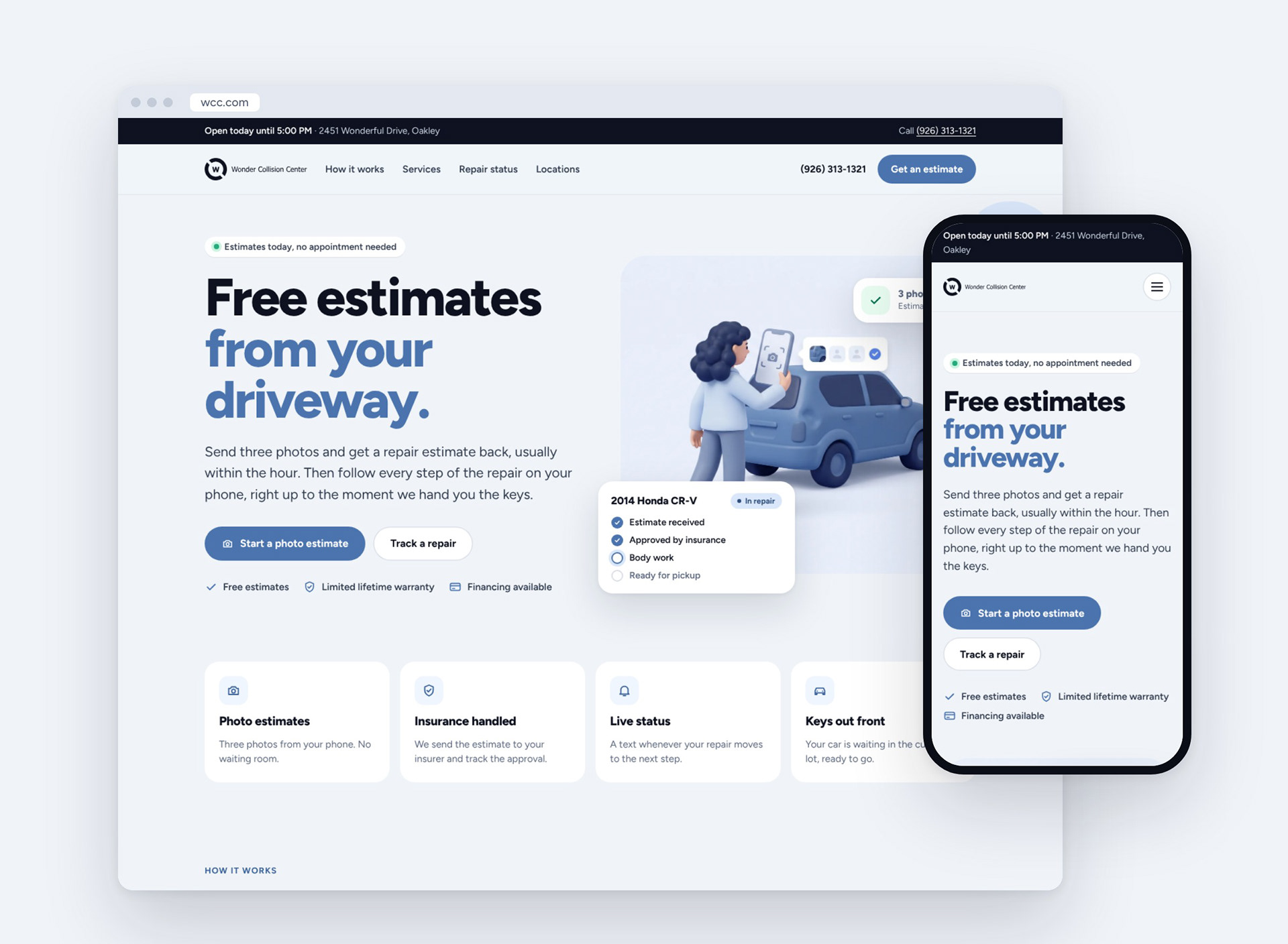
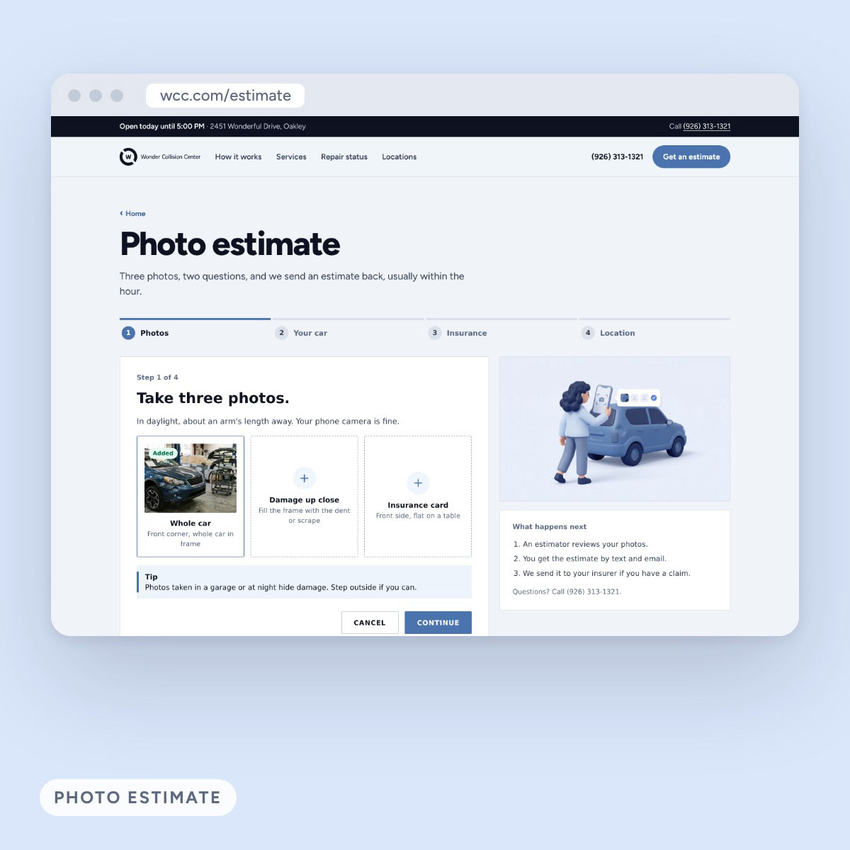
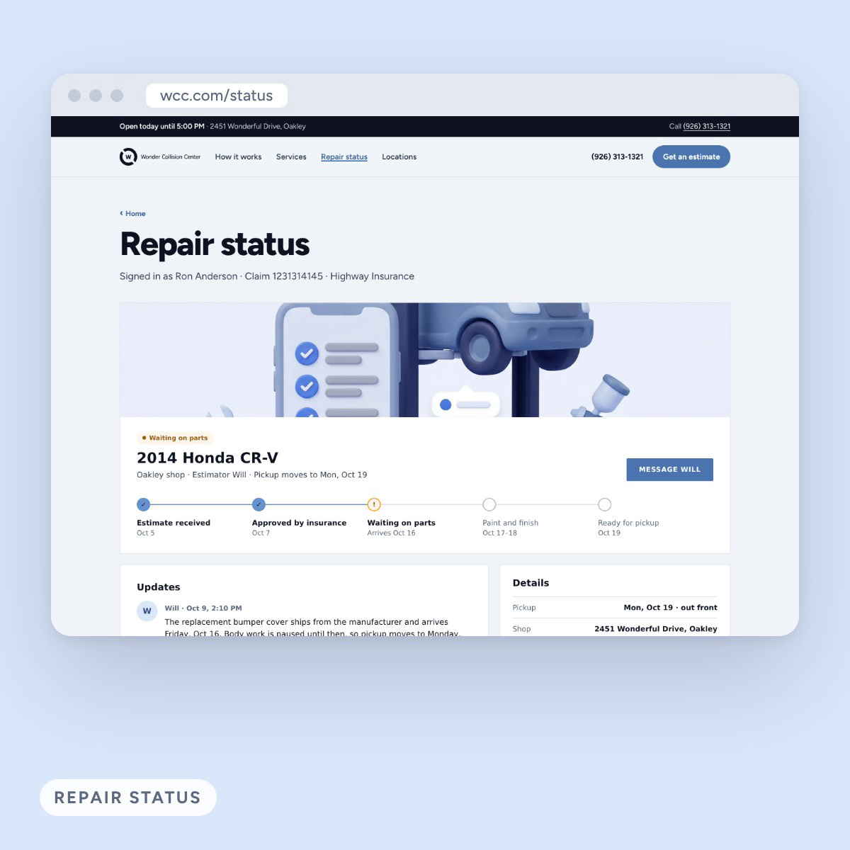
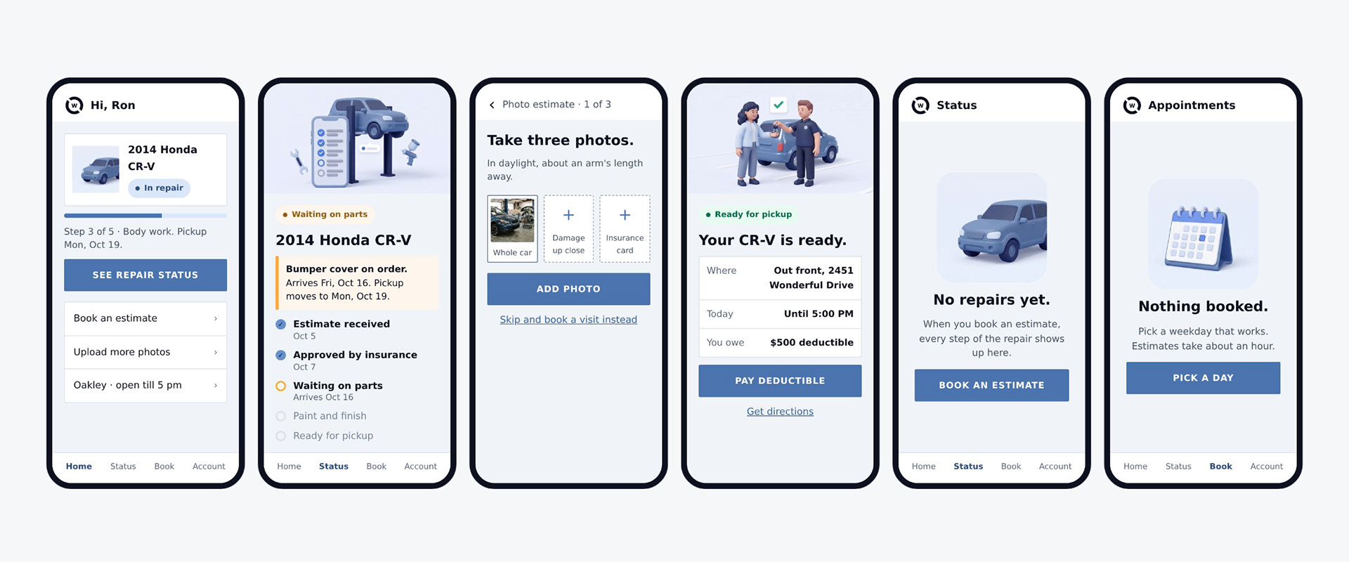
The homepage leads with the photo estimate and shows a live repair status card right in the hero. Pages that sell the service round off like social; pages where someone is doing a task, like the estimate and repair status, switch to the app’s square, 44 px components.
The customer journey
A one-minute film follows one repair from a small bump on the way home to delivery day: the tow, the insurance call, the free estimate, teardown, parts, assembly, paint, detail, and a final quality check. The soft 3D scenes are animated, and the same repair tracker from the app fills in step by step, ending on the three promises: free estimates, a limited lifetime warranty and financing.
Email
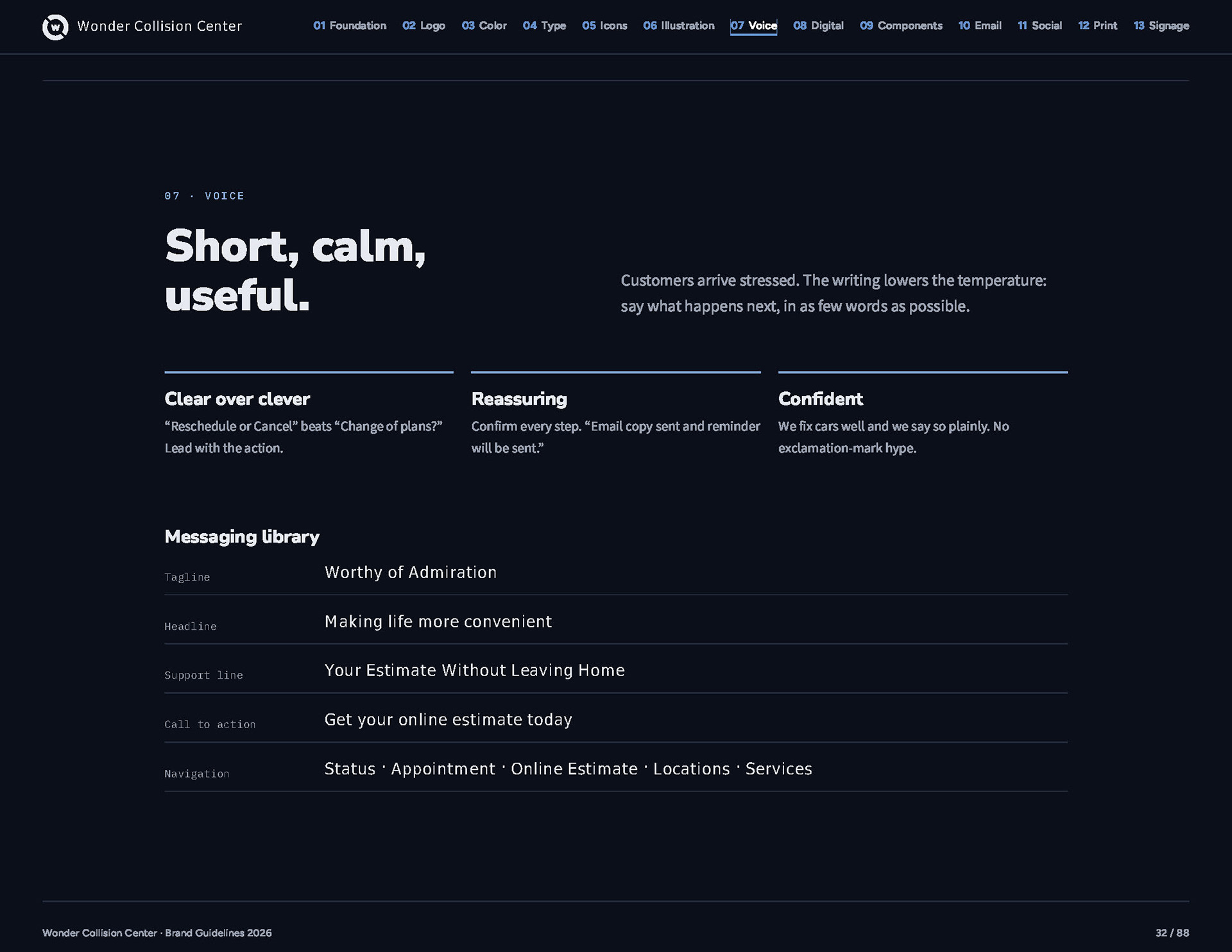
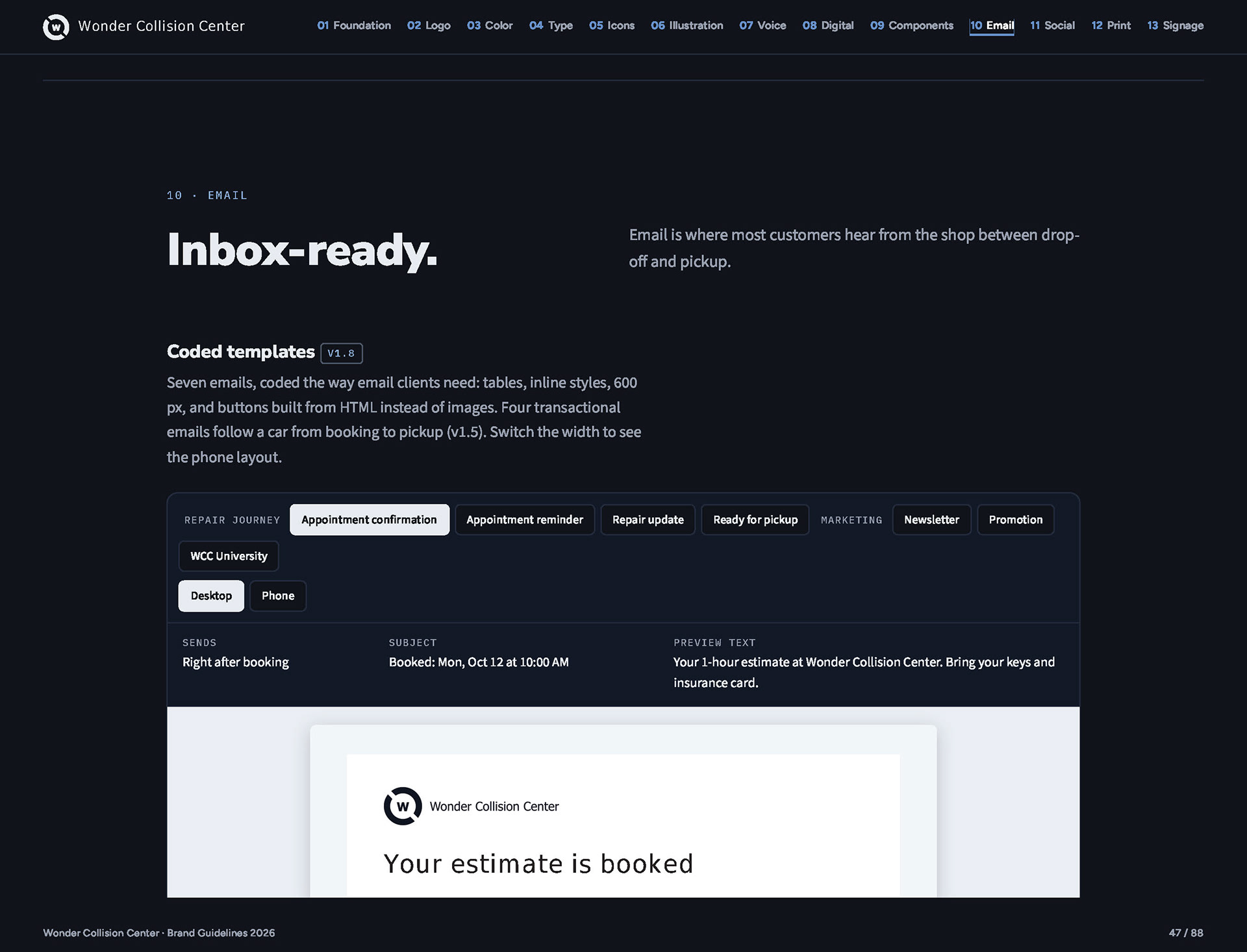
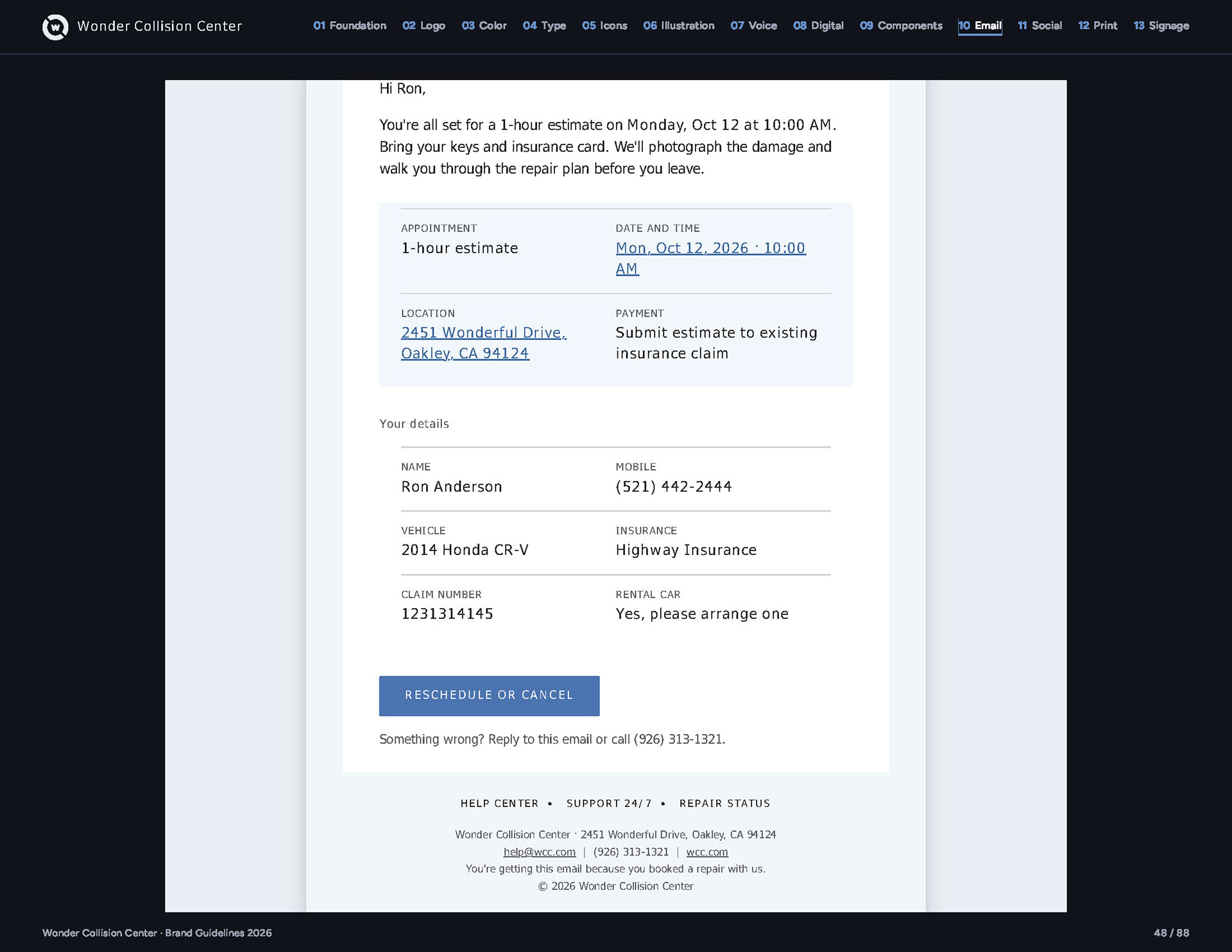
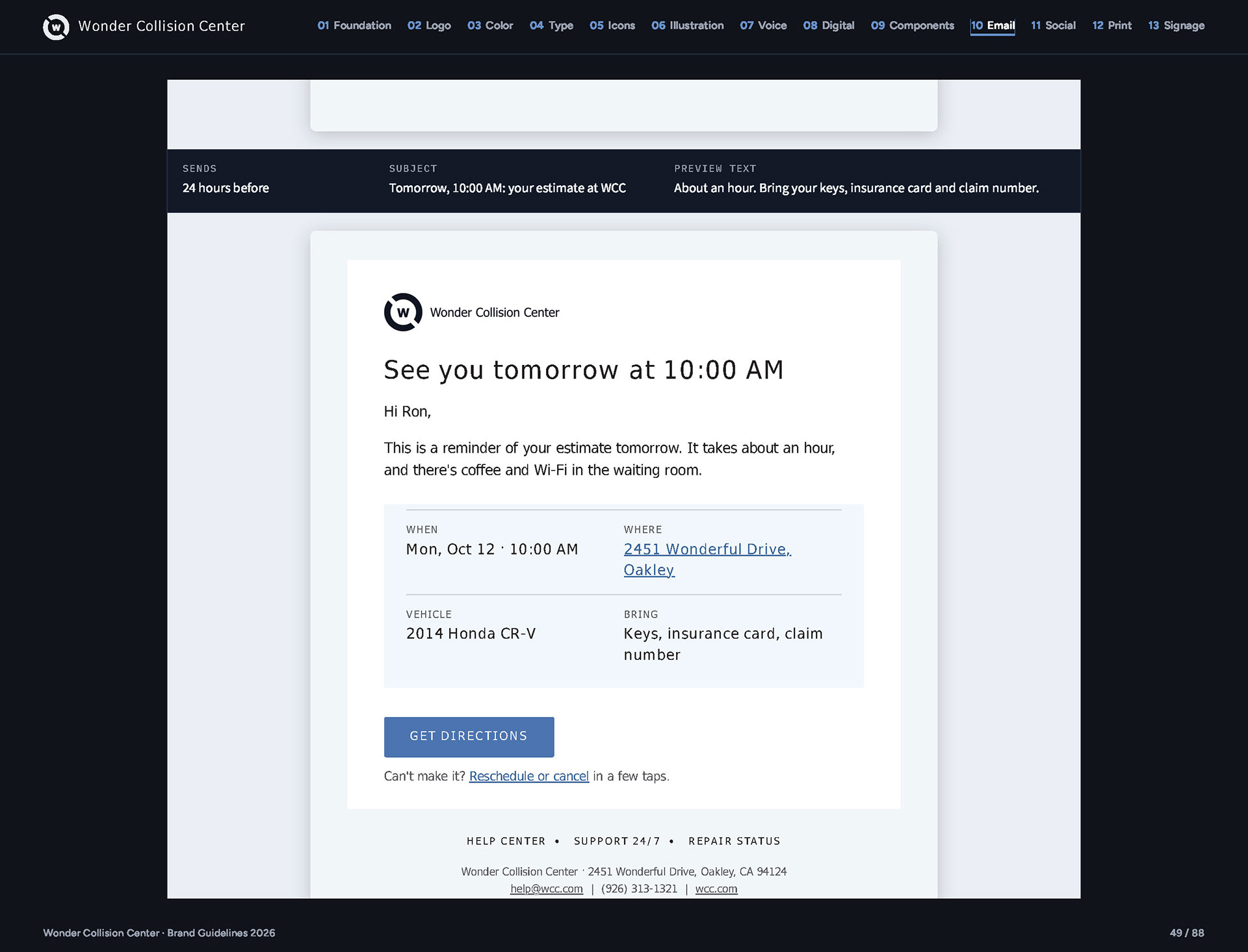
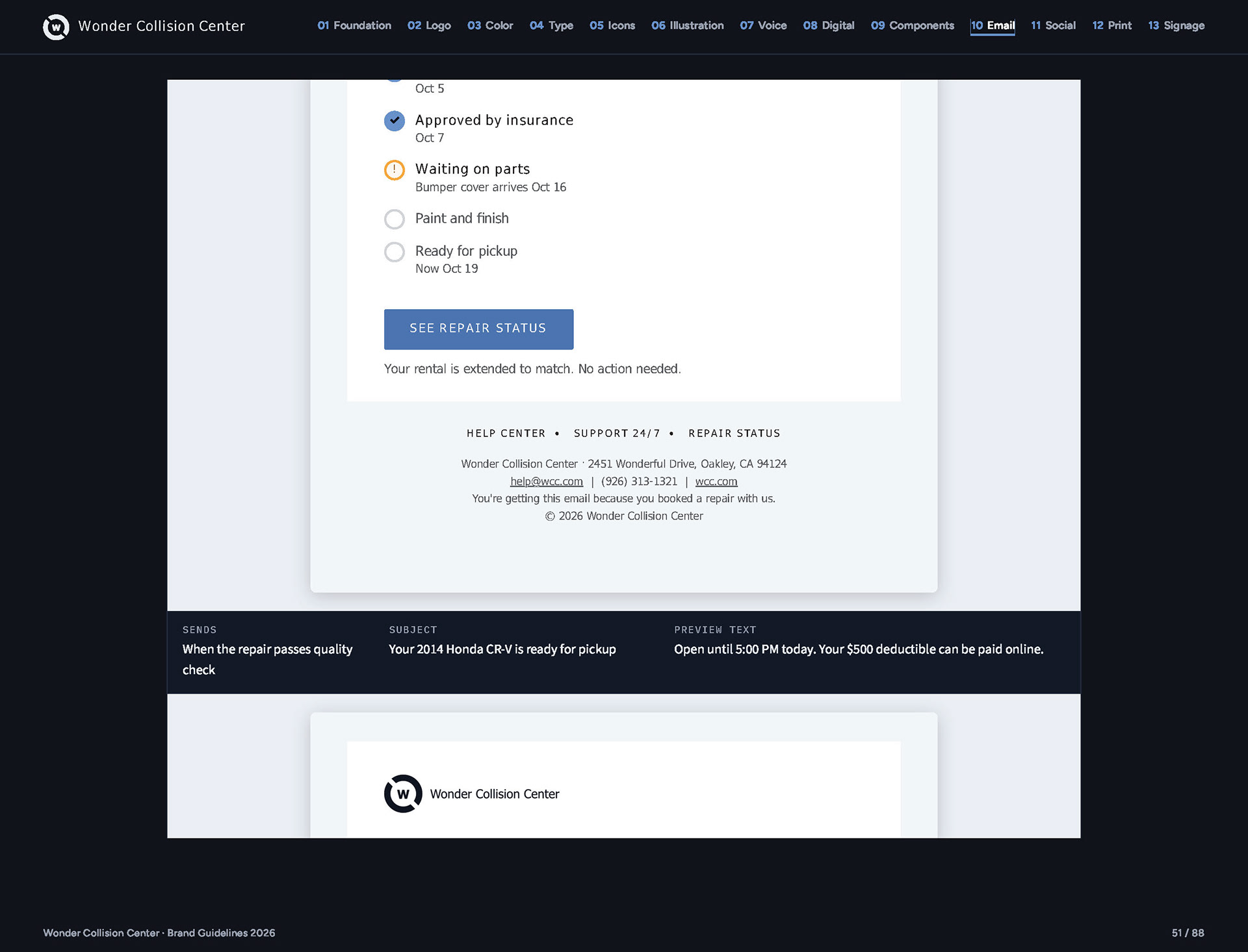
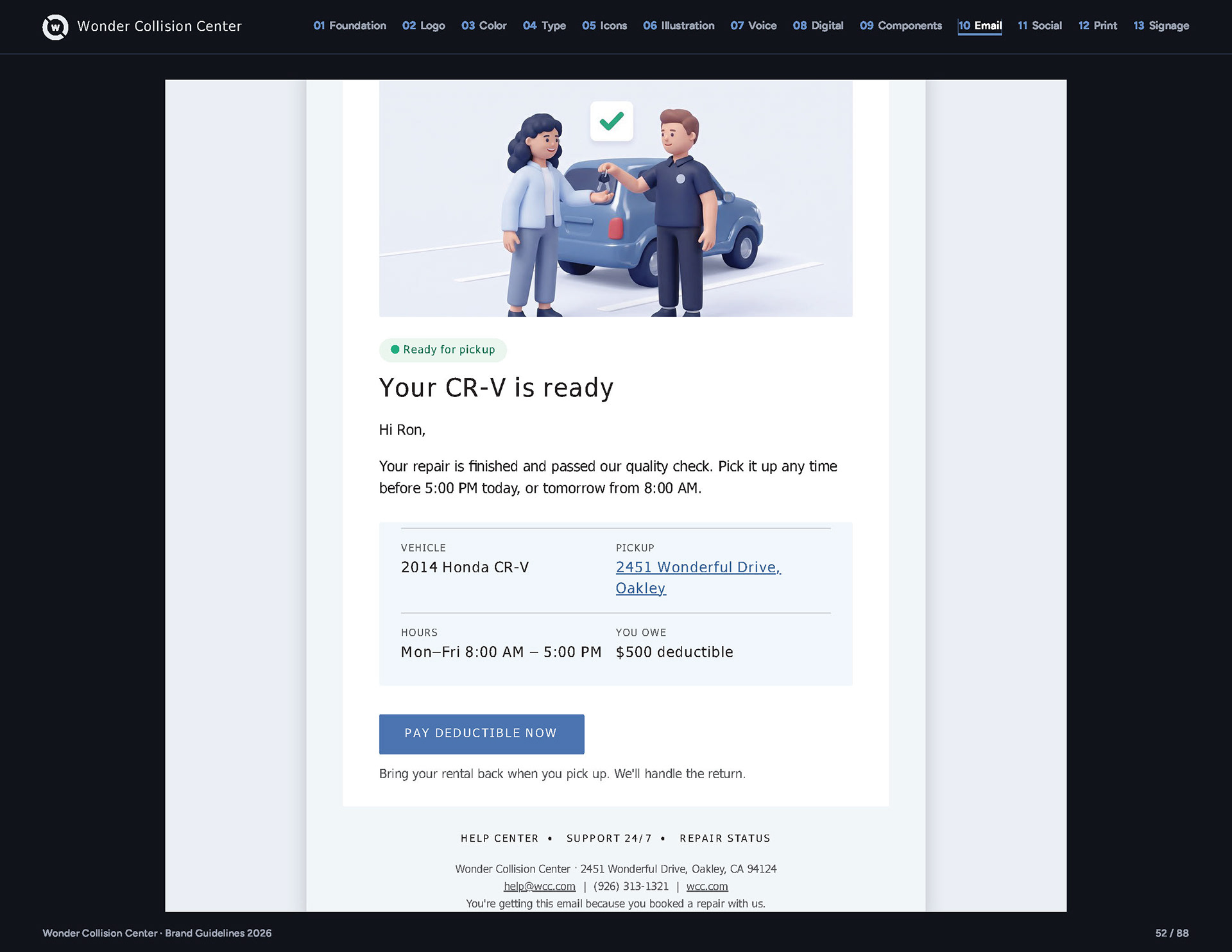
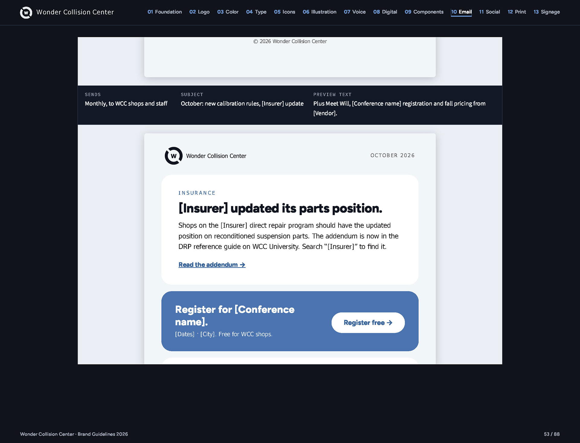
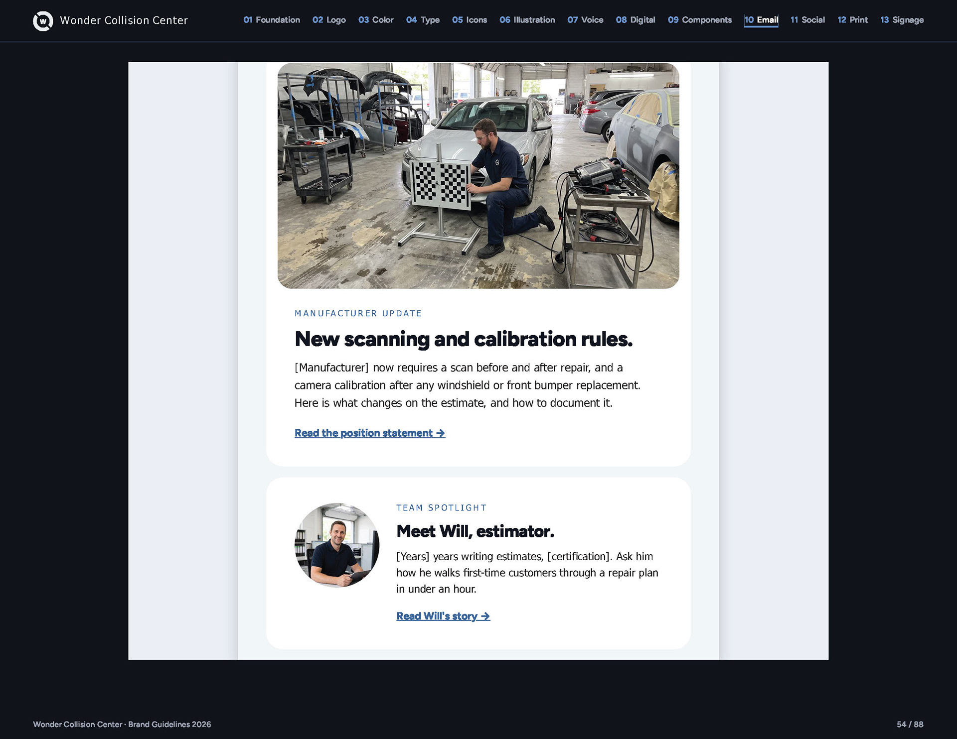
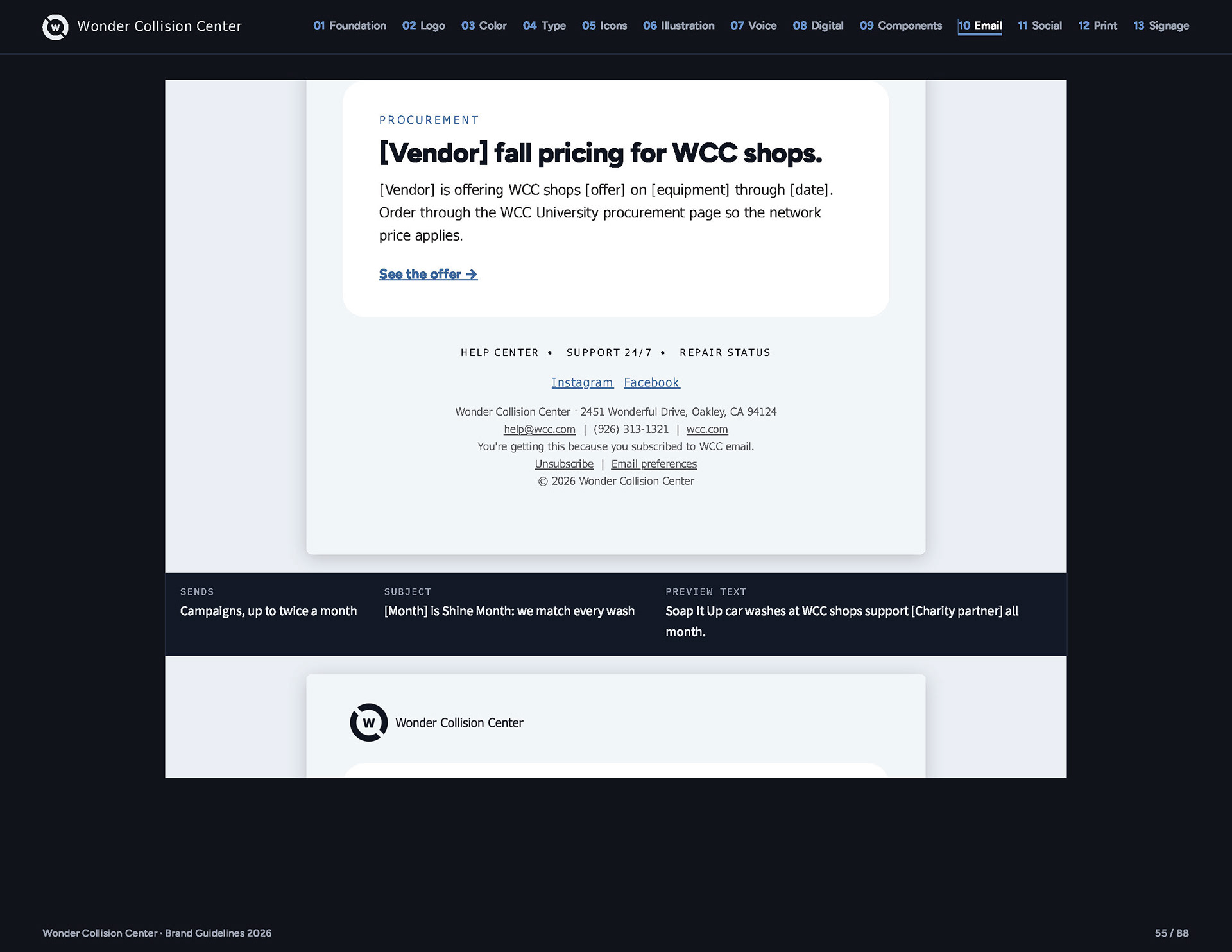
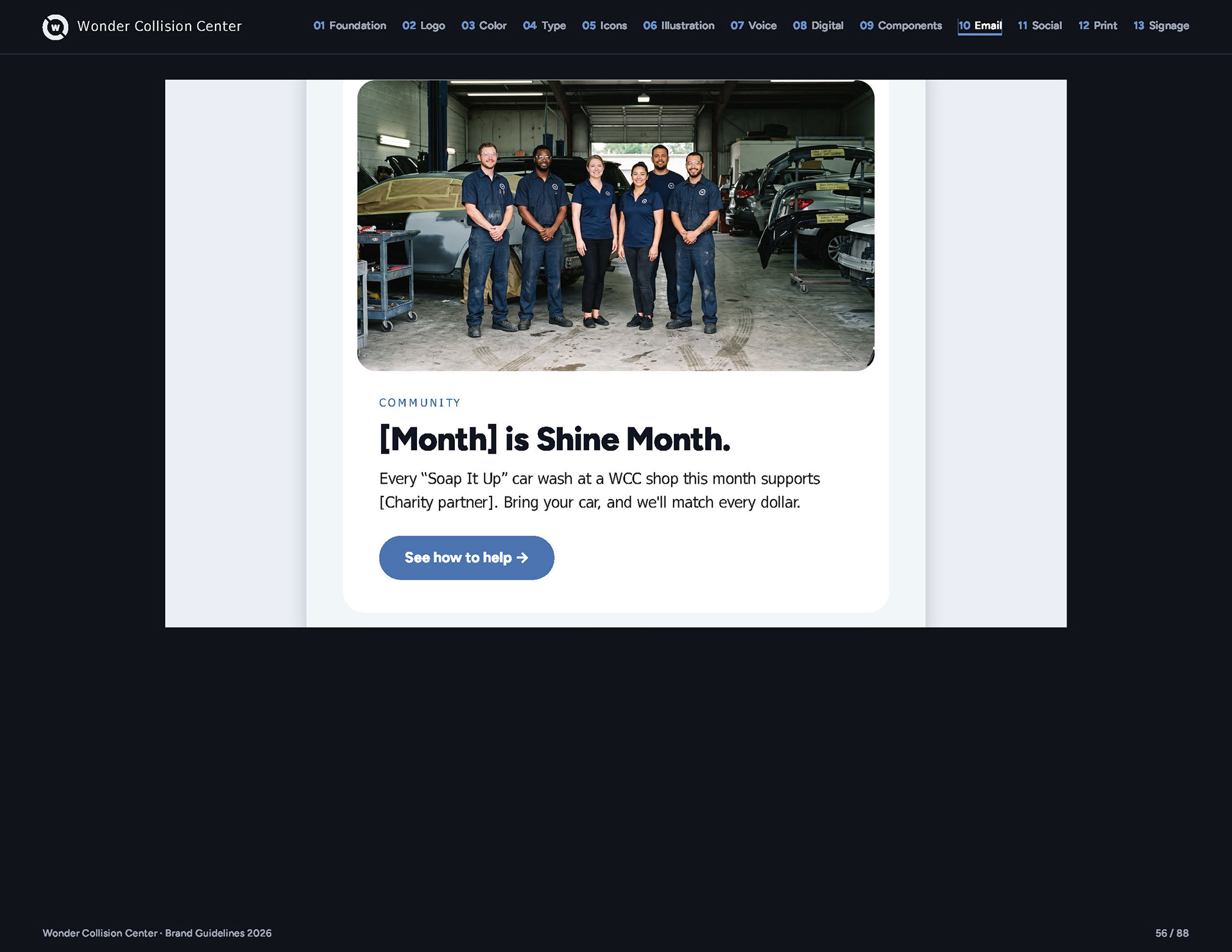
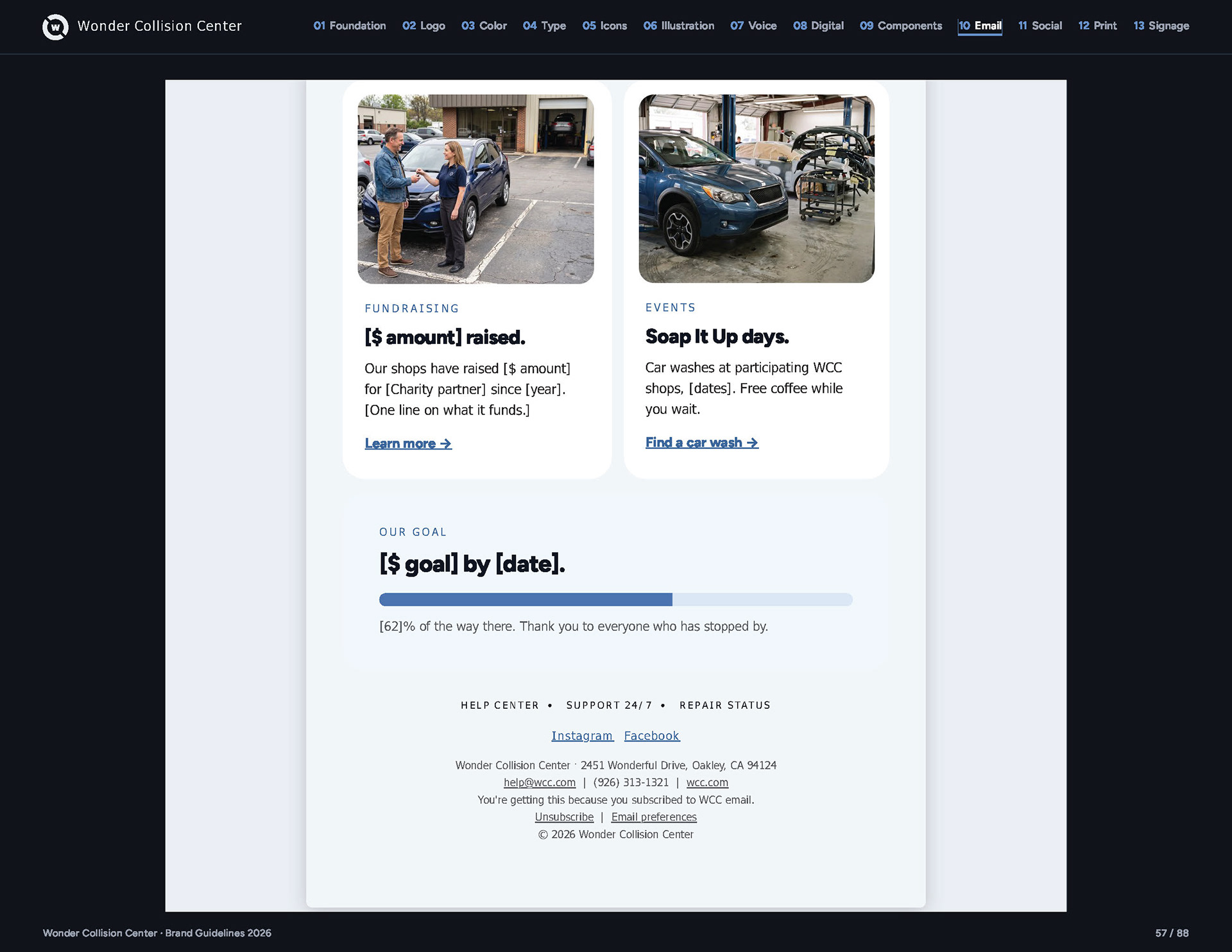
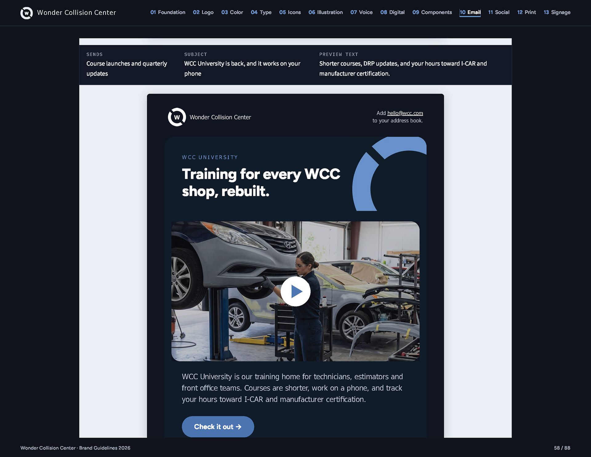
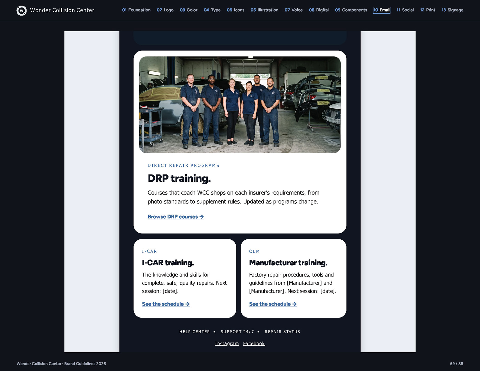
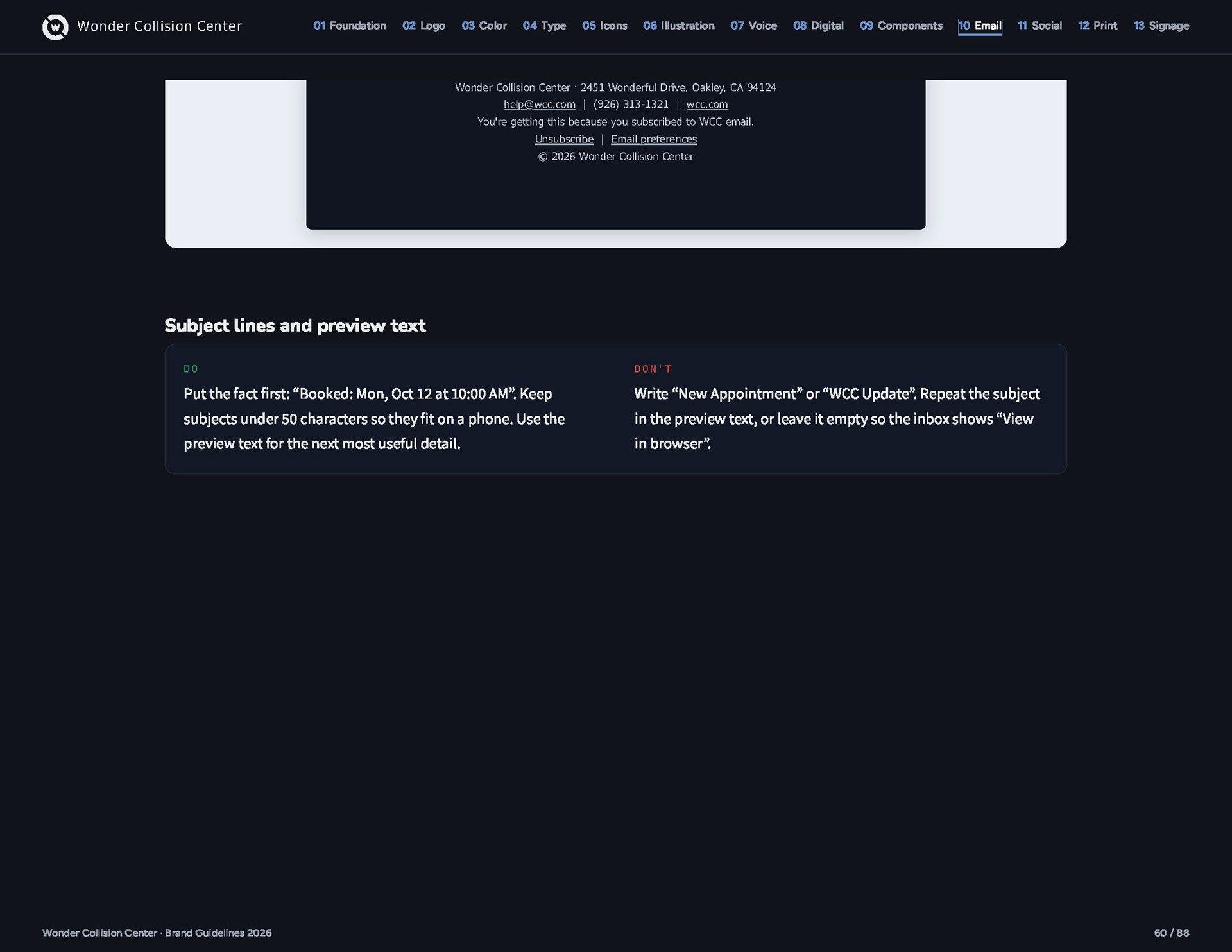
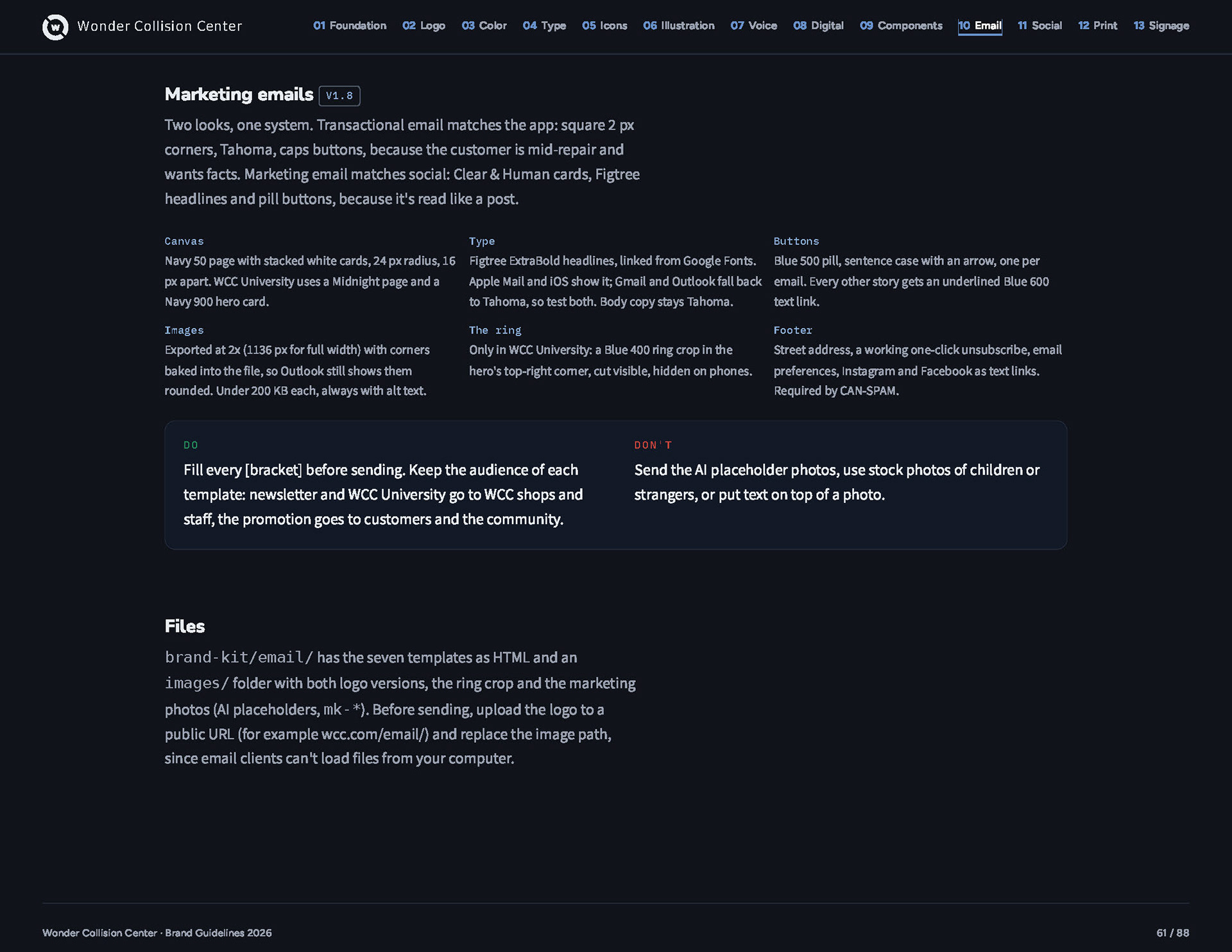
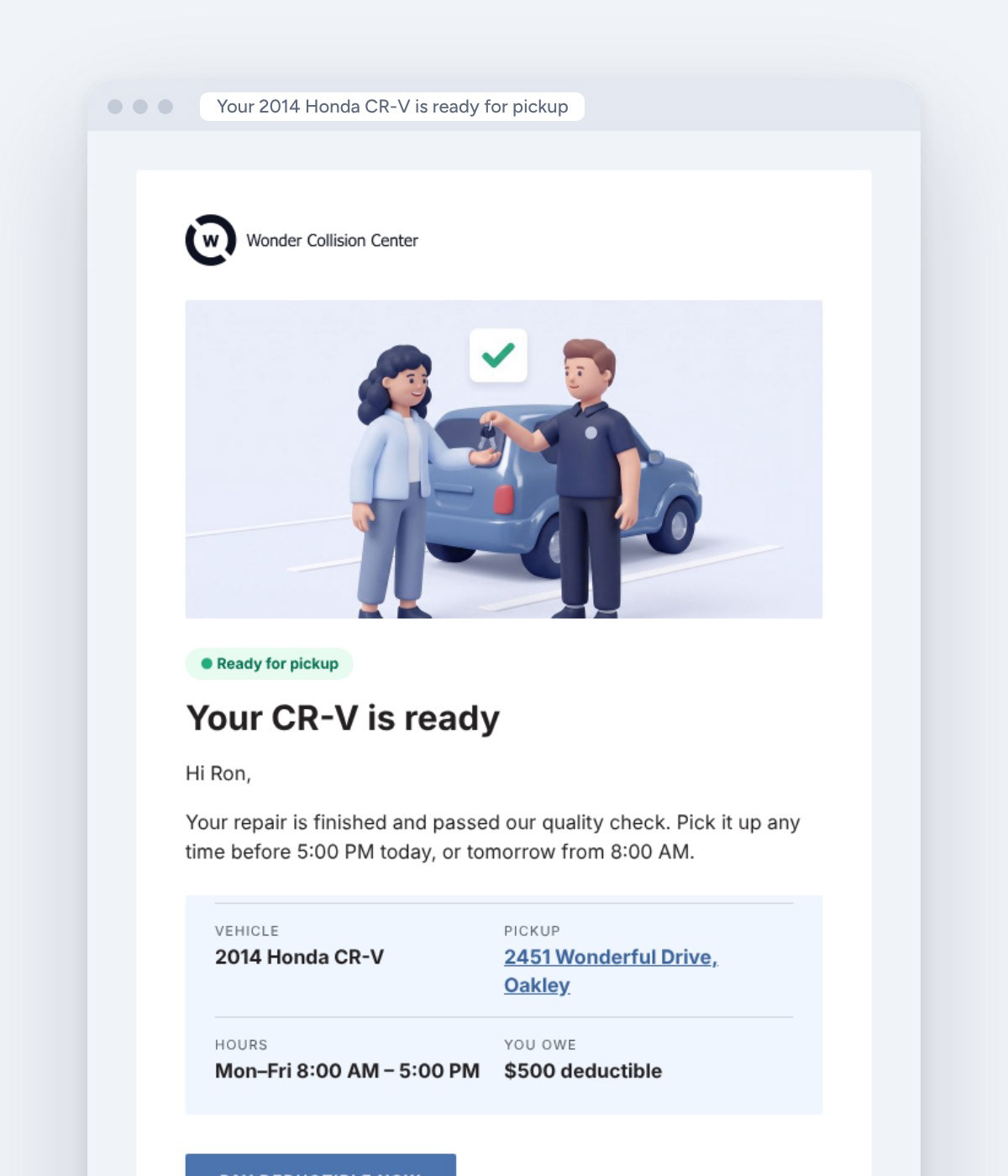
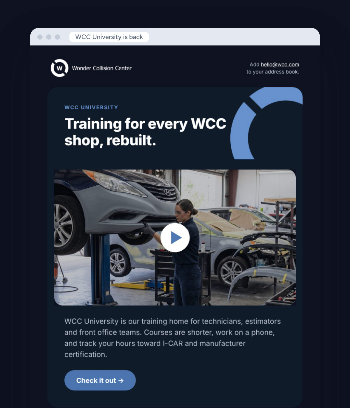
Two looks, chosen by what the reader is doing. Repair emails match the app and lead with facts, because the customer is waiting on their car. Marketing emails match social. All of them are coded for real inboxes.
Building and site
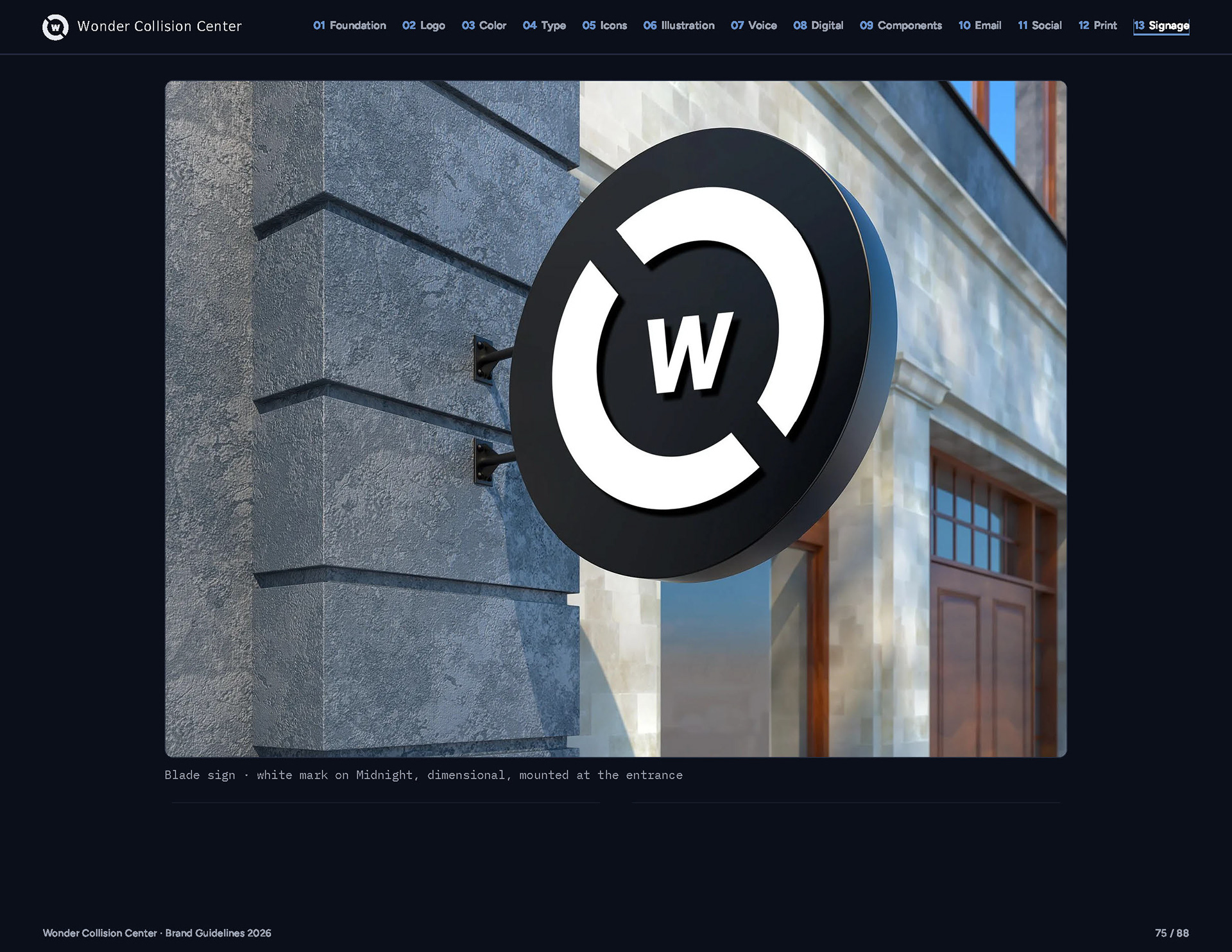
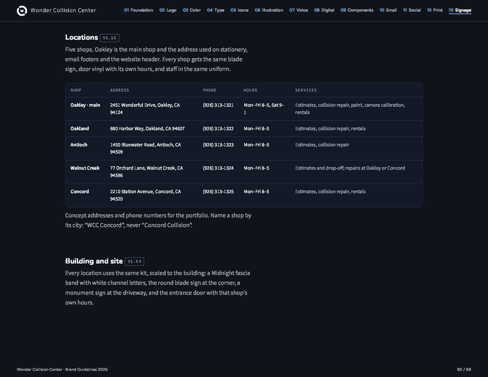
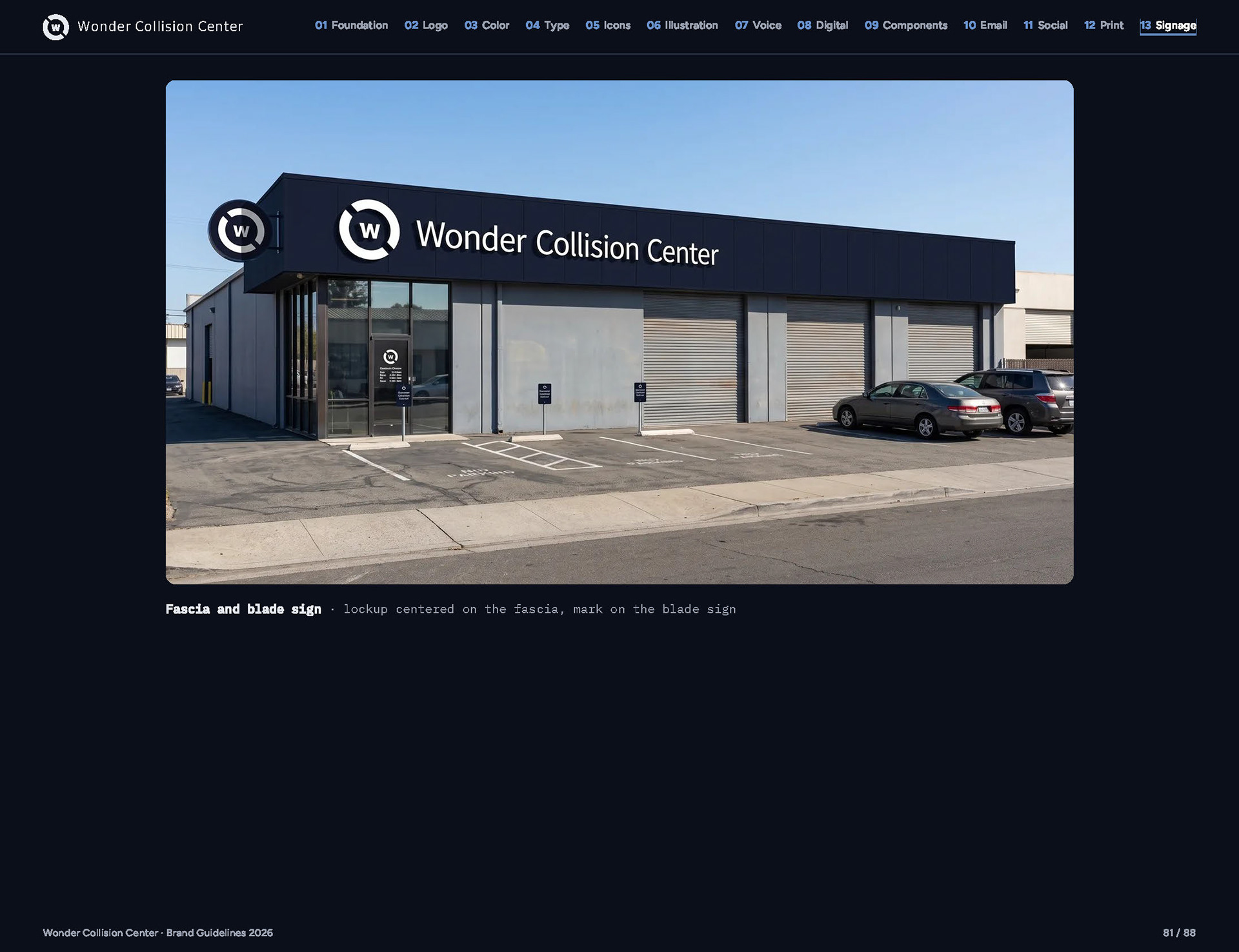
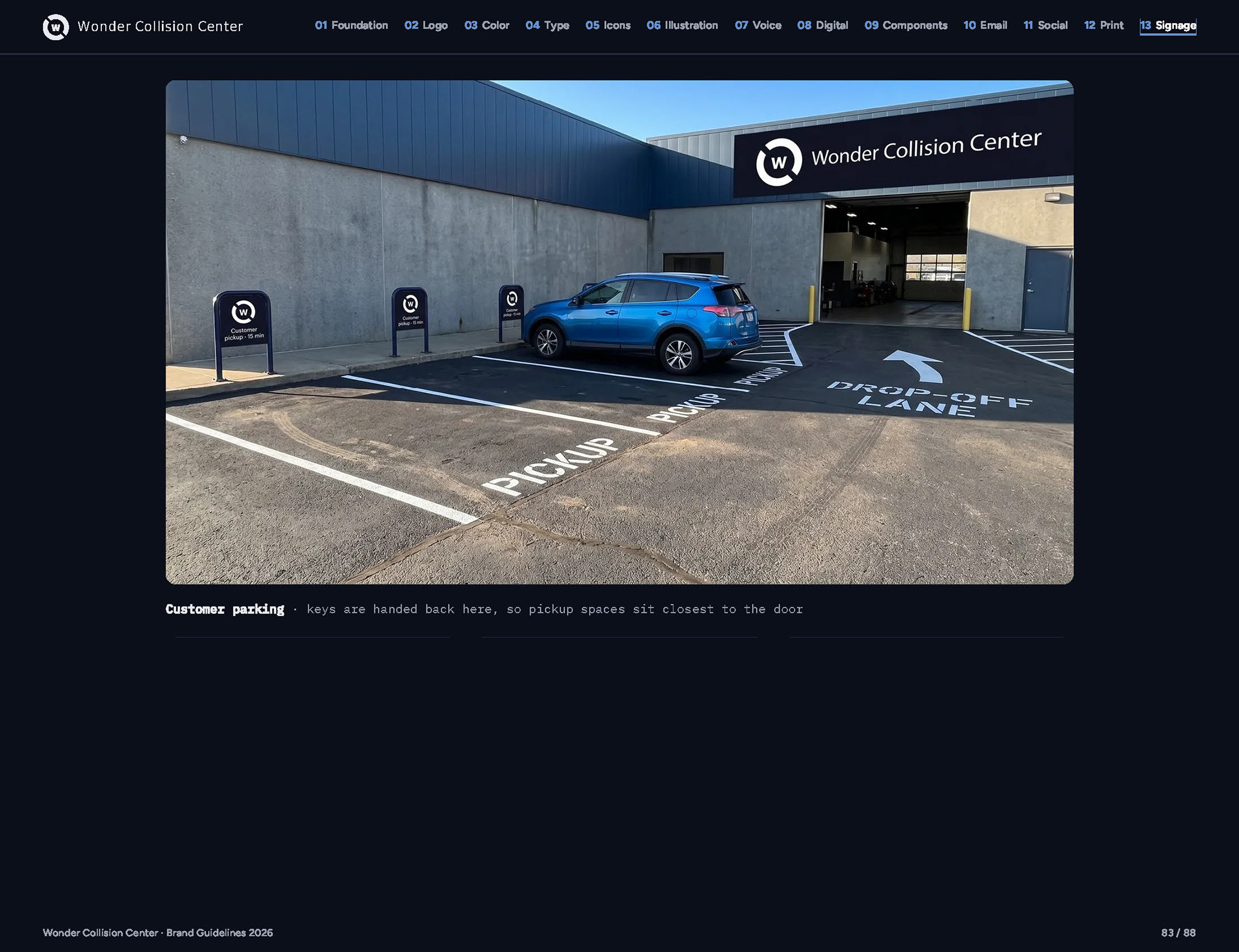
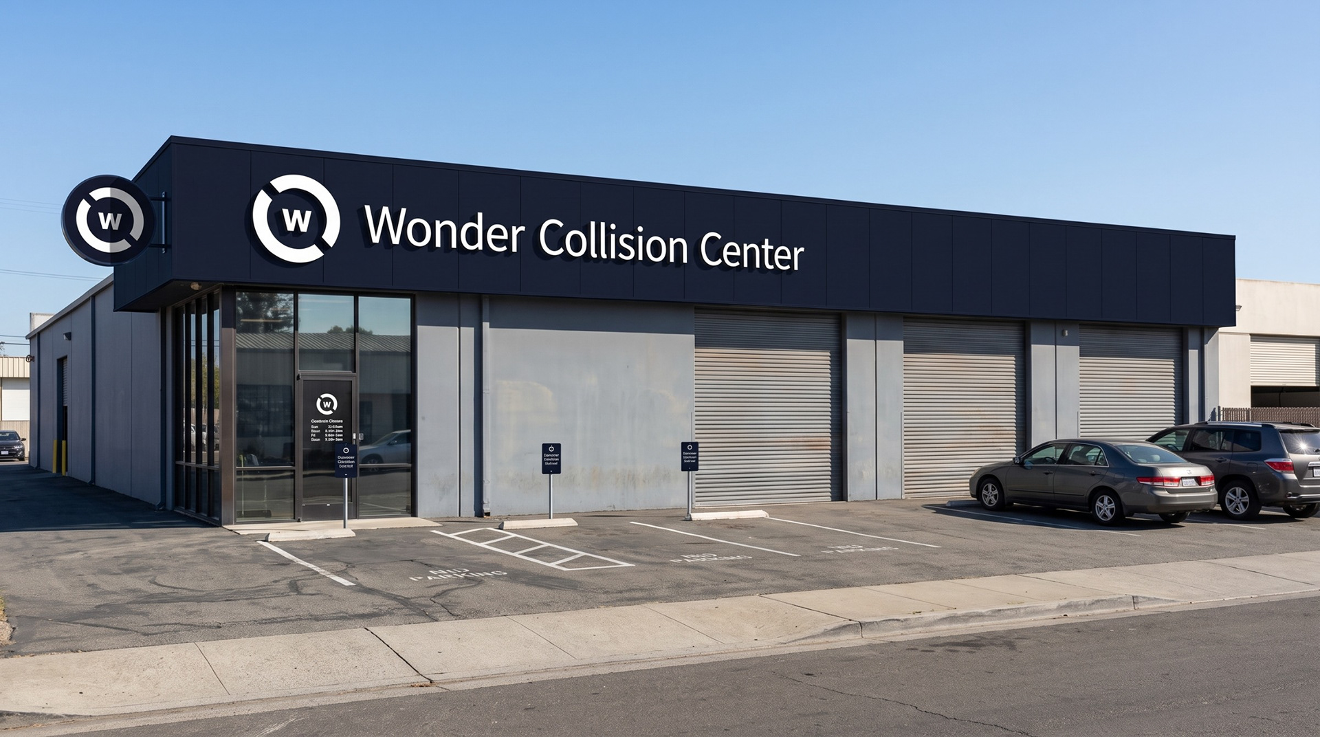
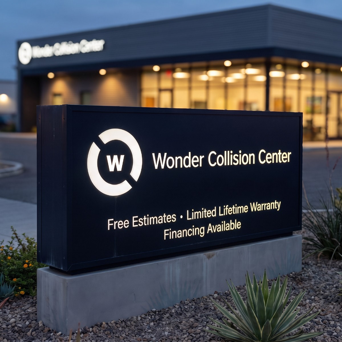
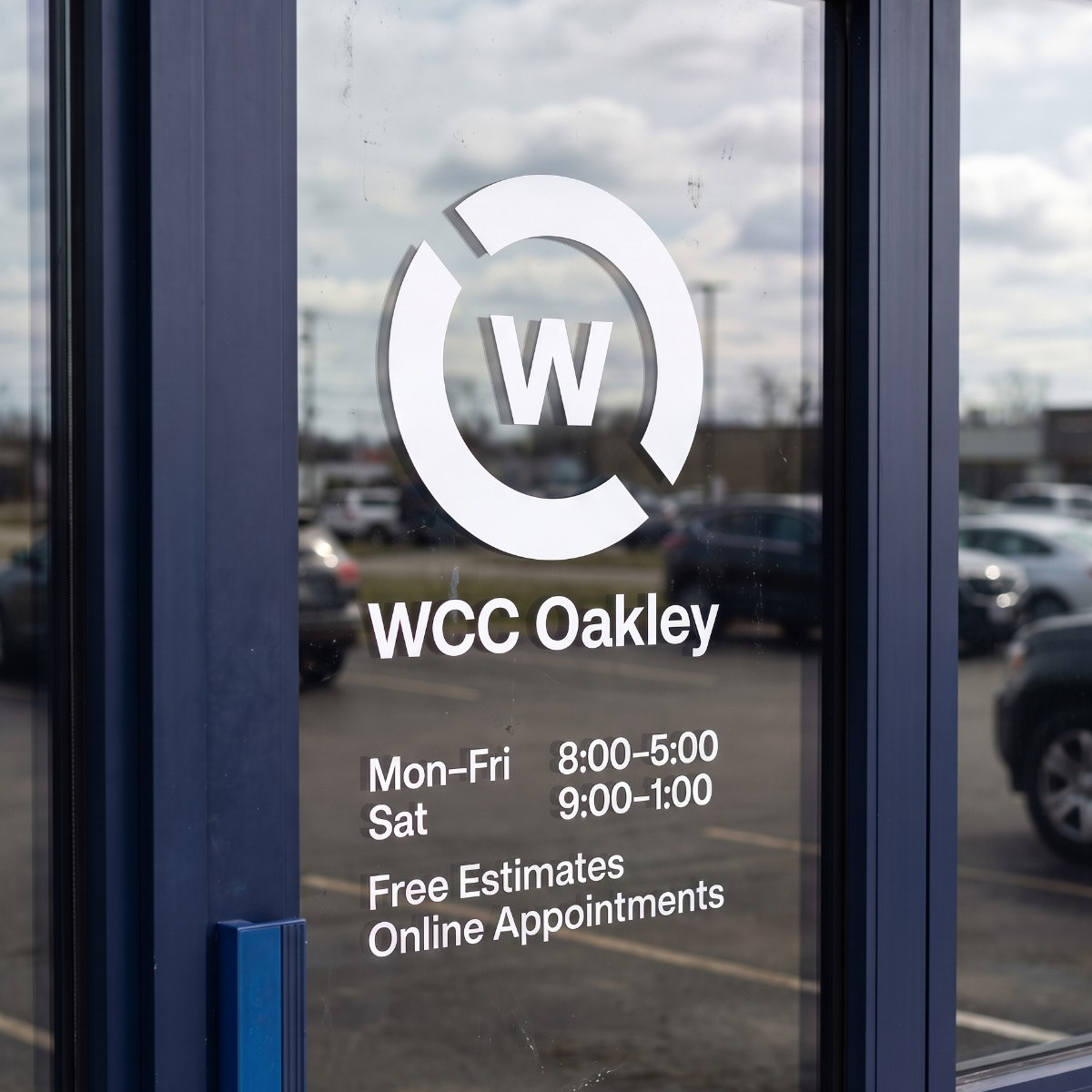
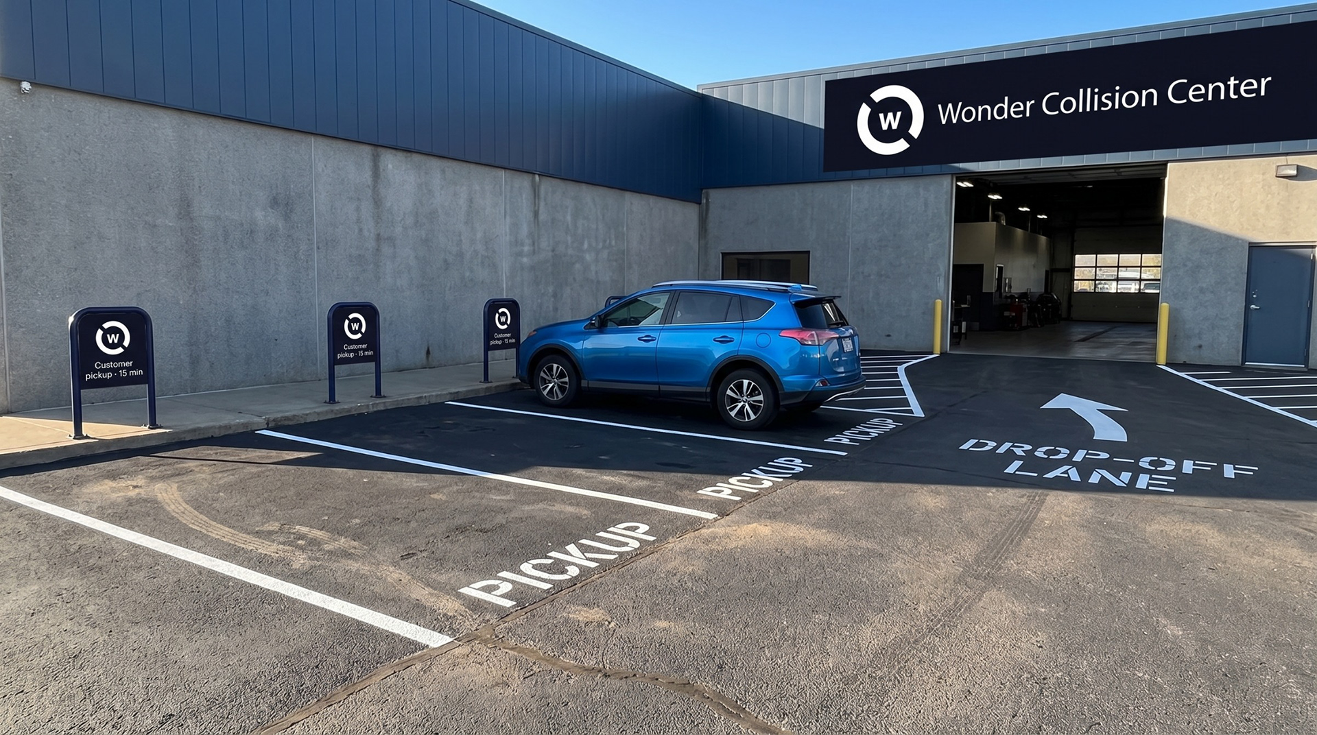
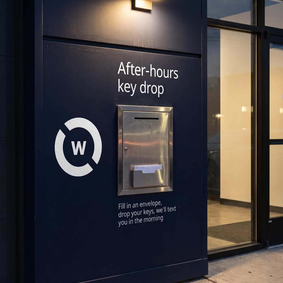
Every location gets the same kit: a Midnight fascia with white channel letters, the round blade sign at the corner, a monument sign at the driveway and an entrance door with that shop’s own hours. Out front, pickup spaces sit closest to the door, because that’s where keys are handed back.
Vehicles
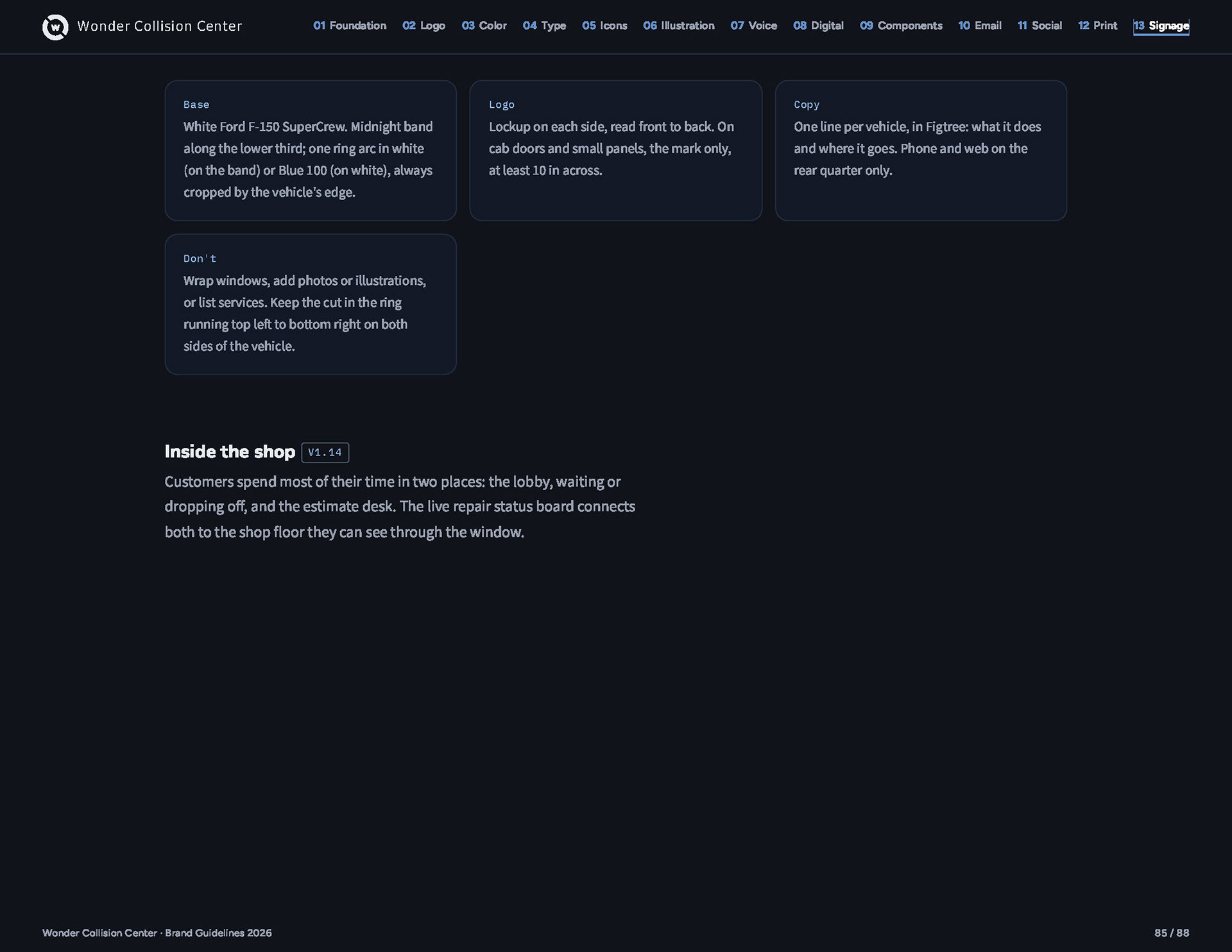
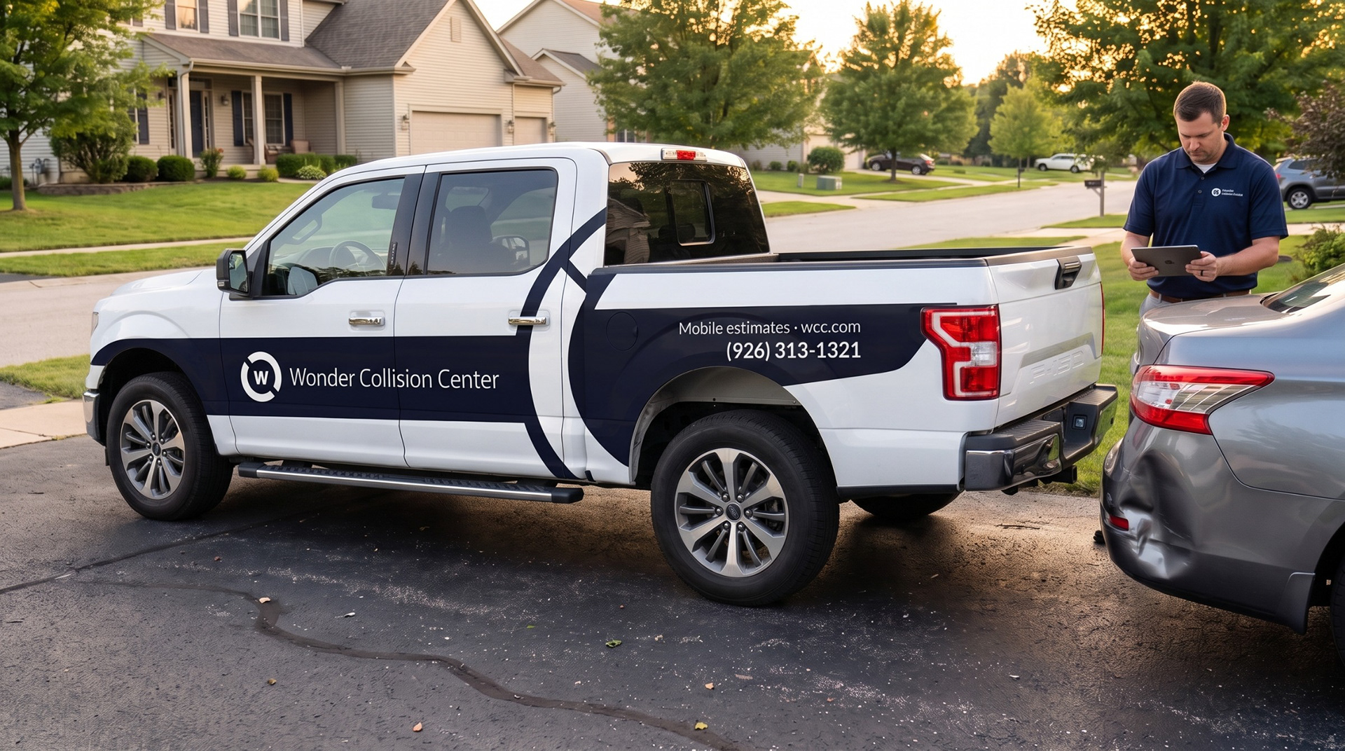
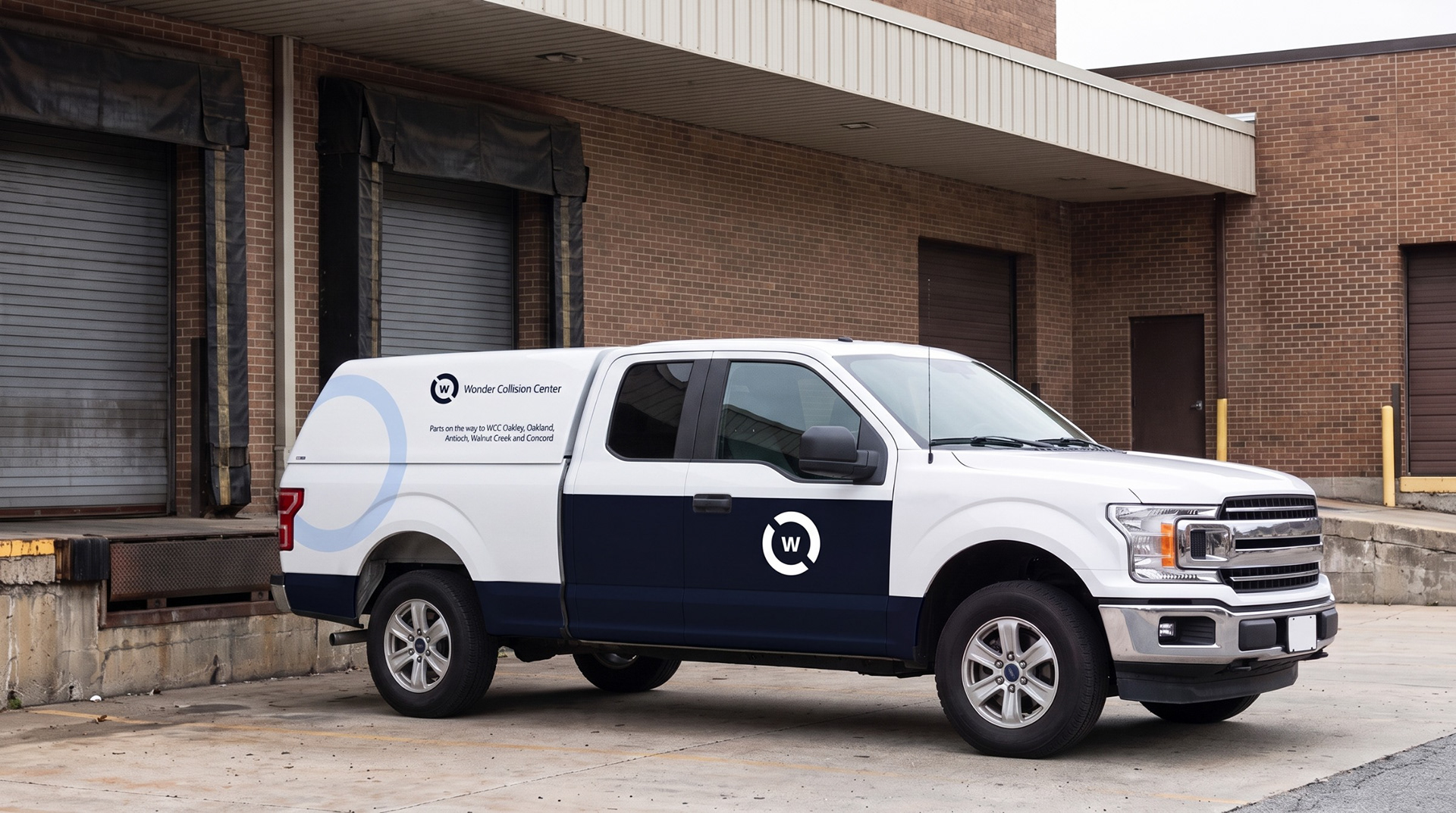
Two white F-150s carry the brand on the road: one an estimator drives to a customer’s driveway, and one with a bed cap that moves parts between the five shops. Both use a Midnight band and one large ring arc, so they read as WCC from across a parking lot.
Inside the shop
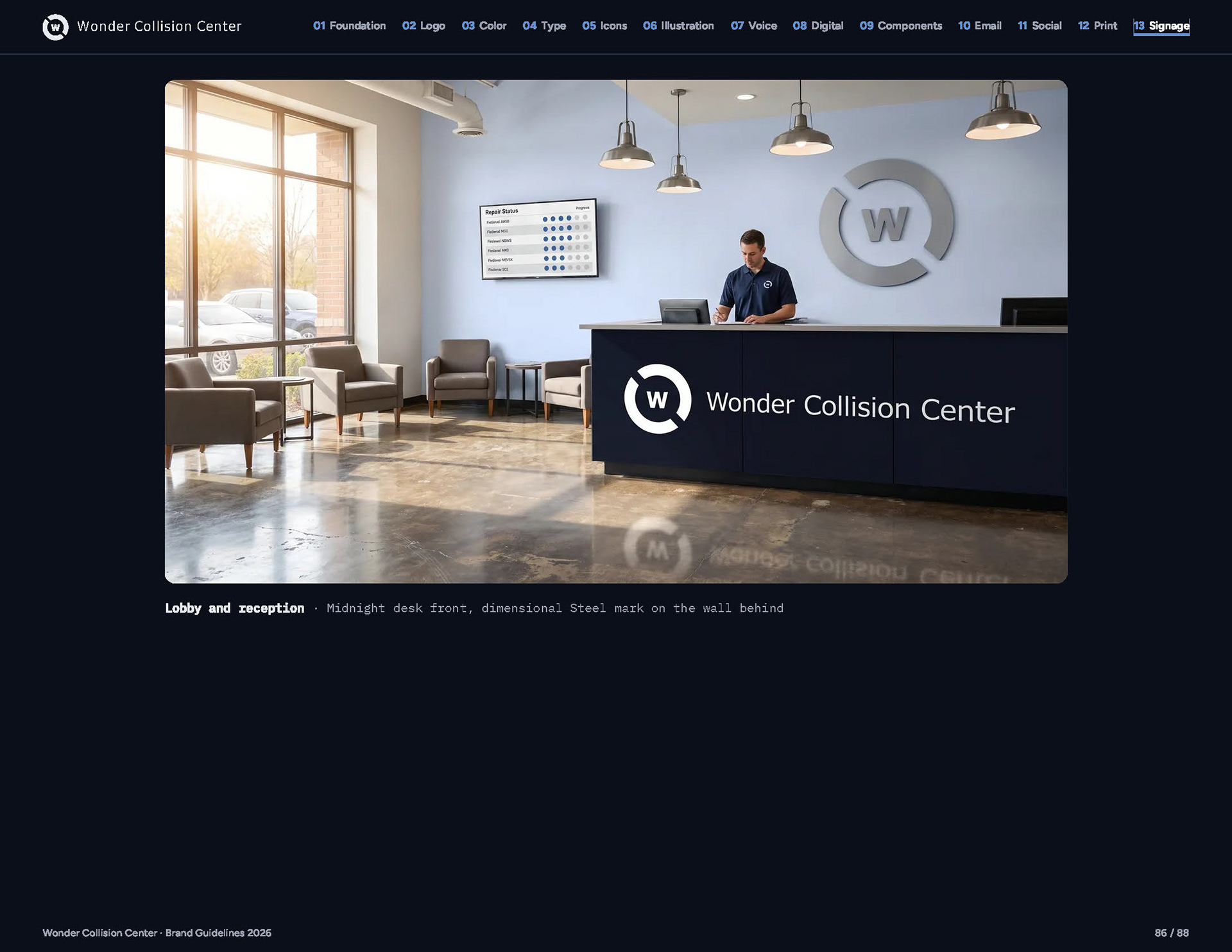
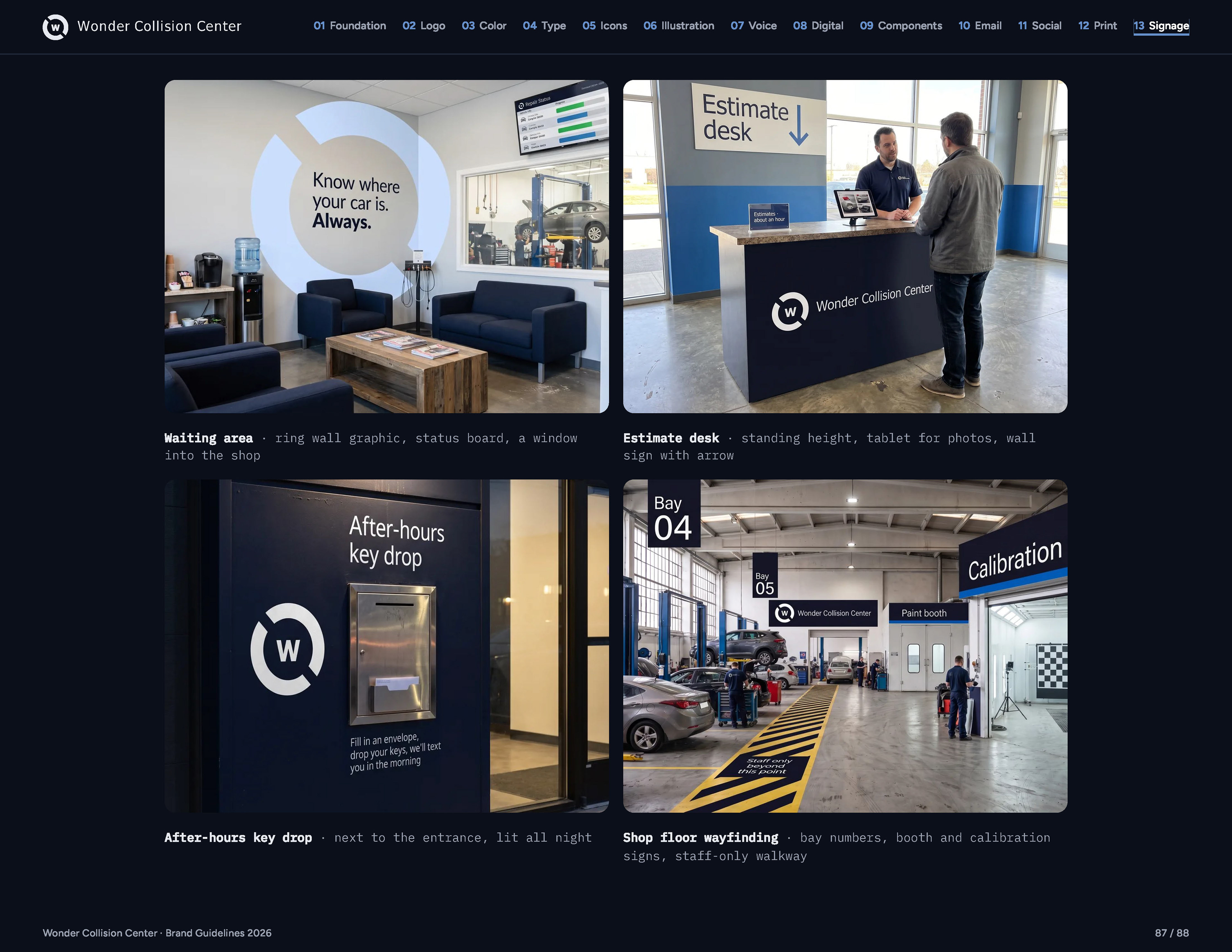
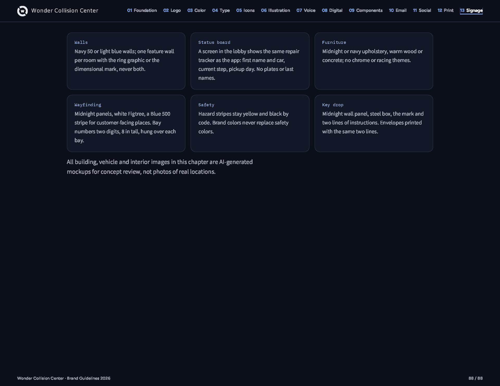
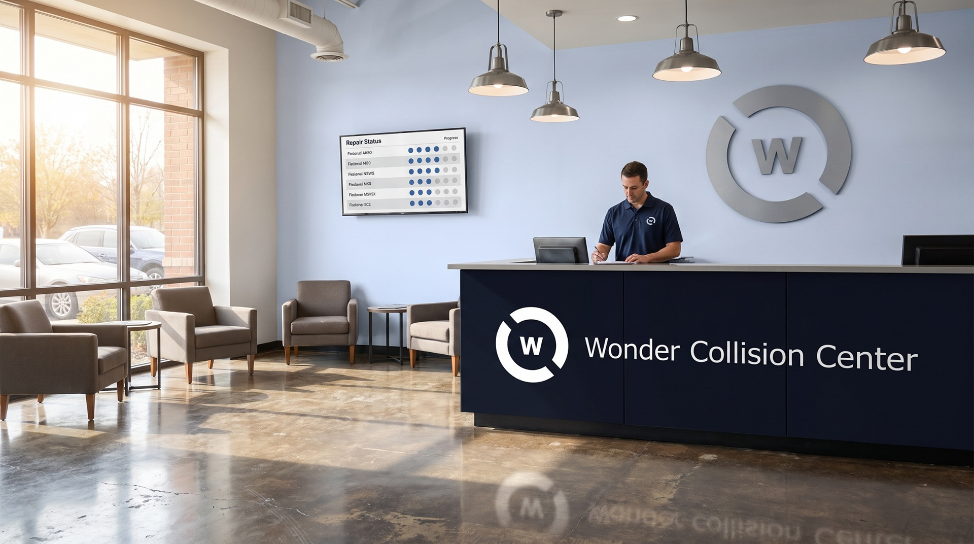
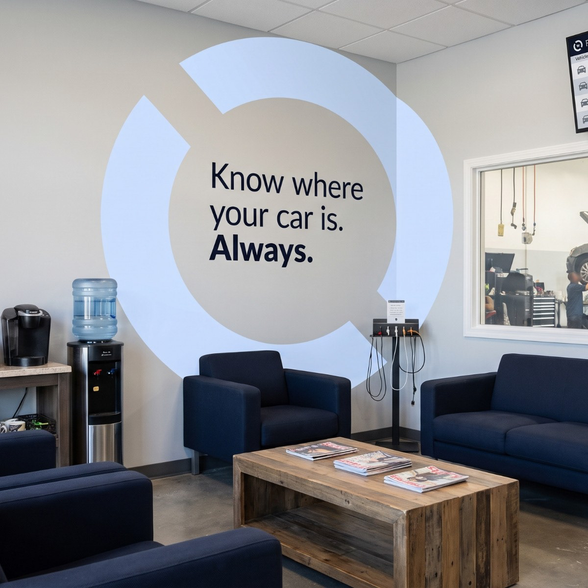
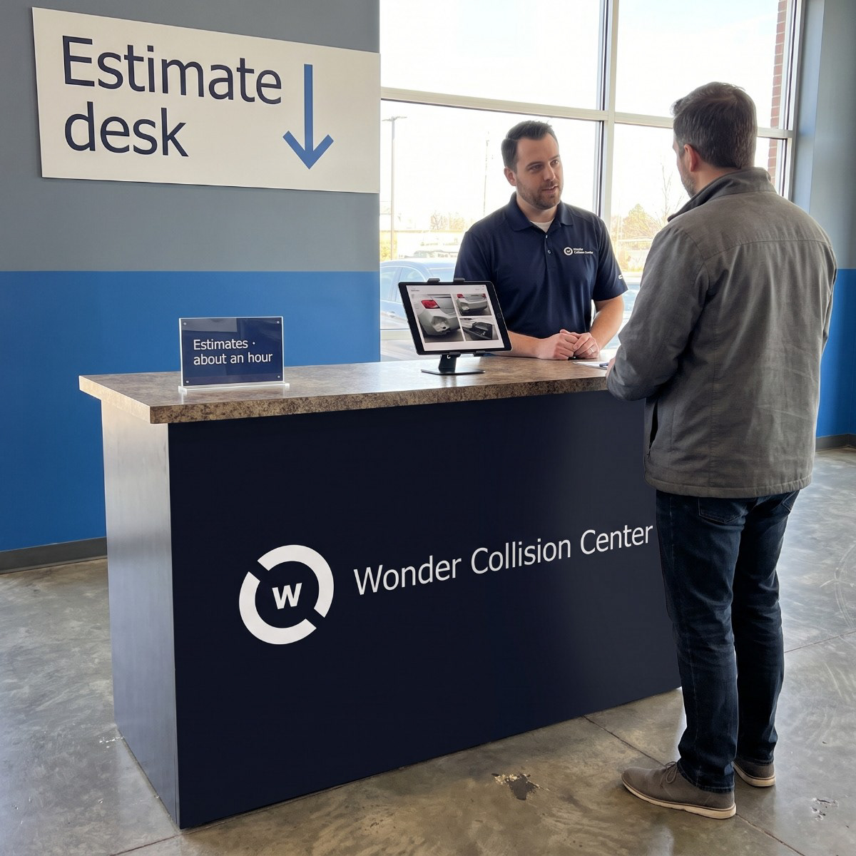
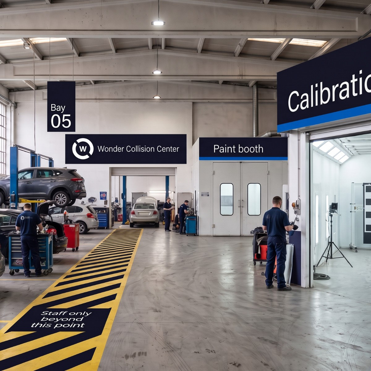
The lobby, the estimate desk and the waiting area all point to the same thing the app does: where your car is. A live status board shows each repair’s current step, and a window looks straight onto the shop floor, where wayfinding keeps customers and technicians in their own lanes.
On the shop floor
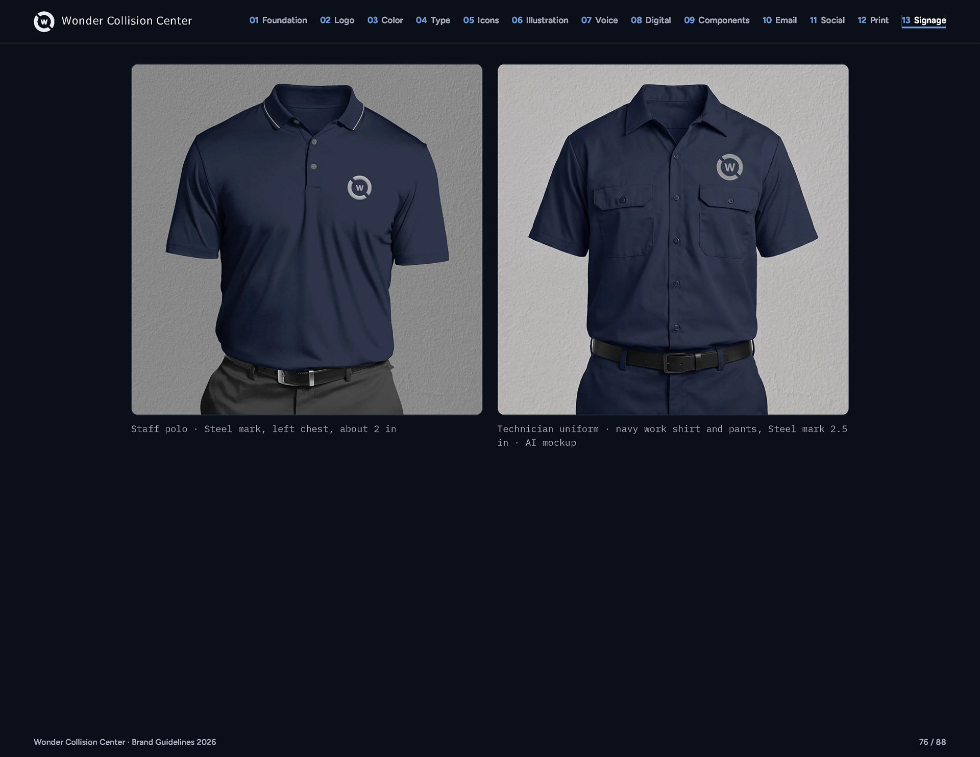
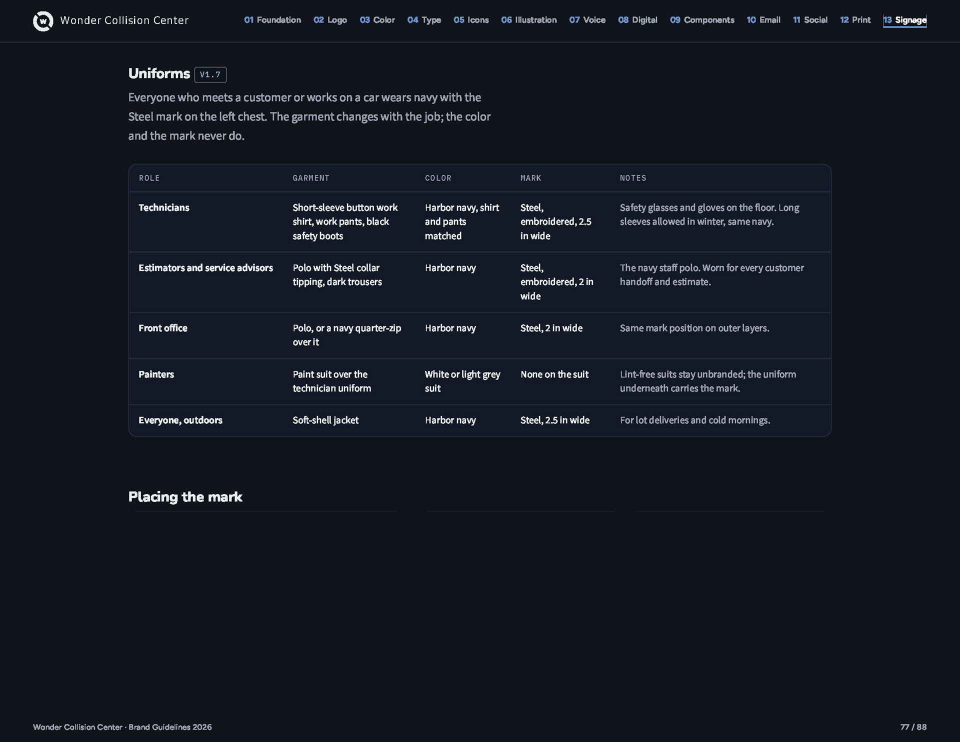
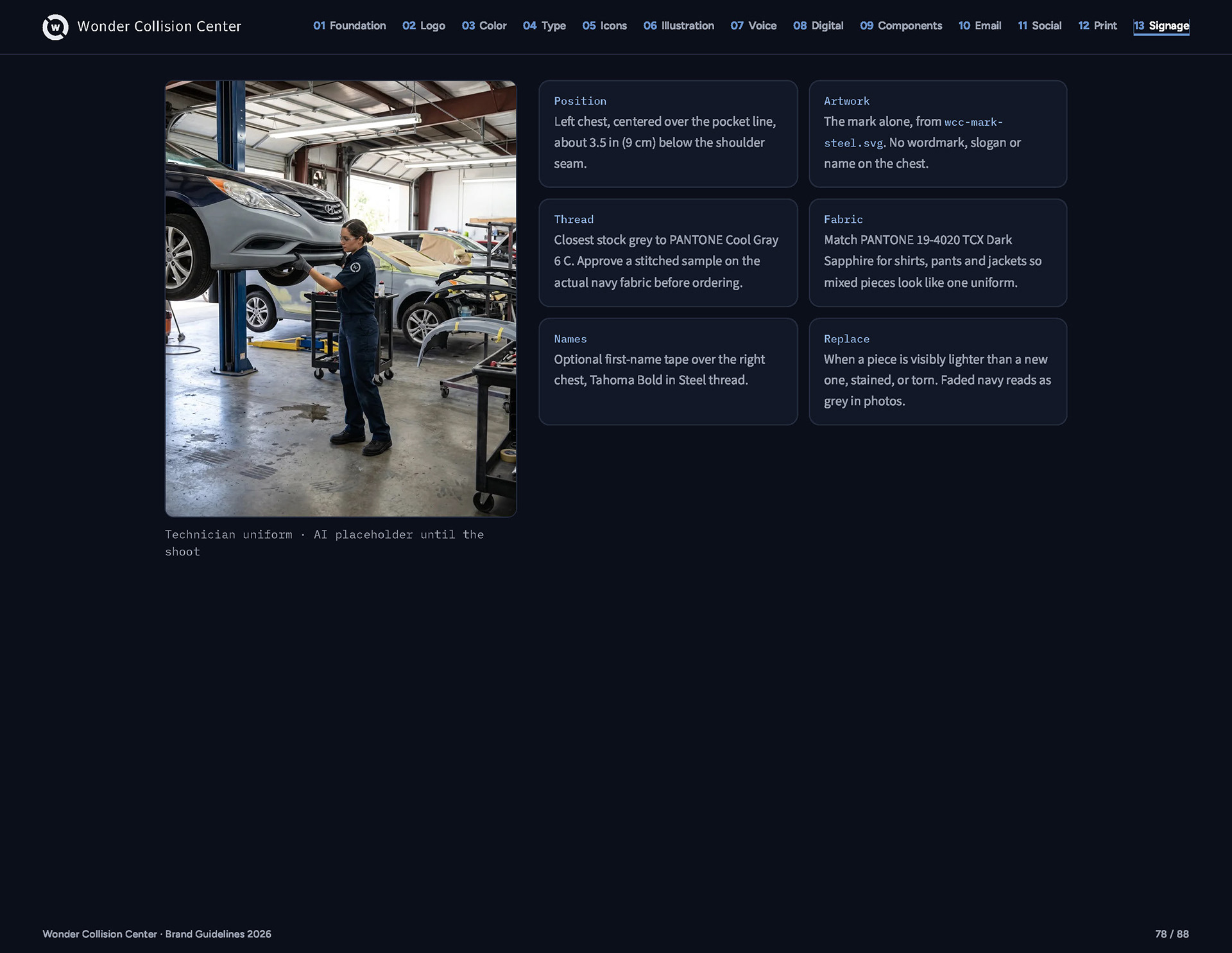
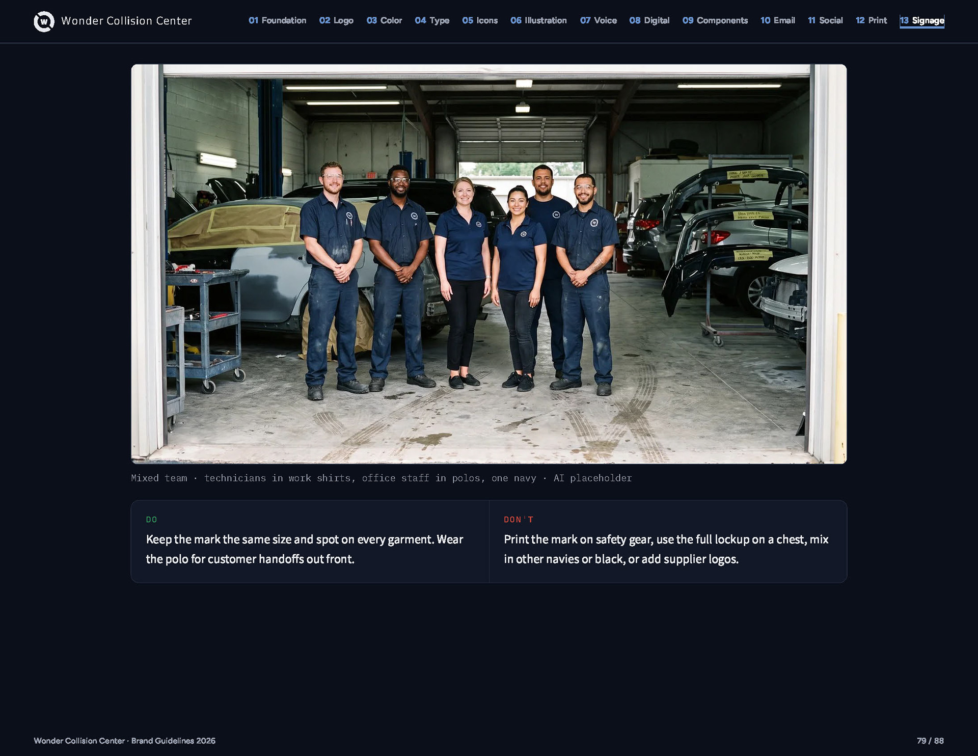
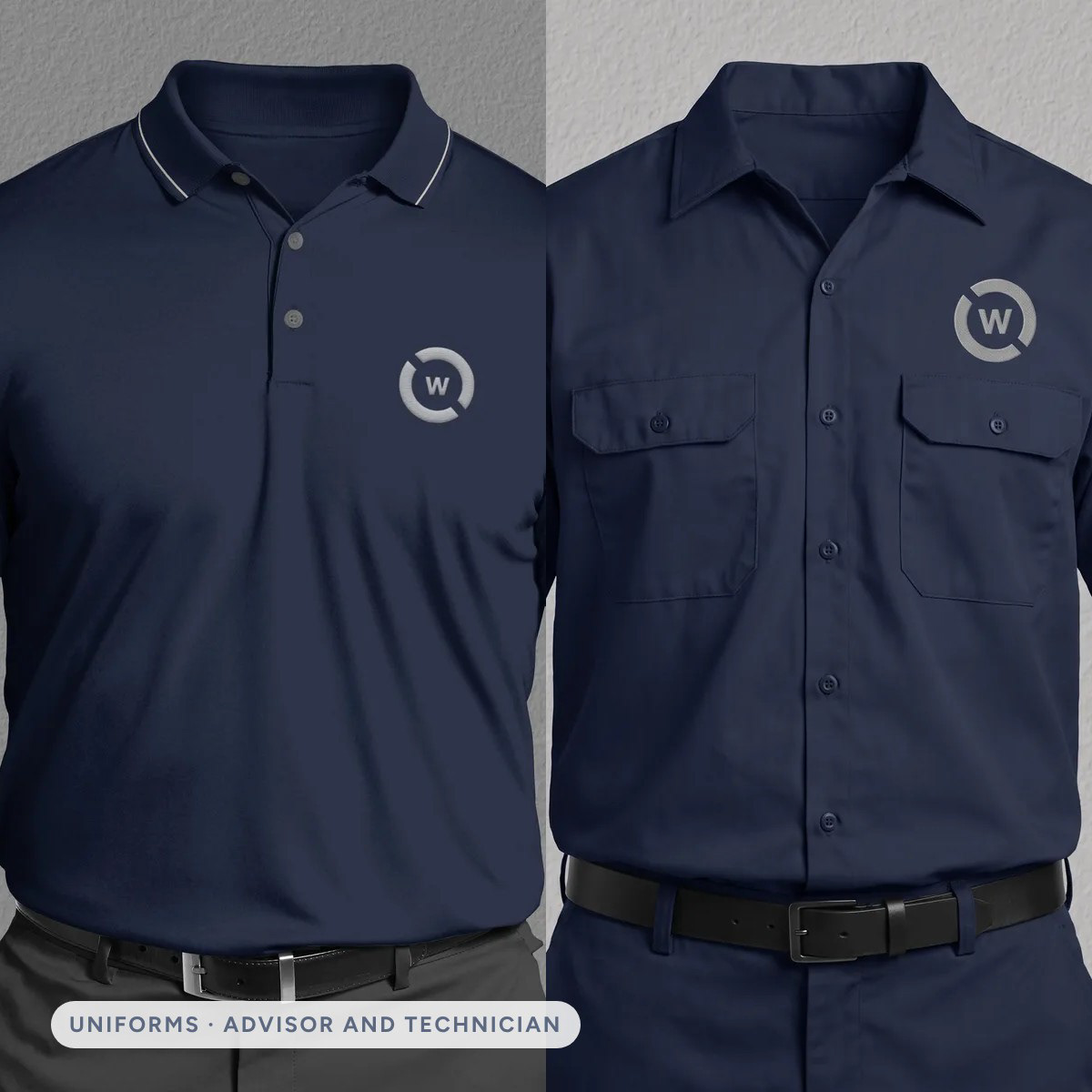
The brand has to work for the person handing back your keys too. Advisors wear the 2019 navy polo; technicians get a matching work shirt, with the Steel mark in the same place on every garment.
Brand Guidelines
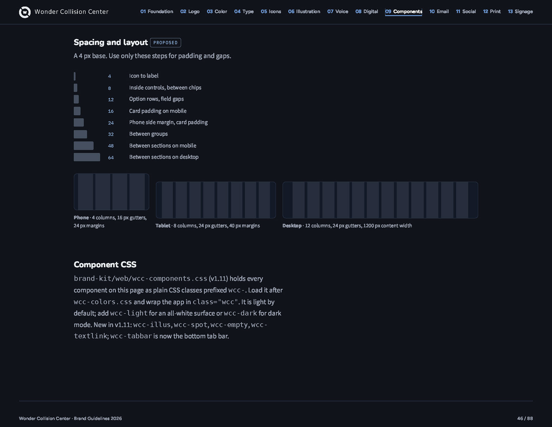
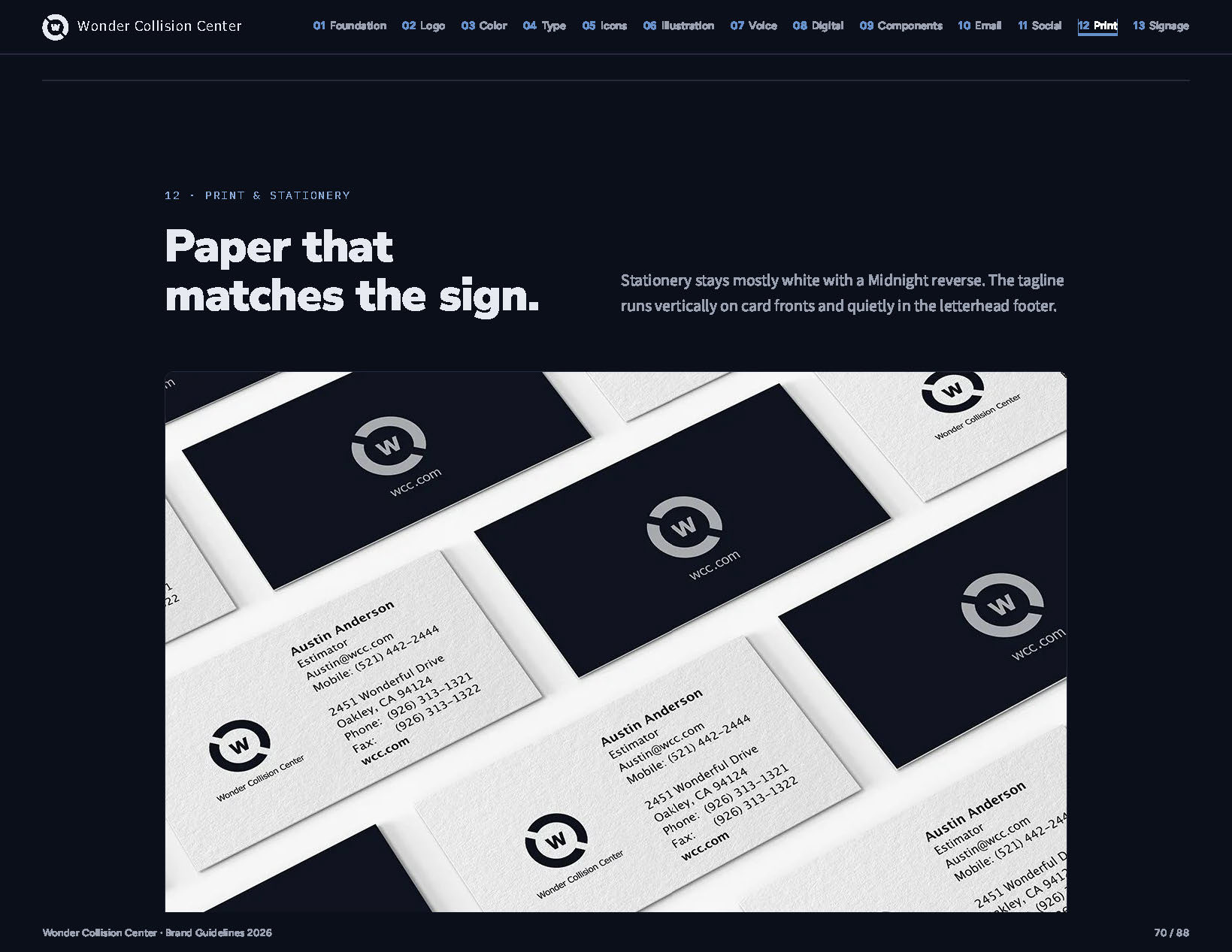
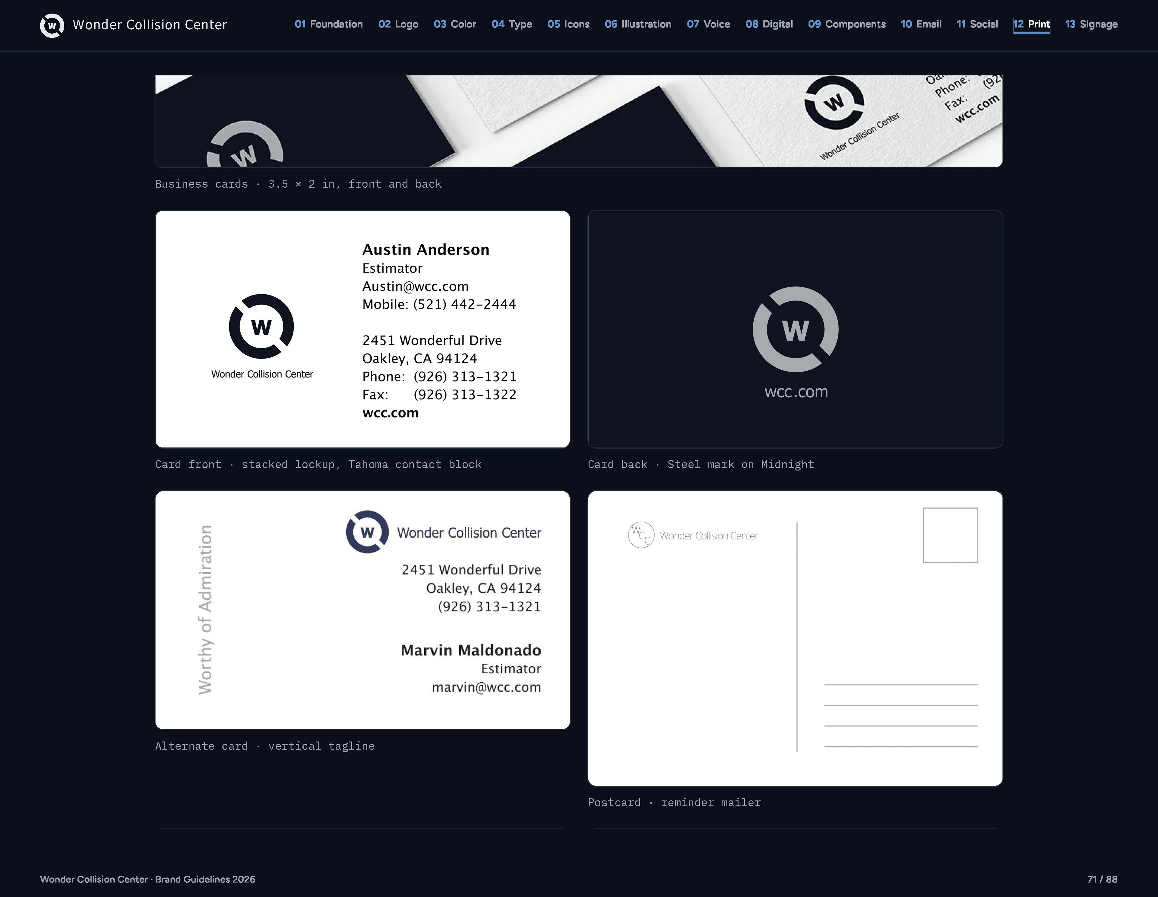
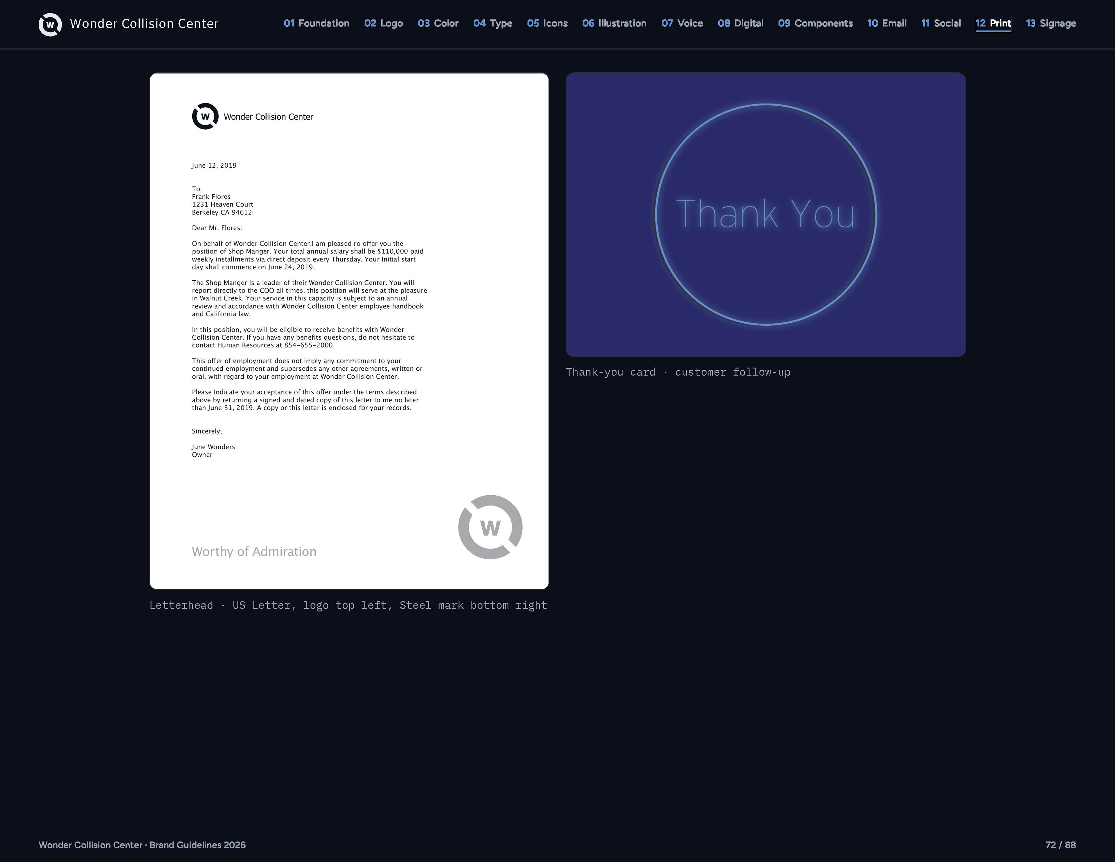
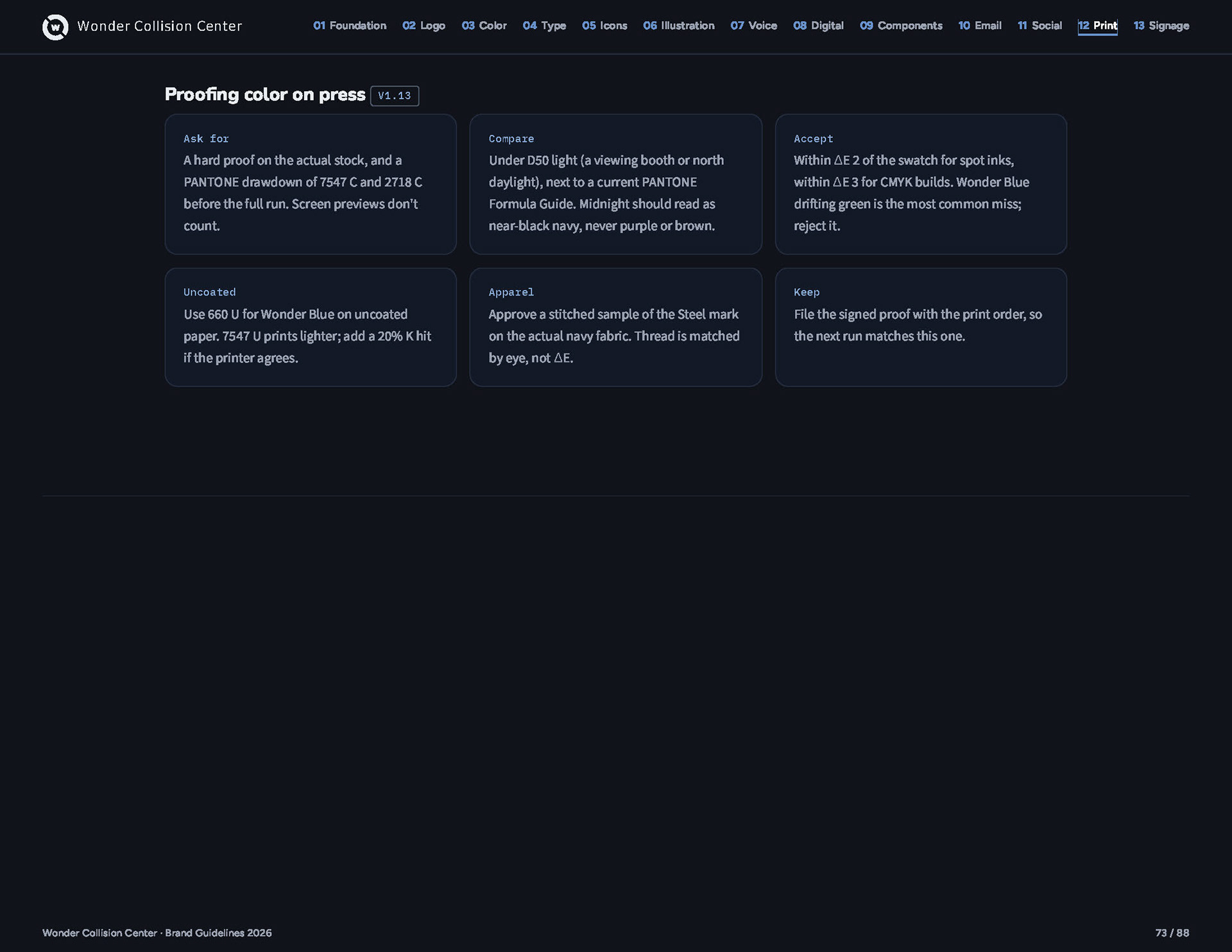
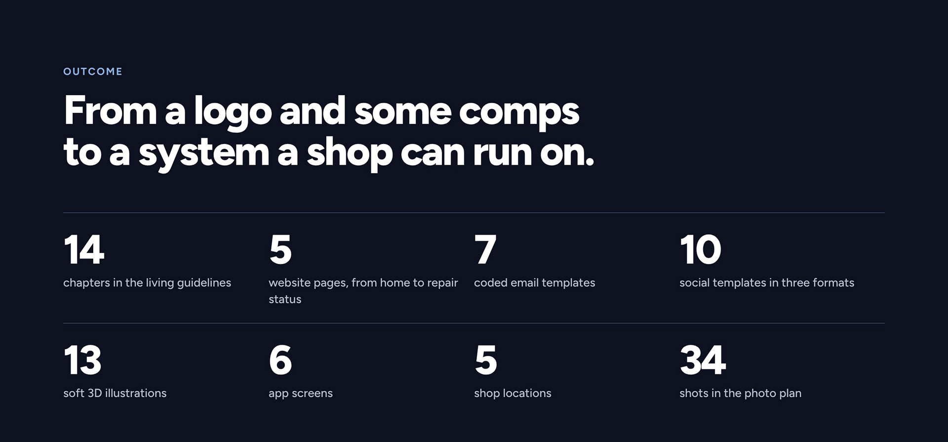
Everything in this case study lives in this guide: logo, color, type, illustration, voice, website and app, email, social, print, signage, and uniforms. Each chapter pairs a rule with a real example and a clear do and don’t, so a designer, a sign shop, or leadership can pick it up and get it right the first time.